This is the full developer documentation for Brand Portal
# Portal Docs
> A GitHub-backed WYSIWYG site builder for brand guides and asset libraries.
[Editor Guide ](/editor/getting-started/your-brand-portal/)Edit your brand portal: text, sections, media, audiences, and publishing — no code.
[Developer Docs ](/developer/overview/what-the-portal-is/)Provision and run a client site, or work on the framework packages and internals.
# For AI agents
> Orientation for a coding agent doing development on the portal framework or a client site.
This page orients a coding agent that has been pointed at a Brand Portal codebase. If you are a human, [What the portal is](/developer/overview/what-the-portal-is/) and [Architecture](/developer/overview/architecture/) are a better start.
## Ingest the whole docs in one request
[Section titled “Ingest the whole docs in one request”](#ingest-the-whole-docs-in-one-request)
This site publishes the [llms.txt](https://llmstxt.org/) standard:
* [**`/llms.txt`**](/llms.txt) — a structured index of every page, with links and one-line summaries.
* [**`/llms-full.txt`**](/llms-full.txt) — the entire documentation set concatenated as one Markdown file. Fetch this to load all developer and editor docs into context at once.
## Which codebase are you in?
[Section titled “Which codebase are you in?”](#which-codebase-are-you-in)
Two very different contexts share these docs — identify yours first:
1. **A client site repo** (e.g. `acme-portal`) — content and configuration only; the framework comes from the published `@drawnagency/*` packages. Most “build or run a site” tasks live here. Start with [Building a client site](/developer/building-a-client-site/provisioning/).
2. **The framework monorepo** (`Drawn-Agency/portal`) — the six published packages (plus the private `@drawnagency/platform`) and the dev, admin, docs, and MCP-connector apps. Start with [Monorepo & dev workflow](/developer/framework-internals/monorepo-and-dev-workflow/).
## Rules that will bite you if you ignore them
[Section titled “Rules that will bite you if you ignore them”](#rules-that-will-bite-you-if-you-ignore-them)
* **Use pnpm.** The monorepo enforces it with a `preinstall` `only-allow pnpm` hook; client repos are pnpm-based too (`.npmrc` + committed lockfile) but without that hook. Either way `npm`/`yarn` break the setup — always use pnpm.
* **The editor import chain must be browser-safe.** `portal.config.mjs` and `src/sections.ts` are bundled into the hydrated editor island. No `node:*`, `Buffer`, server adapters, or unguarded `process.env`. See [Building custom sections](/developer/framework-internals/building-custom-sections/) and [SSR / Netlify gotchas](/developer/framework-internals/ssr-netlify-gotchas/).
* **Publish packages via `scripts/publish.sh` (which uses `pnpm publish`), never `npm publish`.** npm publishes `workspace:*` dependencies literally and silently breaks every consumer install. See [Publishing packages](/developer/framework-internals/publishing-packages/).
* **The docs site (`apps/docs`) must not import `@drawnagency/*`** — not even as types — so it builds independently of package `dist`. Reference the packages in prose and code fences only, never as a real `import`.
* **Custom section types register via root `src/sections.ts`**, not the `sections` config field. See [Building custom sections](/developer/framework-internals/building-custom-sections/).
* **Never write `nav.json` (or a `nav` key) unless you mean to change the page grouping.** Sidebar order and grouping live in `src/content/nav.json`, and a write replaces it wholesale — so `{"entries": []}` silently deletes every group on the site, with a clean parse and no error. Leaving the file (or the `nav` key on an MCP `save_sections` index) alone preserves it. See the [nav.json reference](/developer/reference/nav-json-reference/).
* **A `documentId` is not an `imageId`, and documents are a third sidecar.** File metadata for `document` sections lives in `src/content/document-manifest.json`, never in `image-manifest.json` or the index — so a document can’t be referenced until it exists there. Upload it first (MCP `upload_document`, or the media library’s documents tab), then put the returned id in `content.doc.documentId`. An id with no manifest entry renders a dead row and is only a validator *warning*, so nothing stops you shipping it. See the [`document` section reference](/developer/reference/section-schema-reference/#document).
* **A read that reports `missing` is INCOMPLETE — don’t write from it.** MCP content reads return a `missing` array when an indexed section file isn’t valid JSON: those ids are absent from `sections`, but their files are still on the branch. Never post back an index that drops them, and never `pruneOrphans` off such a read — fix the file (re-save that section) first. See [Using the MCP connector](/developer/using-the-mcp-connector/).
## Common tasks → start here
[Section titled “Common tasks → start here”](#common-tasks--start-here)
| You want to… | Page |
| -------------------------------------------------------- | ----------------------------------------------------------------------------------------------------------------------------------------------------- |
| Stand up a new client site | [Provisioning a new site](/developer/building-a-client-site/provisioning/) |
| Create, edit, or populate a site from chat (no checkout) | [Using the MCP connector](/developer/using-the-mcp-connector/) |
| Configure a site | [Configuration](/developer/building-a-client-site/configuration/) · [Config reference](/developer/reference/config-reference/) |
| Add a custom section type | [Building custom sections](/developer/framework-internals/building-custom-sections/) |
| Understand how rendering works | [Architecture](/developer/overview/architecture/) |
| Run the monorepo locally | [Monorepo & dev workflow](/developer/framework-internals/monorepo-and-dev-workflow/) |
| Publish a package release | [Publishing packages](/developer/framework-internals/publishing-packages/) |
| Wire auth & audiences | [Auth & audiences setup](/developer/building-a-client-site/auth-audiences-setup/) |
| Set environment variables | [Environment variables](/developer/building-a-client-site/environment-variables/) · [reference](/developer/reference/environment-variable-reference/) |
# Auth & audiences setup
> Wire up Supabase auth and configure viewer audiences.
The portal supports two authentication modes: `supabase` (OAuth and email/password, with in-app audience management) and `password` (bcrypt-hashed secrets in environment variables, a developer fallback). Use `supabase` for all real deployments.
## Choosing a mode
[Section titled “Choosing a mode”](#choosing-a-mode)
Set `AUTH_PROVIDER` in your `.env` (or in the Netlify environment variables):
```plaintext
AUTH_PROVIDER=supabase
```
Omit `AUTH_PROVIDER` or set it to `password` to use password-only auth. In password mode, audiences are defined entirely by the `VIEWER__PASSWORD` environment variables — they cannot be managed in the editor UI.
## Supabase mode
[Section titled “Supabase mode”](#supabase-mode)
### Shared Supabase project
[Section titled “Shared Supabase project”](#shared-supabase-project)
All client sites share **one** Supabase project. Every `*.drawn.guide` site does OAuth, invite, and password-reset flows against the same Auth instance. The three required env vars are the same across all client sites:
```plaintext
SUPABASE_URL=https://your-project.supabase.co
SUPABASE_ANON_KEY=your-anon-key
SUPABASE_SERVICE_ROLE_KEY=your-service-role-key
```
### Default audience
[Section titled “Default audience”](#default-audience)
Each site has a default viewer audience seeded at site creation. The `isDefault` flag is a Supabase-only concept — it marks the audience that viewers fall into when they authenticate without being assigned to a named audience. This is set in the database at provisioning time and does not appear in password-mode sites.
The flag now also grants access: a viewer whose sign-in belongs to the default audience can reach `/audiences` and reveal every sign-in password there, so the client can hand a new partner access without an editor login. Treat a default-audience sign-in accordingly. See [Auth architecture](/developer/framework-internals/auth-architecture/#viewer-credentials-named-sign-ins).
A newly provisioned site gets one credential automatically — username `client` on the default audience, with a generated passphrase returned in the provisioning result. Hand that over; it is not stored in readable form, so if it is lost an editor must set a new password (which then becomes revealable in-portal).
### Named sign-ins replace the audience password
[Section titled “Named sign-ins replace the audience password”](#named-sign-ins-replace-the-audience-password)
Viewers log in with a username and password. Each credential row points at exactly one audience and inherits its access, so `agency1`/`agency2`/`agency3` can all sit on **External Agencies** and be revoked independently. Audiences themselves carry no password at all — the column was dropped once every portal had been redeployed (`20260805154537`). A new audience has no way in until you add a sign-in to it.
The credentials migration back-fills one credential per existing audience password, named after the audience slug. Existing viewers therefore keep their password and simply type e.g. `external-agencies` as the username — no lockout and no coordination needed.
### Making existing passwords revealable
[Section titled “Making existing passwords revealable”](#making-existing-passwords-revealable)
`/audiences` can only show a password stored with a reversible copy alongside its bcrypt hash. Anything created before that shipped — including every back-filled credential and the provisioner’s initial sign-in — reads as “can’t be shown” until its password is next changed in **Site Settings → Viewer Access**. bcrypt cannot be reversed, so there is no backfill. Expect to reset each carried-over sign-in once per site if the client wants to look them up.
### Critical Supabase dashboard configuration
[Section titled “Critical Supabase dashboard configuration”](#critical-supabase-dashboard-configuration)
The following rules apply to the **Supabase dashboard** (the production source of truth). Do not apply them via `supabase config push` — the monorepo’s `supabase/config.toml` has `site_url` set to localhost and would clobber production settings.
**Site URL — set to a single concrete origin:**
```plaintext
https://acme.drawn.guide
```
Wildcards are rejected in the Site URL field and a wildcard entry silently breaks the fallback path for every site. Pick one concrete domain as the Site URL (typically the main client site or the first site created).
**Redirect URL allow-list — restrict to platform-controlled paths:**
```plaintext
https://*.drawn.guide/edit/login
https://*.drawn.guide/edit/login/callback
```
These are the only two paths any auth flow redirects to: OAuth and invite/reset flows use `/edit/login/callback`; the existing-user invite login link uses `/edit/login`. Path-restricting the allow-list means a wildcard subdomain entry cannot be abused to redirect to an arbitrary page on any `drawn.guide` subdomain.
**Never add a bare `*.netlify.app` entry.** `netlify.app` is a shared hosting domain — any Netlify tenant could register a subdomain and become a valid redirect target in your allow-list, enabling an open-redirect attack that could steal auth codes.
### OAuth redirect\_to
[Section titled “OAuth redirect\_to”](#oauth-redirect_to)
The portal builds the OAuth `redirect_to` parameter from the **live request origin**, not from the build-time `SITE` environment variable. This is required because Netlify’s `URL` environment variable (which Astro bakes into `import.meta.env.SITE`) can resolve to the `*.netlify.app` host instead of the custom domain — making `redirect_to` unmatched in the allow-list and landing the PKCE callback on a different origin from where the verifier cookie was set.
Any custom auth flow you add must derive its redirect origin from the incoming request, not from `import.meta.env.SITE`.
## Password mode
[Section titled “Password mode”](#password-mode)
In password mode, audiences are defined by environment variables. Each audience needs a name (the `` suffix), a bcrypt password hash, and optionally a display color:
```plaintext
VIEWER_INTERNAL_PASSWORD=\$2b\$10\$...
VIEWER_INTERNAL_COLOR=#10b981
VIEWER_EXTERNAL_PASSWORD=\$2b\$10\$...
VIEWER_EXTERNAL_COLOR=#3b82f6
```
See [Environment variables](/developer/building-a-client-site/environment-variables/) for the bcrypt hash generation command and the `\$`-escaping requirement.
Audience settings are read-only in the editor UI when running in password mode. To add or remove an audience, edit the environment variables and redeploy.
Password mode also cannot reveal passwords on `/audiences` — the env vars hold only bcrypt hashes, so `createPasswordAuth()` omits the `reveal` capability and the page masks them.
# Brand onboarding
> Scaffold and evolve the Brand Foundation page during client onboarding.
The `brand-onboarding` skill (shipped in `@drawnagency/authoring`, linked into every client repo as `.claude/skills/brand-onboarding/`) scaffolds the **Brand Foundation page** — Drawn’s working document for the client onboarding phase of an engagement — and describes how to evolve it as new material arrives.
## The three-page model
[Section titled “The three-page model”](#the-three-page-model)
* **Brand Foundation** (slug `brand-foundation`) — the onboarding working document: info-gathering, alignment observations, and personality drafting. A companion scratch pad. It does not evolve into the other pages; it is archived once its job is done.
* **Brand Atlas** — the polished foundation narrative (story, values, personality).
* **Brand Guide** — the standards (logo, color, type, voice).
The pages evolve in tandem from day one — the Foundation is a working document, not a staging area. The Atlas and Guide grow as narrative and standards land; material only occasionally moves between pages, at the operator’s direction, through ordinary editing. There is no finalization step, and the Foundation page is archived whenever its job is done. Git history is the record — every published state is preserved automatically, so never simulate history inside page content (no “as of \” framing, no timestamps-as-content).
## Scaffold vs evolve
[Section titled “Scaffold vs evolve”](#scaffold-vs-evolve)
* **Scaffold** — first build from intake materials: settles the page plan (which of Foundation/Guide/Atlas to create), shapes the page from the four-group armature (Getting Started, Brand Alignment, Brand Personality, Round 1).
* **Evolve** — every later update is an ordinary editing session (connector or /edit) with the new material as context: fill blanks in the client’s language, add observations-as-questions, rewrite or remove settled items, iterate the personality, add rounds. No special tooling.
## Conventions
[Section titled “Conventions”](#conventions)
* **Brand Foundation page settings** — slug `brand-foundation` (display title bespoke per client), `showInNav: true`, default audience access. Do not add special audiences or per-section access restrictions.
* **Edit settled content in place** — when new material answers a blank or closes an observation, just rewrite or remove it. Git preserves every prior published state, so there is no archive-on-resolve step.
* **`archived` means dormant-but-resurrectable** — a campaign page that ended, or a Foundation page whose job is done. Never use it to mean “resolved”.
* **Blanks are the agenda** — prompts the client cannot yet answer (success criteria, good-to-knows, decision makers, additional partners) stay visibly blank; they are the next call’s agenda. Never invent an answer to fill one.
* **Observations are questions** — alignment findings are framed for discussion (“you describe the brand as X; the materials lean Y — which is it?”), never as verdicts. Drawn holds the pen; clients are read-only viewers.
* **Drawn-internal material stays in operator notes** — candid observations live in the operator’s own intake notes, out of the portal. If something must travel with the page for editors’ eyes only, a `draft` section is the escape hatch (drafts never render for viewers) — use sparingly.
## Via the MCP connector
[Section titled “Via the MCP connector”](#via-the-mcp-connector)
Use the `brand_onboarding` prompt (args: `siteId`, `context`) or call `get_onboarding_guide` before scaffolding or editing a Brand Foundation page. The guidance is embedded at connector build time from `packages/authoring/skills/brand-onboarding/guidance/onboarding-core.md` — edit the process there.
# Configuration
> portal.config.mjs and site-config.json.
Client site configuration lives in two files: `portal.config.mjs` wires up the runtime providers, and `src/content/site-config.json` controls the brand presentation.
## portal.config.mjs
[Section titled “portal.config.mjs”](#portalconfigmjs)
`portal.config.mjs` is the entry point for the portal framework. It must import `defineConfig` from `@drawnagency/core/config` — **not** the root `@drawnagency/core` export, which includes Node-only integration code and will break in the browser during editor hydration.
```js
import { defineConfig, supabaseDeployStatus } from "@drawnagency/core/config";
import { supabaseAuth } from "@drawnagency/auth-supabase";
import { githubStorage } from "@drawnagency/github";
export default defineConfig({
auth: supabaseAuth(),
storage: githubStorage(),
deployStatus: supabaseDeployStatus(),
site: { name: "Acme Brand Portal" },
});
```
To add your own section types, create a `src/sections.ts` file at the repo root — see [Building custom sections](/developer/framework-internals/building-custom-sections/). You can optionally also pass that array to `defineConfig`’s `sections` field for a type-check, but registration happens through `src/sections.ts` regardless of the config field.
### Top-level keys
[Section titled “Top-level keys”](#top-level-keys)
| Key | Description |
| -------------- | ---------------------------------------------------------------------------------------------------------------------------------------------------------------------------------------------------------------------------------------------------- |
| `auth` | Authentication provider. `supabaseAuth()` for OAuth + email/password; see [Auth & audiences setup](/developer/building-a-client-site/auth-audiences-setup/). |
| `storage` | Content storage backend. `githubStorage()` saves edits back to the GitHub repository. |
| `deployStatus` | Deploy status provider. `supabaseDeployStatus()` exposes Netlify build state in the editor UI. |
| `sections` | Optional, **type-only**. Custom section types register from a root `src/sections.ts` file, not this field — see [Building custom sections](/developer/framework-internals/building-custom-sections/). Passing the array here only adds a type-check. |
| `assets` | Optional. Bucket storage for self-hosted video over the git cap. `r2Assets()` from `@drawnagency/assets-r2` — the template’s default. Omit and video falls back to small git-backed loops plus YouTube/Vimeo embeds. |
| `documents` | Optional. Private-bucket storage for the files behind `document` sections over the 2.5 MB git cap. `r2Documents()` from `@drawnagency/assets-r2` — the template’s default. |
| `collab` | Optional. Live multi-editor presence and section locks. `supabaseCollab()` from `@drawnagency/auth-supabase`. Absent, the editor degrades cleanly to solo. |
| `media` | Optional. The media provider (image resolution/upload). Defaults to the GitHub-backed one; this is where the adapter is chosen, **not** in `site-config.json`. |
| `builtins` | Optional, `"core"` \| `"all"`. A typed seam that is **not yet wired** — both built-in groups always register today, so setting it has no effect. |
| `site.name` | The site’s display name, shown in the editor header and page ``. |
Every optional key above is documented field-by-field in the [Config reference](/developer/reference/config-reference/), including its env-var requirements in platform vs standalone mode.
## src/content/site-config.json
[Section titled “src/content/site-config.json”](#srccontentsite-configjson)
`site-config.json` controls brand presentation — colors, typography, and media pipeline settings. The provisioner writes this file when creating a new site; update it manually or via the `/populate-site` skill.
```json
{
"siteName": "Brand Portal",
"primaryColor": "#a84300",
"primaryContrast": "#f0f0f0",
"darkMode": "dark",
"headingFont": "system-ui",
"bodyFont": "system-ui",
"googleFontsUrl": null,
"media": {
"sizes": [640, 1080, 1920],
"maxFileSize": 5242880,
"quality": 85
}
}
```
### Fields
[Section titled “Fields”](#fields)
| Field | Type | Description |
| ------------------- | ------------------------------------- | ----------------------------------------------------------------------------------------------------------------------------------- |
| `siteName` | string | Site display name (used in metadata and editor UI). |
| `primaryColor` | string | Brand primary color as a 6-digit hex (`#RRGGBB`). |
| `primaryContrast` | string | The accent color — text on primary-colored buttons and the text-selection color, as a 6-digit hex. Editable in the **Display** tab. |
| `darkMode` | `"light"` \| `"dark"` \| `"optional"` | Color scheme. `"optional"` respects the viewer’s OS preference. |
| `headingFont` | string | CSS font-family value for headings. Use `"system-ui"` or a Google Font name. |
| `bodyFont` | string | CSS font-family value for body text. |
| `googleFontsUrl` | string \| `null` | Full `https://fonts.googleapis.com/css2?...` URL, or `null` for system fonts. |
| `media.sizes` | number\[] | Output widths (px) for processed images. Default: `[640, 1080, 1920]`. |
| `media.maxFileSize` | number | Maximum upload size in bytes. Default: `5242880` (5 MB). |
| `media.quality` | number | WebP compression quality (1–100). Default: `85`. |
For the full reference of every accepted field and its validation rules, see the [Config reference](/developer/reference/config-reference/).
# Deploying to Netlify
> Connect the repo to Netlify and go live.
Portal sites deploy to Netlify as SSR sites using the Netlify adapter. Each client site is its own Netlify site connected to its own GitHub repository.
## Connect the repository
[Section titled “Connect the repository”](#connect-the-repository)
1. In the [Netlify dashboard](https://app.netlify.com), click **Add new site → Import an existing project**.
2. Authorize GitHub and select the client repository.
3. Netlify will detect the Astro project automatically. Verify the build settings:
* **Build command:** `pnpm run build`
* **Publish directory:** `dist` (what `template/netlify.toml` and the provisioner both set)
4. Click **Deploy site**.
The first build will fail if env vars are not yet set. Set them before deploying, or trigger a new deploy after setting them.
## Set environment variables
[Section titled “Set environment variables”](#set-environment-variables)
In the Netlify dashboard, go to **Site configuration → Environment variables** and add the same variables from your local `.env`:
* `GITHUB_TOKEN`, `GITHUB_OWNER`, `GITHUB_REPO`
* `SESSION_SECRET`
* `AUTH_PROVIDER` (if using Supabase)
* `SUPABASE_URL`, `SUPABASE_ANON_KEY`, `SUPABASE_SERVICE_ROLE_KEY` (if using Supabase)
* `ADMIN_PASSWORD`, `EDITOR_PASSWORD`, viewer passwords (if using password mode)
* `SITE` — **pin to the custom domain** (see below)
## Pin SITE to the custom domain
[Section titled “Pin SITE to the custom domain”](#pin-site-to-the-custom-domain)
Set `SITE` to the site’s custom domain:
```plaintext
SITE=https://acme.drawn.guide
```
`SITE` is used by invite and password-reset emails to build absolute URLs. Netlify’s built-in `URL` variable can resolve to the `*.netlify.app` subdomain instead of the custom domain — so an explicit `SITE` is required. The provisioner sets this automatically for new sites; for existing sites, add it manually.
## Add a custom domain
[Section titled “Add a custom domain”](#add-a-custom-domain)
1. In the Netlify dashboard, go to **Domain management → Add a domain**.
2. Enter the client’s domain (e.g. `acme.drawn.guide`).
3. Update the DNS records as prompted.
4. Wait for the domain to become primary (shown as “Primary domain” in the Netlify dashboard).
Once the custom domain is primary, Netlify’s `URL` variable resolves correctly and OAuth redirect flows work as expected.
## Commit the lockfile
[Section titled “Commit the lockfile”](#commit-the-lockfile)
Netlify installs dependencies with a **frozen lockfile** (`pnpm install --frozen-lockfile`). The committed `pnpm-lock.yaml` is the source of truth for what gets installed — always commit it alongside `package.json` whenever you update dependencies.
If you forget to commit the lockfile after an update, the Netlify build will fail with a lockfile mismatch error.
## Subsequent deploys
[Section titled “Subsequent deploys”](#subsequent-deploys)
Push to the main branch to trigger a new Netlify build and deploy. No additional configuration is needed — Netlify rebuilds the site automatically on every push to `main`. The client template does not include its own CI workflows; automated tests and linting live in the framework monorepo, not the client repo.
See [Updating packages](/developer/building-a-client-site/updating-packages/) for how `@drawnagency` package updates reach the site.
# Environment variables
> What each runtime env var does.
Copy `.env.example` to `.env` and fill in the values before running the dev server or deploying. All variables listed here are read at runtime by the Netlify function — none are baked into the static build.
## GitHub
[Section titled “GitHub”](#github)
| Variable | Required | Description |
| -------------- | -------- | ---------------------------------------------------------------------------------------------------------------------------------------------------------------------------------------------- |
| `GITHUB_TOKEN` | Yes | Fine-grained personal access token with **read/write** access to the client repo’s **Contents**, plus the mandatory read-only **Metadata** permission. Scoped to the single client repository. |
| `GITHUB_OWNER` | Yes | GitHub organization or username that owns the client repo. |
| `GITHUB_REPO` | Yes | Repository name (without the owner prefix). |
## Auth core
[Section titled “Auth core”](#auth-core)
| Variable | Required | Description |
| ---------------- | -------- | ----------------------------------------------------------------------------------------- |
| `SESSION_SECRET` | Yes | Random string used to sign session cookies. Must be at least 32 characters. Generate one: |
```bash
node -e "console.log(require('crypto').randomBytes(32).toString('hex'))"
```
| Variable | Required | Description |
| --------------- | -------- | ------------------------------------------------------------------- |
| `AUTH_PROVIDER` | No | `password` (default) or `supabase`. Omit to use password-only auth. |
## Password mode
[Section titled “Password mode”](#password-mode)
Used when `AUTH_PROVIDER=password` (or `AUTH_PROVIDER` is unset). All `*_PASSWORD` values are **bcrypt hashes**, not plaintext.
| Variable | Required | Description |
| ------------------------ | ------------------- | ------------------------------------------------------------------------------------------------------------------------------------------------------------ |
| `ADMIN_PASSWORD` | Yes (password mode) | Bcrypt hash for the site owner account. |
| `EDITOR_PASSWORD` | Yes (password mode) | Bcrypt hash for editor accounts. |
| `VIEWER_<NAME>_PASSWORD` | No | Bcrypt hash for a named viewer audience. `<NAME>` becomes the audience name (e.g. `VIEWER_INTERNAL_PASSWORD`). Optional — add one per gated viewer audience. |
| `VIEWER_<NAME>_COLOR` | No | Hex color for the named audience badge in the editor UI (e.g. `VIEWER_INTERNAL_COLOR=#10b981`). |
### Generating a bcrypt hash
[Section titled “Generating a bcrypt hash”](#generating-a-bcrypt-hash)
```bash
node -e "console.log(require('bcryptjs').hashSync('your-password', 10))"
```
**Critical — escape every `$` in the hash with a backslash.** Vite runs `dotenv-expand`, which interprets `$name` as a variable reference and silently strips it, corrupting the hash. Quoting the value does NOT prevent this; only `\$` does.
```plaintext
# bcryptjs gives you:
$2b$10$n1JHs0z5qYC.ISZG...
# Write in .env as:
ADMIN_PASSWORD=\$2b\$10\$n1JHs0z5qYC.ISZG...
```
**Second gotcha: no leading whitespace before the key name.** dotenv silently skips indented lines, so every sign-in attempt will fail with “Invalid password” — with no error in the logs.
## Supabase mode
[Section titled “Supabase mode”](#supabase-mode)
Used when `AUTH_PROVIDER=supabase`.
| Variable | Required | Description |
| --------------------------- | ------------------- | ------------------------------------------------------------------------ |
| `SUPABASE_URL` | Yes (supabase mode) | Your Supabase project URL, e.g. `https://your-project.supabase.co`. |
| `SUPABASE_ANON_KEY` | Yes (supabase mode) | Supabase anon (public) key. Safe to include in the build. |
| `SUPABASE_SERVICE_ROLE_KEY` | Yes (supabase mode) | Supabase service role key. **Server-only** — never expose to the client. |
The optional `SUPABASE_ACCOUNT_TOKEN` and `SUPABASE_PROJECT_REF` variables are only needed when running Supabase migrations via the CLI (`pnpm db:push`) — they are not required at runtime.
## Platform mode
[Section titled “Platform mode”](#platform-mode)
Used on provisioned client sites instead of `SUPABASE_SERVICE_ROLE_KEY`. Brokers privileged operations (auth admin, video asset storage on Cloudflare R2, GitHub App writes) through the admin app instead of holding provider credentials on the client site.
| Variable | Required | Description |
| ------------------ | ------------------- | ---------------------------------------------------------------------------------------------- |
| `PLATFORM_API_URL` | Yes (platform mode) | Origin of the admin app’s broker API, e.g. `https://admin.drawn.guide`. |
| `PLATFORM_API_KEY` | Yes (platform mode) | API key authorizing this site’s broker requests. **Server-only** — never expose to the client. |
| `PORTAL_SITE_ID` | Yes (platform mode) | This site’s id in the shared platform database. |
A site needs **either** this platform trio (the default for provisioned sites) **or** `SUPABASE_SERVICE_ROLE_KEY` (standalone) — not both. These three are usually set by the provisioner, not hand-filled.
## Assets (video storage)
[Section titled “Assets (video storage)”](#assets-video-storage)
Optional. Only needed for large, self-hosted video uploads (over 5 MB) — see [Using video](/editor/media-library/using-video/). External YouTube/Vimeo embeds and small looping video uploads (5 MB or less) work without any of this.
`r2Assets()` introduces no env vars on a provisioned (platform-mode) site: the admin app holds the Cloudflare R2 credentials and brokers uploads, deletes and listings, so the site needs only `PLATFORM_API_URL` + `PLATFORM_API_KEY` + `PORTAL_SITE_ID`.
A **standalone** site that talks to R2 directly needs six variables of its own:
| Variable | Description |
| ---------------------- | ---------------------------------------------------------------------------------------------------------------------------------------------------------------------------------- |
| `R2_ACCOUNT_ID` | Cloudflare account id that owns the bucket. |
| `R2_ACCESS_KEY_ID` | R2 S3-API access key id. |
| `R2_SECRET_ACCESS_KEY` | R2 S3-API secret. **Server-only.** Scope the token to *Object Read & Write* on the one bucket — it never needs to create or delete buckets. |
| `R2_BUCKET` | Bucket name (`portal-assets`). |
| `R2_PUBLIC_BASE` | Public origin serving the bucket, e.g. `https://assets.drawn.guide`. Use a custom domain, not the `r2.dev` subdomain — Cloudflare rate-limits `r2.dev` and it gets no CDN caching. |
| `PORTAL_SITE_ID` | The site’s uuid. Every object key is tenant-prefixed `sites/{PORTAL_SITE_ID}/…`, so this is required in standalone mode too — not only in platform mode. |
## Documents (PDF/HTML storage)
[Section titled “Documents (PDF/HTML storage)”](#documents-pdfhtml-storage)
Optional. Only needed for document files over 2.5 MB — see [Section types](/editor/editing-content/section-types/). Smaller PDFs and HTML files commit straight to the repository and need none of this.
Like `r2Assets()`, `r2Documents()` introduces no env vars on a provisioned (platform-mode) site: the admin app holds the credentials and brokers uploads, downloads and deletes.
A **standalone** site adds one variable to the four it already shares with the assets bucket (`R2_ACCOUNT_ID`, `R2_ACCESS_KEY_ID`, `R2_SECRET_ACCESS_KEY`, `PORTAL_SITE_ID`):
| Variable | Description |
| ---------------- | ----------------------------------------------------------------------------------------------------------------------------------------------------------------------------------------------------------------------------------------------------------------------------------------------------------------------- |
| `R2_DOCS_BUCKET` | Name of a **second, private** R2 bucket for document files (`portal-documents`). It must have no public domain and no `r2.dev` access — documents are served only through the site’s auth-gated `/api/document-file/` route, which signs a short-lived GET per request. There is deliberately no `R2_DOCS_PUBLIC_BASE`. |
## Deploy
[Section titled “Deploy”](#deploy)
| Variable | Required | Description |
| -------- | ------------------------------- | ----------------------------------------------------------------------------------------------------------------------------------------------------------------------------------------------------------------------- |
| `SITE` | Yes (Supabase mode, production) | The canonical origin of the site, e.g. `https://acme.drawn.guide`. Required in Supabase mode — used by invite and password-reset emails. Not needed in password-only mode. Set in the Netlify dashboard, not in `.env`. |
`SITE` must be pinned to the custom domain — **not** the `*.netlify.app` subdomain. It is used by invite and password-reset emails. Netlify’s built-in `URL` environment variable can resolve to the Netlify subdomain instead of the custom domain, so an explicit `SITE` is required.
This variable is set by the provisioner when creating the site. For existing sites built before this was introduced, set it manually in the Netlify dashboard and trigger a redeploy.
For the exhaustive list of every variable and its validation rules, see the [Environment variable reference](/developer/reference/environment-variable-reference/).
# Media pipeline
> How images are processed and served.
The portal media pipeline converts raw uploaded images into optimized WebP variants, stores them in the GitHub repository, and serves them through a Netlify CDN-cached API route. Understanding this pipeline is useful when debugging media display issues or adding images manually.
## Processing
[Section titled “Processing”](#processing)
Images are processed by the `@drawnagency/authoring` CLI. Run it from the client repo root:
```bash
pnpm exec authoring process-images --project .
```
The command reads raw images from `_ingest/images/` and produces output in `assets/images/`. For each source image it generates WebP variants at 640, 1080 and 1920 px wide. Those widths are **hardcoded in the CLI** — it does not read `media.sizes` from `site-config.json`, so changing that key has no effect on `process-images` (it does still govern the in-editor upload pipeline).
Each processed image is assigned a **16-character hash ID** derived from its content. The manifest file `src/content/image-manifest.json` maps each hash ID to its output folder and metadata (original filename, dimensions, MIME type). Section JSON files reference images by their hash ID in the `imageId` field.
## Staging directory
[Section titled “Staging directory”](#staging-directory)
Raw images go into `_ingest/images/` before processing. This directory is **gitignored** — only the processed output in `assets/images/` gets committed to the repository.
When the `/populate-site` skill runs, it downloads images from websites directly into `_ingest/images/`. Images embedded in PDFs (logos, label artwork, pattern graphics) cannot be extracted automatically; you must provide them manually by copying the files into `_ingest/images/` and re-running `process-images`.
## Serving
[Section titled “Serving”](#serving)
Processed images are committed to the GitHub repository as regular files. The portal serves them through `/api/media/{imageId}/{width}.webp`.
That API route:
1. Resolves the `imageId` to a file path using the in-memory manifest cache (loaded once per function cold start).
2. Fetches the WebP file from GitHub using the **GitHub App installation token** — not the `GITHUB_TOKEN` PAT. This means the images are fetched server-side and the GitHub repo can remain private.
3. Returns the image with `Netlify-CDN-Cache-Control: public, durable, immutable` so Netlify’s CDN caches it at the edge. After the first request, subsequent requests for the same image are served from the CDN without hitting the function.
Because the URL contains a content-hash ID, cached responses remain valid until the image is replaced with a new file (which produces a new hash and a new URL).
## Adding images manually
[Section titled “Adding images manually”](#adding-images-manually)
To add an image outside of the `/populate-site` workflow:
1. Drop the source file into `_ingest/images/`.
2. Run `pnpm exec authoring process-images --project .`
3. Note the hash ID assigned to the image in `src/content/image-manifest.json`.
4. Reference the hash ID in your section JSON as `"imageId": "<hash>"`.
5. Commit `assets/images/`, `src/content/image-manifest.json`, and any updated section files.
## Video
[Section titled “Video”](#video)
Video shares the same manifest (`src/content/image-manifest.json`) as images, but processes and stores differently — `process-images` explicitly skips video files (it points you at the command below instead), and files above a size threshold never touch the git repository at all.
### Uploading via the CLI
[Section titled “Uploading via the CLI”](#uploading-via-the-cli)
```bash
pnpm exec authoring upload-video <file> --project <path> --width <n> --height <n> [--duration <s>] [--poster <path>]
```
`--width` and `--height` are required — the CLI doesn’t probe the file for dimensions, so pass the video’s real pixel dimensions (used for the player’s aspect-ratio box). `--duration` and `--poster` are optional; `--poster` is a still image, encoded to WebP and written to `assets/images/<folder>/poster.webp`, matching the auto-generated poster the editor produces on upload.
The CLI always uploads straight to the shared `portal-assets` Cloudflare R2 bucket (`sites/{siteId}/media/{hash}/original.{ext}`) and writes a manifest entry (`kind: "video"`, `storage: "assets"`), so the result is indistinguishable from a video uploaded through the editor. It requires `R2_ACCOUNT_ID`, `R2_ACCESS_KEY_ID`, `R2_SECRET_ACCESS_KEY`, `R2_BUCKET`, `R2_PUBLIC_BASE` and `PORTAL_SITE_ID` in the environment — the CLI always signs directly with R2 credentials, regardless of whether the running site itself is in platform or standalone mode (see [Environment variables](/developer/building-a-client-site/environment-variables/)).
### Size tiers
[Section titled “Size tiers”](#size-tiers)
* **5 MB or less** — small, silent loops go through the same git-committed path as images, referenced from the manifest by hash id. There’s no CLI command for this tier; it’s only reached through the editor’s own drag-and-drop upload.
* **Over 5 MB, up to 200 MB** — routed to dedicated asset storage instead of the git repository, via `assets: r2Assets()` in `portal.config.mjs`. This is what `upload-video` always targets, and what the editor’s own upload switches to once a file crosses the 5 MB threshold.
* **Over 200 MB** — rejected outright; compress or trim the file first.
Never commit a video file directly into the repository outside of this pipeline. Even a small loop needs a manifest entry and a content-hash id to be selectable in the editor or referenced from a `video` or `media` section’s `imageId` — a loose file dropped into `assets/` with no manifest entry isn’t usable.
### Caching and egress
[Section titled “Caching and egress”](#caching-and-egress)
Bucket objects are uploaded with `Cache-Control: max-age=31536000, immutable`. That is safe because object keys are content-hashed — replacing a video produces a new hash and therefore a new URL, so a cached response can never go stale.
The header is not optional and not merely advisory. The presigned upload URL **signs** `Cache-Control` alongside `Content-Type`, so an upload that omits it is rejected with a 403 rather than silently producing an uncacheable object. This matters because the previous host (Supabase Storage) defaulted uploads without the header to `no-cache`, and served that regardless of stored metadata on plans without CDN purging — every play of every video became billable origin egress, including a plain page reload.
Ambient (autoplaying, looping) videos also render with `preload="none"` so an off-screen loop does not fetch during initial page load. `autoplay` overrides the hint once the browser decides to play, so playback is unaffected — only the timing of the fetch moves. The poster frame paints in the meantime.
# Populating content
> Use the /populate-site skill to fill a client site with brand content.
The `/populate-site` skill populates a blank portal site with content by analyzing source material — PDFs, websites, and contextual notes — and generating valid portal content files. It ships inside the published `@drawnagency/authoring` package and is linked into each client repo’s `.claude/skills/` by `postinstall`.
Run it from the **client repo root** in Claude Code. The portal monorepo is not required.
Note
Two same-named mechanisms share this workflow. This page covers the `/populate-site` **skill** — local, inside a checked-out client repo, using the `authoring` CLI. The MCP connector exposes the same guidance as the `populate_site` **prompt**, which populates a remote site from chat with no checkout at all — see [Using the MCP connector](/developer/using-the-mcp-connector/#populating-a-blank-site). Their narrative guidance is single-sourced in `@drawnagency/authoring`.
## Prerequisites
[Section titled “Prerequisites”](#prerequisites)
* `pnpm install` has been run in the client repo (installs `@drawnagency/authoring` and links skills via `postinstall`).
* The repo has the template structure: `src/content/index.json`, `src/content/site-config.json`, and `src/content/sections/`.
## Usage
[Section titled “Usage”](#usage)
```plaintext
/populate-site <project-path> <sources...> "<context>"
```
| Argument | Description |
| -------------- | -------------------------------------------------------------------- |
| `project-path` | Absolute path to the client project directory. |
| `sources` | One or more PDF file paths and/or URLs to scrape for brand content. |
| `context` | Quoted string with industry, aesthetic, or other background context. |
## Example
[Section titled “Example”](#example)
```plaintext
/populate-site ~/coldfire-brewing-portal ~/coldfire-ref/brand_standards_2024.pdf https://coldfirebrewing.com "craft brewery in Eugene, Oregon"
```
## What it does
[Section titled “What it does”](#what-it-does)
The skill runs in six phases:
1. **Gather source material** — reads PDFs and fetches URLs to extract brand elements: color palette, typography, logo usage, voice and tone, imagery direction, and any other brand-specific content.
2. **Plan site structure** — maps content to section types and produces a section ordering that follows the source material’s structure.
3. **Generate content files** — writes section JSON files to `src/content/sections/`, and updates `index.json` and `site-config.json` with the brand’s colors, fonts, and site name.
4. **Process images** — downloads available images to `_ingest/images/`, then runs:
```bash
pnpm exec authoring process-images --project .
```
This produces WebP variants and assigns each image a 16-char hash ID. Section files are updated with the resulting `imageId` references.
5. **Validate** — runs:
```bash
pnpm exec authoring validate --project .
```
If errors are reported, the skill fixes the offending files and re-validates until clean.
## After populating
[Section titled “After populating”](#after-populating)
1. Review generated section files in `src/content/sections/` and adjust as needed.
2. Provide any images that could not be extracted — images embedded in PDF files (logos, patterns, label designs) cannot be extracted programmatically and must be supplied manually from original design files. Drop them into `_ingest/images/` and re-run:
```bash
pnpm exec authoring process-images --project .
```
3. Commit and push when the content looks right.
## Notes
[Section titled “Notes”](#notes)
* The `_ingest/` directory is gitignored. Only processed images in `assets/images/` get committed to the repository.
* Images downloaded from websites are staged automatically; PDF-embedded images require manual extraction.
* Run `pnpm exec authoring validate --project .` at any time to check content files for schema errors.
* Sites with their own section types are covered: `validate` loads `src/sections.{ts,mjs,js}` and checks those sections against their own schemas. See [Building custom sections](/developer/framework-internals/building-custom-sections/#how-content-validates).
# Provisioning a new site
> Create a client site via the admin app or manually from the template.
Every client site is its own GitHub repository created from the portal template. The template ships pre-wired with the correct `pnpm` configuration, dev patches, and a `postinstall` hook that links authoring skills into Claude Code.
There are three ways to provision a site:
* **The admin app** (`apps/admin`) — a one-form hosted flow that creates and wires up everything (repo, Netlify site, subdomain, Supabase records). Recommended for Drawn Agency–hosted clients.
* **The MCP connector’s `create_site` tool** — the same provisioning orchestration, invoked from a Claude chat and run as a background job you poll. See [Using the MCP connector](/developer/using-the-mcp-connector/#creating-a-site).
* **Manually from the template** — clone the template and configure it yourself. Use this for self-hosted clients, or when you’re not running the admin app. These are the steps further down this page.
## Provision via the admin app
[Section titled “Provision via the admin app”](#provision-via-the-admin-app)
The admin app (`apps/admin`) is the hosted provisioning path: an operator fills in one form and the app creates and wires up the entire site. Access to the app is gated by Supabase auth plus platform-membership checks.
From the admin dashboard, choose **Create site** (`/sites/create`). The form collects:
* **Site name** — e.g. “Acme Corp Brand Guide”
* **GitHub organization** — chosen from the orgs where the **Portal GitHub App** is installed
* **Repository name** — defaults to `{slug}-portal`
* **Subdomain** — the site goes live at `{slug}.drawn.guide`
On submit, `provisionSite()` (`packages/platform/src/provisioner.ts`) runs these steps in order:
1. **Check the subdomain is available** in Cloudflare DNS for the `drawn.guide` zone.
2. **Create a private GitHub repo** from the template (configured via `TEMPLATE_OWNER`/`TEMPLATE_REPO`) using a short-lived Portal GitHub App installation token.
3. **Create a Netlify site** linked to the repo (build command `pnpm run build`, publish `dist`). The build command matters: `pnpm run build` is `astro build && portal-build-pdfs`, and `template/netlify.toml` warns that the PDF step must never be bypassed — a bare `astro build` would deploy a site whose document PDFs are never rendered.
4. **Create Cloudflare DNS** CNAMEs (`{slug}` and `www.{slug}` → the Netlify host) and **add the custom domain** to the Netlify site.
5. **Insert Supabase records** — a `sites` row, the operator as `owner` in `site_users`, and a hashed platform API key. The default **“Client”** viewer audience is seeded automatically by a database trigger (not by the app).
6. **Set the Netlify env vars** on the new site — including `SITE` pinned to `https://{slug}.drawn.guide`, the Supabase keys, `GITHUB_OWNER`/`GITHUB_REPO`/`GITHUB_BRANCH`, `PLATFORM_API_URL`/`PLATFORM_API_KEY`, `PORTAL_SITE_ID`, a freshly generated per-site `SESSION_SECRET`, and `NETLIFY_WEBHOOK_SECRET` — and register deploy webhooks.
7. **Commit the customized config** (`portal.config.mjs`, `src/content/site-config.json`, `src/content/index.json` — site name and `siteId`) to the new repo. This commit triggers the first successful Netlify build. (The build that fires when the Netlify site is first created fails by design — it runs before the env vars exist.)
When it finishes you get a live site at **`https://{slug}.drawn.guide`**, the GitHub repo, and a link to the Netlify dashboard. The operator’s existing admin login is the site **owner** — no new credential is issued; invite additional owners/editors later from the per-site page.
### Requirements & caveats
[Section titled “Requirements & caveats”](#requirements--caveats)
* The target GitHub org must have the **Portal GitHub App** installed, or it won’t appear in the organization list.
* The admin app must be configured with its own environment: the GitHub App credentials, `NETLIFY_API_TOKEN`/`NETLIFY_TEAM_SLUG`, `TEMPLATE_OWNER`/`TEMPLATE_REPO`, `CLOUDFLARE_API_TOKEN`/`CLOUDFLARE_ZONE_ID`, and the shared `SUPABASE_*` keys, and — if the brand chatbot is used — `ANTHROPIC_API_KEY`/`CHATBOT_MODEL` (see the [environment variable reference](/developer/reference/environment-variable-reference/#chatbot-broker-variables-appsadmin-deployment)). (These are the **admin app’s** env vars, separate from a client site’s.)
* Set **`DEV_DRY_RUN=true`** to simulate provisioning — it only inserts the Supabase rows, with no real GitHub/Netlify/Cloudflare changes.
* There is **no automatic rollback**: if a step fails partway, earlier-created resources (repo, Netlify site, DNS) remain and must be cleaned up manually.
The rest of this page covers provisioning **manually from the template**.
## Create the repository
[Section titled “Create the repository”](#create-the-repository)
Go to [drawn-agency/portal-template](https://github.com/drawn-agency/portal-template) on GitHub and click **Use this template → Create a new repository**. Choose the client’s GitHub org or account as the owner.
Then clone the new repository locally:
```bash
git clone git@github.com:<owner>/<repo>.git
cd <repo>
```
## Customize the project
[Section titled “Customize the project”](#customize-the-project)
**1. Set the package name.** Open `package.json` and change the `"name"` field to match the client repo name:
```json
{
"name": "acme-portal",
...
}
```
**2. Set the site display name.** Open `portal.config.mjs` and update `site.name`:
```js
export default defineConfig({
...
site: { name: "Acme Brand Portal" },
});
```
**3. Fill in environment variables.** Copy the example file:
```bash
cp .env.example .env
```
Then open `.env` and fill in your credentials. See [Environment variables](/developer/building-a-client-site/environment-variables/) for what each value does.
## Install and run locally
[Section titled “Install and run locally”](#install-and-run-locally)
```bash
pnpm install
pnpm dev
```
The dev server starts at `http://localhost:4321`.
## What the template includes
[Section titled “What the template includes”](#what-the-template-includes)
The template repository ships with several pieces of configuration that client sites must not remove:
* **`.npmrc`** — sets `shamefully-hoist=true` so pnpm hoists transitive dependencies (atlaskit, tiptap, etc.) to the project root where Vite’s optimizer can find and pre-bundle them. Without this, dev mode fails with missing module errors.
* **`patches/bind-event-listener@3.0.0.patch`** — adds an ESM entry point to this CJS-only package (a transitive dependency of atlaskit). **Not currently applied:** neither `template/package.json` nor its lockfile carries a `pnpm.patchedDependencies` entry, so pnpm ignores the file. Either dev works without it and both the patch and this note are vestigial, or client-repo dev is subtly broken — unresolved, and it needs a fresh template clone to settle. Don’t delete the file on the strength of this note alone.
* **`.portal/` in `.gitignore`** — the Vite plugin auto-generates this directory of symlinks on dev start; it must not be committed.
* **`postinstall` script** — runs `node node_modules/@drawnagency/authoring/scripts/link-skills.mjs` after every `pnpm install`, linking the portal authoring skills (including `/populate-site`) into `.claude/skills/`.
## Next steps
[Section titled “Next steps”](#next-steps)
With the site running locally, continue with:
* [Configuration](/developer/building-a-client-site/configuration/) — customize `portal.config.mjs` and `site-config.json`
* [Populating content](/developer/building-a-client-site/populating-content/) — use `/populate-site` to fill the site with brand content
* [Deploying to Netlify](/developer/building-a-client-site/deploying-to-netlify/) — connect the repo and go live
# Updating packages
> Keep @drawnagency packages current.
`@drawnagency` packages follow a `0.1.x` version range. Client sites use `"^0.1.0"` in `package.json`, which under semver 0.x rules means `>=0.1.0 <0.2.0` — only patch releases are in range; a jump to `0.2.0` would require a manual update.
Being *in range* is not the same as being installed. Netlify installs with a **frozen lockfile**, so the committed `pnpm-lock.yaml` is what actually ships: a newer in-range version reaches a live site only once that lockfile is updated and pushed. Something has to do that — Renovate, or you.
## Renovate: what it is configured to do
[Section titled “Renovate: what it is configured to do”](#renovate-what-it-is-configured-to-do)
Client sites ship with `renovate.json` pre-configured. It is **deliberately scoped to `@drawnagency/*` only** — a wildcard rule disables every package, and a second rule re-enables ours. Third-party dependency upgrades (Astro, React, Tailwind, Zod…) are **manual**, by operator decision. `lockFileMaintenance` is off too.
For `@drawnagency` packages the configured behavior is:
* **`rangeStrategy: "bump"`** — Renovate bumps the version floor in `package.json` (e.g. `^0.1.4` → `^0.1.5`) rather than leaving a range that could be satisfied by a stale version.
* **`minimumReleaseAge: "3 days"`** — Renovate waits three days after a new version is published before opening the PR, providing a buffer to catch and retract a bad publish before it reaches client sites.
* **`automerge: true`** (squash) — Renovate merges its own PR without human review.
### What is actually true in production today
[Section titled “What is actually true in production today”](#what-is-actually-true-in-production-today)
Two things make the description above aspirational rather than operative. Read them before relying on it.
* **Renovate has never opened a PR on any client repo.** The GitHub App is installed org-wide and every repo’s config is correct, but the Mend organization’s *Dependency Updates (Renovate)* engine is set to **Silent** — it runs on schedule and suppresses all output, so there are no PRs and not even a Dependency Dashboard issue. Until that setting is flipped to Enabled at `developer.mend.io`, **no update reaches any client site automatically.** In the meantime every release ships by hand (below).
* **There is no CI to gate the automerge on.** Client repos have no `.github/workflows` and no branch protection, so when Renovate is un-silenced, `automerge: true` will merge straight to `main` and trigger a production Netlify deploy with nothing having verified the build. `minimumReleaseAge: "3 days"` is the **only** safeguard — it is a delay, not a check. (The framework’s own `scripts/publish.sh` runs the full test suite before anything reaches npm, which is why this posture was accepted; but nothing re-verifies the *client* build.) Expect a burst of PRs on the first non-silent run, too.
There is also **no automated vulnerability signal** on these repos: `osvVulnerabilityAlerts` and `vulnerabilityAlerts` are both disabled in `renovate.json`. That is deliberate — security alerts bypass `packageRules` in Renovate, so leaving them on would have raised third-party CVE PRs in defiance of the `@drawnagency`-only scoping. It is a recorded, accepted risk; the intended compensating control is GitHub Dependabot **alerts** (alerts only, no PRs). Do not re-enable those keys without re-reading the `description` block at the top of `renovate.json`.
## Forcing an immediate update
[Section titled “Forcing an immediate update”](#forcing-an-immediate-update)
Because nothing lands unattended today, this is the path that actually ships a release to a live site.
To update `@drawnagency` packages right now, run from the client repo root:
```bash
pnpm update "@drawnagency/*"
git add package.json pnpm-lock.yaml
git commit -m "chore: update @drawnagency packages"
git push
```
Netlify picks up the push and deploys the updated site.
### Rolling the whole fleet at once
[Section titled “Rolling the whole fleet at once”](#rolling-the-whole-fleet-at-once)
For a release that has to reach every client site, the framework monorepo ships `scripts/bump-client-sites.mjs`. It discovers the portal repos in the org, then per repo: shallow-clones, runs `pnpm update "@drawnagency/*"` (rewriting `package.json` and `pnpm-lock.yaml` together), builds as a gate, commits both files, and pushes — which is what triggers each Netlify deploy. It refuses to touch anything unless you pass `--yes`; `--dry-run` resolves and reports without writing. `--repos` / `--exclude` narrow the set, and `--no-build` skips the build gate.
```bash
node scripts/bump-client-sites.mjs --dry-run
node scripts/bump-client-sites.mjs --yes
```
It only ever modifies `package.json` and `pnpm-lock.yaml`, and skips any repo whose diff contains anything else.
## Always commit the lockfile
[Section titled “Always commit the lockfile”](#always-commit-the-lockfile)
Netlify installs with a frozen lockfile. The committed `pnpm-lock.yaml` is the exact set of packages that will be installed — if you update `package.json` without updating and committing `pnpm-lock.yaml`, the Netlify build will fail with a lockfile mismatch error.
Always commit `package.json` and `pnpm-lock.yaml` together.
## Version range rules
[Section titled “Version range rules”](#version-range-rules)
The `^0.1.0` range will not pick up a `0.2.0` or later release. If a future breaking change requires moving to `0.2.x`, update the range in `package.json` manually:
```json
{
"dependencies": {
"@drawnagency/core": "^0.2.0",
"@drawnagency/primitives": "^0.2.0"
}
}
```
Then run `pnpm install` and commit both files. Check the release notes for migration steps before updating across a minor-version boundary.
# apps/admin isolation
> Why admin imports type-only.
`apps/admin` is the internal provisioner — a separate Astro app that creates and configures client sites. It deploys to its own Netlify site with its own `astro build`. That build does **not** run `build:packages`.
## The problem
[Section titled “The problem”](#the-problem)
Because `apps/admin`’s Netlify build runs without building the workspace packages, there is no `dist/` directory inside any `@drawnagency/*` package at deploy time. A runtime (value) import like:
```ts
import { slugifyAudienceName } from "@drawnagency/primitives";
```
would fail with a module-not-found error at build time on Netlify — because Node can’t find `@drawnagency/primitives/dist/index.js`.
## The rule
[Section titled “The rule”](#the-rule)
`apps/admin/src` may import `@drawnagency/*` **only as `import type`**:
```ts
// Correct — type import is erased by esbuild, no dist needed
import type { Audience } from "@drawnagency/primitives";
// Wrong — runtime import fails when dist/ is absent
import { Audience } from "@drawnagency/primitives";
// Also wrong — inline type-only still flagged; hoist it to `import type`
import { type Audience } from "@drawnagency/primitives";
```
Type imports are erased by esbuild during `astro build` and have no runtime presence. `import { type X }` (inline type-only) is also erased but is flagged by the static checker anyway — hoist it to a top-level `import type` statement.
## Enforcement
[Section titled “Enforcement”](#enforcement)
Two gates in CI catch violations:
### Layer 1: static check
[Section titled “Layer 1: static check”](#layer-1-static-check)
```bash
node scripts/check-admin-isolation.mjs
```
`scripts/check-admin-isolation.mjs` walks every `.ts`, `.tsx`, `.astro`, `.mts`, and `.cts` file under `apps/admin/src/`. It strips comments (preserving string literals so import specifiers remain visible) then pattern-matches for runtime `@drawnagency/*` imports: `import`/`export ... from "@drawnagency/..."`, bare side-effect imports, dynamic `import(...)`, and `require(...)`. Any match is a violation.
This runs in CI **before** `build:packages`, so it does not depend on the packages being built.
### Layer 2: build with dist absent
[Section titled “Layer 2: build with dist absent”](#layer-2-build-with-dist-absent)
```bash
pnpm --filter portal-admin build
```
Also runs **before** `build:packages` in CI. With no `dist/` present, any runtime import causes an actual build failure — the exact Netlify failure mode. This is the practical proof that the static gate is working.
## Duplicating values locally
[Section titled “Duplicating values locally”](#duplicating-values-locally)
When `apps/admin` needs a value that exists in `@drawnagency/primitives`, duplicate it locally rather than importing it. Example: `apps/admin/src/lib/slugify.ts` provides `slugifySubdomain` and `slugifyAudienceName` — functions that are byte-for-byte equivalent to the primitives originals but live entirely in admin:
apps/admin/src/lib/slugify.ts
```ts
// Audience slug — kept byte-for-byte equivalent to @drawnagency/primitives'
// slugifyAudienceName (schemas/audience.ts). Duplicated here on purpose:
// apps/admin must stay free of primitives runtime imports.
export function slugifyAudienceName(input: string): string {
return input
.toLowerCase()
.replace(/[^a-z0-9]+/g, "-")
.replace(/^-+|-+$/g, "");
}
```
If the canonical function in primitives changes, the admin copy must be updated to match. The comment on the admin copy documents this intentional duplication.
# Auth architecture
> The pluggable AuthProvider.
Authentication is pluggable. The framework defines an `AuthProvider` interface in `@drawnagency/primitives`; client sites wire up a concrete adapter in `portal.config.mjs`; the core middleware and API routes call through the interface without knowing which adapter is in use.
## AuthProvider interface
[Section titled “AuthProvider interface”](#authprovider-interface)
`AuthProvider` is the contract any auth adapter must satisfy. It is defined in `packages/primitives/src/auth/` and re-exported from the root `@drawnagency/primitives` entry. Key method groups:
* `resolveSession(ctx)` — extract and verify the current session from cookies
* `signIn(method, ctx)` — handle a sign-in attempt
* `signOut(ctx)` — clear session cookies
* `audiences.list()` — list viewer audiences
* `audiences.verify?(name, password)` — verify an audience-level password. **`.env` mode only**, and optional: `supabaseAuth()` retired the audience-level password and does not implement it
* `audiences.credentials?` — named viewer sign-ins; **presence puts the site in credential mode** (see below)
* `passwordEnabled.get()` — whether the viewer password gate is active
## Adapters
[Section titled “Adapters”](#adapters)
### supabaseAuth() — `@drawnagency/auth-supabase`
[Section titled “supabaseAuth() — @drawnagency/auth-supabase”](#supabaseauth--drawnagencyauth-supabase)
The production adapter. Uses Supabase Auth for editor authentication (email/OAuth flows) and manages viewer audiences in the Supabase database.
```ts
import { supabaseAuth } from "@drawnagency/auth-supabase";
```
Env vars required at runtime: `SUPABASE_URL`, `SUPABASE_ANON_KEY`, and either `SUPABASE_SERVICE_ROLE_KEY` (standalone) or `PLATFORM_API_URL` + `PLATFORM_API_KEY` + `PORTAL_SITE_ID` (platform mode). Env is validated lazily — on the first auth method call, not at import time — so `portal.config.mjs` can be loaded in browser contexts without throwing.
OAuth redirect derives its origin from the live request (`url.origin`), not from `import.meta.env.SITE`. This is required because Netlify’s build-time `URL` env var may resolve to the `*.netlify.app` domain instead of the custom domain, which would make the OAuth redirect URI unmatched in the Supabase allow-list and break PKCE cookie cross-origin.
### createPasswordAuth() — `@drawnagency/core/password`
[Section titled “createPasswordAuth() — @drawnagency/core/password”](#createpasswordauth--drawnagencycorepassword)
The password-only adapter. No Supabase required. Discovers audiences from environment variables following the convention `VIEWER_<NAME>_PASSWORD` (bcrypt hash) and optionally `VIEWER_<NAME>_COLOR`. Editor logins use `ADMIN_PASSWORD` and `EDITOR_PASSWORD` (bcrypt hashes).
```ts
import { createPasswordAuth } from "@drawnagency/core/password";
```
This adapter has no database dependency and no OAuth support. It is useful for simple deployments or during initial setup before Supabase is configured.
## Viewer credentials (named sign-ins)
[Section titled “Viewer credentials (named sign-ins)”](#viewer-credentials-named-sign-ins)
Viewers authenticate with a **username and password**, not by picking an audience. Each row in `viewer_credentials` (`site_id`, `audience_id`, `username`, `label`, `password_hash`, `password_cipher`) grants exactly one audience’s access.
**Authentication only.** Authorization is unchanged and still keyed on the audience *name* — section/page `access`, chatbot audiences, and the editor’s preview menu never learn that credentials exist. Adding `agency4` or removing `agency2` cannot alter what the audience sees.
`unique (site_id, username)` is load-bearing: login is username-only, so a username must resolve to exactly one credential and therefore one audience. Usernames are lowercased and trimmed at the boundary (`NormalizedUsernameSchema`), so case can never block a login.
**Capability, not configuration.** `audiences.credentials` present ⇒ credential mode: `login.astro` renders a username field, `/api/auth/verify-audience` accepts `{ username, password }`, and the settings UI shows sign-in lists. `createPasswordAuth()` omits it, so `.env` sites keep the audience dropdown and the audience-level `verify` path with no env sniffing anywhere — and they are now its only user.
`Audience.credentialCount` carries the number of sign-ins (0 in `.env` mode); `hasPassword` means “some way in exists” — a credential on Supabase, or the env-var password in `.env` mode — so the admin dashboard and MCP `list_audiences` needed no rework.
**`viewer_audiences.password_hash` is gone (2026-08-05, `20260805154537`).** It was retained deliberately by the credentials migration so a client site on pre-credentials packages could still reach the broker’s audience-level `verify`; once every portal was redeployed that condition was met, and the column, the `verify` implementation, the broker action and the editor’s audience-password fields all came out together. The credentials migration had back-filled a credential per existing audience password, named after the audience slug, so those viewers keep working by typing the slug as their username.
On Supabase, an audience is now purely a label with an access list — a **named sign-in is the only way to enter one**. A fresh audience has no way in until a credential is added to it, which is what the settings UI says.
### Login and revocation
[Section titled “Login and revocation”](#login-and-revocation)
`POST /api/auth/verify-audience` returns ONE message — “Incorrect username or password” — for both an unknown username and a wrong password, and the adapter bcrypt-compares against a dummy hash when the username is missing so timing does not distinguish them either. Rate limiting is keyed on both the IP and `u:<username>`, since credential stuffing rotates IPs.
Revocation is eventually-consistent: the audience cookie is a 24h JWT with no rotation token, so deleting a credential stops new logins but leaves a live session working until it expires. That is the pre-existing posture documented in `cookies.ts` (a `token_version` claim is the fix, in the backlog); the settings UI says so where you delete.
### Provisioning
[Section titled “Provisioning”](#provisioning)
A new site’s default audience is seeded by a DB trigger and carries no password, so the provisioner creates the first credential (`client`, label “Initial access”) with a generated passphrase and returns it in `ProvisionResult.initialViewer` for handover. It stores **no sealed copy** — sealing needs the primitives helper and `apps/admin` may runtime-import only `@drawnagency/platform`, so that would mean duplicating the crypto. The initial password therefore becomes revealable in-portal only after it is first changed.
## Revealing viewer passwords
[Section titled “Revealing viewer passwords”](#revealing-viewer-passwords)
The Audience Details page (`/audiences`) can show an existing sign-in’s password so a client can share access themselves. `password_hash` is bcrypt and one-way, so a **second, reversible copy** is stored in `viewer_credentials.password_cipher` whenever a credential is created or its password changed.
* **Key derivation** — AES-256-GCM under a key derived from the site’s own `SESSION_SECRET` via HKDF-SHA256 (`packages/primitives/src/lib/audience-secret.ts`). No new env var, and nothing to provision. Format: `v1.<base64url iv>.<base64url ciphertext>`.
* **Where it is opened** — always in the client site’s runtime. In platform mode the broker returns the blob and the hash; the platform holds no key and never sees plaintext.
* **The stale-seal guard** — `credentials.reveal()` re-checks the opened password against that credential’s `password_hash` with bcrypt and returns `null` on mismatch. Any writer that updates the hash without the cipher (an older admin deploy, a manual SQL fix, a rotated `SESSION_SECRET`) therefore degrades to “not revealable” instead of showing a password that no longer works. **Any new `reveal()` implementation must keep this check.**
* **Capability, not config** — presence of `audiences.credentials` is the capability. `createPasswordAuth()` omits it (env vars hold only bcrypt hashes), so `/api/auth/viewer-password` answers `501` and the UI masks the password.
* **Not a KMS** — anyone holding the site’s `SESSION_SECRET` *and* the row can recover the password. That is the same secret that signs every session cookie, and the protected value is a shared viewing password.
Credentials created before this shipped — including every one back-filled from an audience password by the migration, and the provisioner’s initial sign-in — have no cipher and read as unavailable until their password is next changed. That is deliberate: bcrypt cannot be reversed, so there is nothing to back-fill.
### Who may reveal
[Section titled “Who may reveal”](#who-may-reveal)
`POST /api/auth/viewer-password` is gated to editors **and** the default audience — the client, who needs to hand a partner access without an editor login. The default-audience flag rides in the audience cookie as an `isDefault` claim (`verifyAudienceClaims`), so no per-render audience lookup is needed; a cookie issued before the claim existed reads as `false` and the viewer sees the page after their next login (≤24h, the cookie’s lifetime). Middleware carries it as `locals.audienceIsDefault`.
Consequence worth stating plainly: a default-audience session can read every sign-in password on the site, which makes a default-audience credential as sensitive as an editor login. Reveals are rate-limited and logged (actor role + audience name, never the plaintext).
## portal.config.mjs
[Section titled “portal.config.mjs”](#portalconfigmjs)
Client sites wire up the adapter in `portal.config.mjs`:
```js
import { defineConfig } from "@drawnagency/core/config";
import { supabaseAuth } from "@drawnagency/auth-supabase";
import { githubStorage } from "@drawnagency/github";
export default defineConfig({
auth: supabaseAuth(),
storage: githubStorage(),
site: { name: "My Brand Portal" },
});
```
`defineConfig` must be imported from `@drawnagency/core/config` — not the root `@drawnagency/core`. The root export includes the Astro integration, which imports `node:url`, `node:fs`, and other Node-only modules. `portal.config.mjs` is loaded in the browser during editor hydration (via the `virtual:portal/config` virtual module), so every import it touches must be browser-safe.
## Middleware
[Section titled “Middleware”](#middleware)
`packages/core/src/middleware.ts` is the single auth gate for all routes. It runs before every request via Astro’s middleware system. Decision logic:
1. **Public routes** — pass through with no auth: `/login`, `/edit/login`, `/edit/login/callback`, `/api/auth/sign-in`, `/api/auth/sign-out`, `/api/auth/verify-audience`, `/api/auth/oauth`, `/api/auth/reset-password`, `/api/auth/token-exchange`, `/api/webhooks/netlify`.
2. **Media route** (`/api/media/*`) — open to all tiers; session is resolved but not required (editors are identified so they can access draft-branch media).
3. **Editor routes** (`/edit` and `/edit/*`, `/api/*`) — require a valid session. Unauthenticated requests to API routes get a 401 JSON response; unauthenticated page requests redirect to `/edit/login?next=<url>`.
4. **Owner-only API methods** — a subset of API routes require `role === "owner"` for specific HTTP methods (e.g. POST/PATCH/DELETE on `/api/auth/audiences`, GET/POST/DELETE on `/api/auth/users`).
5. **Viewer routes** — when the password gate is enabled, require a signed audience cookie (JWT signed with `SESSION_SECRET`). Forged or expired cookies are cleared and redirected to `/login`.
`POST /api/auth/viewer-password` has its own branch, alongside `/api/chat` and the document routes: the generic `/api/*` rule is editor-only and would 401 an audience-cookie viewer before the route could evaluate them. It is the only API path that reads the `isDefault` claim. Non-POST methods deliberately fall through to the editor-only branch.
Locals set by middleware:
* `locals.isEditor: boolean`
* `locals.role: "owner" | "editor" | null`
* `locals.userId: string | null`
* `locals.audience: string | null`
* `locals.audienceIsDefault: boolean` — the audience cookie’s default-audience claim; gates `/audiences` and the reveal route
* `locals.viewerUsername: string | null` — the sign-in a viewer used (credential mode only); label + audit only, never an access decision
* `locals.email: string | null` — the editor’s email, for the sidebar’s “Logged in as” row
## Route structure
[Section titled “Route structure”](#route-structure)
Page routes injected by the integration:
| Pattern | Purpose |
| ---------------------- | ---------------------------------------------------------------------------------------- |
| `/[...slug]` | Viewer site — renders sections as server-side HTML |
| `/login` | Viewer login (audience/password gate) |
| `/audiences` | Audience Details — auto-generated; editors and the default audience only (404 otherwise) |
| `/edit` | Editor shell |
| `/edit/[...slug]` | Editor shell with section context |
| `/edit/login` | Editor login page (email or OAuth) |
| `/edit/login/callback` | OAuth PKCE callback |
| `/edit/set-password` | Set/change editor password |
API routes injected by the integration:
| Pattern | Purpose |
| ---------------------------- | --------------------------------------------------------------------------------- |
| `/api/save` | Save section content to GitHub |
| `/api/publish` | Publish a saved branch |
| `/api/content` | Fetch current content |
| `/api/auth/sign-in` | Sign in (password or Supabase email) |
| `/api/auth/sign-out` | Sign out |
| `/api/auth/oauth` | Initiate OAuth flow |
| `/api/auth/verify-audience` | Exchange a sign-in (or, in `.env` mode, an audience password) for a signed cookie |
| `/api/auth/audiences` | CRUD for viewer audiences |
| `/api/auth/credentials` | CRUD for named viewer sign-ins (owner only) |
| `/api/auth/viewer-password` | Reveal an existing sign-in’s password (editors + default audience) |
| `/api/auth/users` | User management (owner only) |
| `/api/auth/password-enabled` | Toggle password gate |
| `/api/auth/set-password` | Set editor password |
| `/api/auth/reset-password` | Password reset email |
| `/api/auth/token-exchange` | Supabase PKCE token exchange |
| `/api/media/[id]/[...path]` | Media serving with CDN caching |
| `/api/history` | Content history (commit list for the version-history navigator) |
| `/api/history/changes` | Change summary for a commit range (added/edited/removed sections) |
| `/api/build-status` | Netlify build status |
| `/api/webhooks/netlify` | Netlify deploy webhook receiver |
# Building custom sections
> Define your own section type with defineSection and register it via src/sections.ts.
The portal ships a set of built-in section types — headings, prose, media, button, container, plus the brand-guide set (colors, icon list, do/don’t). A client repo can also define **its own** section types. A custom section is a first-class citizen: it appears in the editor’s insert menu, renders to static HTML for viewers by default (or hydrates as an island if it opts into `interactive`, the same mechanism built-ins use), hydrates as an editable component in the editor, and validates on save — all through the same registry the built-ins use.
Note
This path is wired end-to-end and covered by tests, but no provisioned client site ships a custom section yet — the monorepo’s own `apps/dev` site is the reference implementation (`apps/dev/src/sections/ProductCard.tsx`). Treat it as supported-but-new; see [Current status](#current-status).
## How registration works
[Section titled “How registration works”](#how-registration-works)
A client repo registers custom sections through one file at the repo root: `src/sections.ts` (or `.mjs` / `.js`). It must default-export an array of section definitions:
src/sections.ts
```ts
import Callout from "./sections/Callout";
export default [Callout];
```
The framework’s Vite plugin exposes that file through a virtual module, `virtual:portal/sections`. When `src/sections.ts` exists, the plugin emits roughly:
```js
import sections from "/abs/path/to/src/sections.ts";
import { registerSection } from "@drawnagency/primitives/lib/registry";
for (const def of sections) registerSection(def);
export default sections;
```
That virtual module is imported at every cold-start entry point — the viewer SSR page, the editor page, **and the hydrated editor island** (`EditorWithMedia.tsx`) — so your section is registered into the single global registry on every render path. There is no build step and no manual wiring: drop in `src/sections.ts` and it is live.
Caution
The `sections` field on `defineConfig({ ... })` in `portal.config.mjs` is a **typed declaration only** — it is never read for registration. `src/sections.ts` is the single source of truth. Passing your array to `defineConfig` is optional and only buys you a type-check. See the [Config reference](/developer/reference/config-reference/).
## A minimal custom section
[Section titled “A minimal custom section”](#a-minimal-custom-section)
A definition needs a unique `type`, a `label` (and optionally an `icon`) for the picker, a Zod `schema`, a `component`, and a `defaults()` factory. Here is the smallest useful example — an editable one-line callout:
src/sections/Callout.tsx
```tsx
import { defineSection } from "@drawnagency/primitives/lib/registry";
import { z } from "zod";
import { Megaphone } from "lucide-react";
import { EditablePlainText } from "@drawnagency/primitives/components/primitives";
const schema = z.object({
type: z.literal("callout"),
content: z.object({ text: z.string() }),
});
export default defineSection({
type: "callout", // unique key — namespace it to avoid clashing with built-ins
label: "Callout", // shown in the insert menu
icon: <Megaphone size={18} />, // any lucide-react icon (or ReactNode)
schema,
component: ({ content, onChange }) =>
onChange ? (
<EditablePlainText
tag="p"
className="callout"
value={content.content.text}
onChange={(text) => onChange({ ...content, content: { text } })}
isEditMode
/>
) : (
<p className="callout">{content.content.text}</p>
),
defaults: () => ({ type: "callout" as const, content: { text: "Heads up!" } }),
getLabel: (content) => content.content.text,
});
```
Then register it:
src/sections.ts
```ts
import Callout from "./sections/Callout";
export default [Callout];
```
Restart the dev server. “Callout” now appears in the insert menu — you can add it, edit its text inline, and save it (it validates against `schema`), and viewers receive a plain `<p class="callout">` with zero JavaScript.
## The viewer / editor split
[Section titled “The viewer / editor split”](#the-viewer--editor-split)
Every section component renders in two contexts from one definition:
* **Viewer (static by default):** rendered server-side to static HTML with no runtime shipped for it, unless the section opts into `interactive` (hydrated as an island — see [The registry & defineSection](/developer/framework-internals/registry-and-definesection/)). `onChange` is `undefined` and `isEditMode` is `false`.
* **Editor (hydrated):** the same component is rendered inside the editor island. `onChange` is provided and `isEditMode` is `true`.
The idiomatic pattern is to branch on `onChange`: render an editable primitive when it is present, plain markup when it is not. The editable primitives live in `@drawnagency/primitives/components/primitives`:
| Primitive | Use for |
| ------------------- | ---------------------------------------- |
| `EditablePlainText` | single-line / plain text (no formatting) |
| `EditableRichText` | TipTap rich text (bold, links, lists…) |
| `MediaBlock` | an image from the media library |
`SectionProps<T>` is the full prop contract the component receives (`content`, `options`, `onChange`, `isEditMode`, `openModal`). For every field a definition itself accepts — `settings`, `settingsTabs`, `navRole`, `getThumbnails`, `inheritableSettings`, and the rest — see [The registry & defineSection](/developer/framework-internals/registry-and-definesection/).
## Rich text & sanitization
[Section titled “Rich text & sanitization”](#rich-text--sanitization)
If a field holds HTML, declare it in `richTextFields`. The framework sanitizes those fields server-side (at save and at SSR render), so the viewer branch can safely set the stored HTML. The `apps/dev` `ProductCard` shows the full pattern:
```tsx
richTextFields: ["description"],
// editor branch:
<EditableRichText value={c.description} onChange={/* … */} isEditMode preset="rich" />
// viewer branch — richTextFields are sanitized by the framework:
<div dangerouslySetInnerHTML={{ __html: c.description }} />
```
## Theme tokens (use them, don’t hardcode)
[Section titled “Theme tokens (use them, don’t hardcode)”](#theme-tokens-use-them-dont-hardcode)
Custom sections should style against the portal’s CSS custom properties so they follow each site’s settings: `--color-primary` / `--color-primary-contrast` / `--color-on-primary`, `--font-heading` / `--font-body`, and the corner-radius tokens `--radius-outer` (cards, plates, frames, buttons — driven by the site’s **Corner radius** setting) and `--radius-inner` (elements nested inside a padded outer-rounded container; derives as `max(calc(var(--radius-outer) - 0.25rem), 0px)`). For a nesting inset other than `0.25rem`, compute your own concentric radius: `calc(var(--radius-outer) - <inset>)`. Inline styles work fine (`style={{ borderRadius: "var(--radius-outer)" }}`) — no Tailwind compilation of site-local files required. Reserve `rounded-full`/`999px` for deliberately pill-shaped elements; those should not follow the token.
### Text on a primary-filled surface
[Section titled “Text on a primary-filled surface”](#text-on-a-primary-filled-surface)
If your section paints a plate with `background: var(--color-primary)`, take its foreground from **`--color-on-primary`**, never a hardcoded `#fff`:
```tsx
// ✅ legible on every brand
color: "var(--color-on-primary)"
// muted secondary text / hairline rules — mix the ink toward the surface
color: "color-mix(in srgb, var(--color-on-primary) 70%, var(--color-primary))"
borderTop: "1px solid color-mix(in srgb, var(--color-on-primary) 25%, var(--color-primary))"
```
`--color-on-primary` is derived per brand (black or white, whichever wins WCAG on `primaryColor`), so the plate stays readable on a pastel primary as well as a deep one. A hardcoded white silently fails the moment a client picks a light brand colour.
Do **not** use `--color-primary-contrast` for body copy on such a plate. It is the *accent*, and brands legitimately set it to a decorative colour — Siete’s gold on aubergine reads as a highlight at 4.85:1 but would flatten a whole plate if it carried the body text. Keep it for kickers, numerals, active states and hover, which is exactly the hierarchy the two tokens are meant to express.
## Browser-safety (hard requirement)
[Section titled “Browser-safety (hard requirement)”](#browser-safety-hard-requirement)
`src/sections.ts` and **everything it imports** is bundled into the hydrated editor island. That whole import graph must be browser-safe:
* ✅ **Allowed:** `@drawnagency/primitives/lib/registry` (`defineSection`), `@drawnagency/primitives/components/primitives`, `@drawnagency/primitives/schemas` (e.g. `LinkValueSchema`, `SingleMediaReferenceSchema`, `DEFAULT_LINK`), `zod`, `lucide-react`, and your own pure React/CSS.
* ❌ **Forbidden:** `node:*` modules, `Buffer`, server adapters (`@drawnagency/github`, `@drawnagency/auth-supabase`), filesystem access, or reading `process.env` directly. If you must read an env var, use the guarded `env()` helper from `@drawnagency/primitives/lib/env`.
A server-only import here breaks editor hydration — not the build — so it can pass `astro build` and still fail in the browser. Keep the module lean.
## How content validates
[Section titled “How content validates”](#how-content-validates)
Section content is stored per-JSON-file under `src/content/sections/`. The two validation paths differ:
* **On load / SSR**, `mergeSiteContent()` builds a `z.union` of every registered schema and `safeParse`s each section file, **dropping** any that don’t match (with a console warning) so one bad file never breaks the page.
* **On save**, `/api/save` validates each section with `getSchema(type).safeParse()` and **rejects the whole save** (HTTP 400) if any section is invalid.
Because the `virtual:portal/sections` channel runs at both the SSR and save entry points, your custom schema participates in both automatically — exactly like a built-in.
There is a third path, and it runs outside Vite: **`pnpm exec authoring validate --project .`**. The virtual module doesn’t exist there, so the CLI loads `src/sections.{ts,mjs,js}` itself — transpiling a TypeScript module with the esbuild that ships with Astro, then registering the definitions it default-exports. Your custom types are validated exactly like built-ins. Two consequences worth knowing:
* The module is imported in **Node**, which is why the browser-safety rule above matters here too: a module-scope `window` reference or a `node:*`-hostile import makes it unloadable.
* If it can’t be loaded, the CLI **warns and skips** those sections rather than failing them — it names the module, the reason, and the types it could not check. It never reports a site-local type as invalid content.
## Current status
[Section titled “Current status”](#current-status)
The custom-section channel is implemented, unit-tested, and exercised by a real build (`apps/dev`’s `ProductCard`). A few things to know before you rely on it:
* **`src/sections.ts` is the entry point — not the config field.** The `sections` option in `portal.config.mjs` is typed but not read for registration.
* **Nothing is scaffolded.** The template ships no `src/sections.ts`; you create it by hand. No provisioned `*.drawn.guide` client ships a custom section yet, so this path — while wired and tested — has not yet been run on a live client deploy.
* **Namespace your `type`.** Registration is last-write-wins by `type`; a custom section whose `type` collides with a built-in silently replaces it. Use a distinctive key.
* **Reference implementation:** `apps/dev/src/sections/ProductCard.tsx` + `apps/dev/src/sections.ts` (media + rich text + settings).
# MCP connector internals
> How the apps/mcp service is built, secured, configured, and deployed.
`apps/mcp` is the remote MCP connector behind `mcp.drawn.guide` — a thin protocol + auth adapter over the same multi-tenant cores the admin app and client sites use. This page covers how it’s built and configured; for what it does from a user’s chair, see [Using the MCP connector](/developer/using-the-mcp-connector/).
## Service shape
[Section titled “Service shape”](#service-shape)
A **plain Node service on Netlify functions** — deliberately *not* an Astro app:
* It renders no HTML (aside from the OAuth consent page), so Astro/Vite buys nothing.
* Importing `@drawnagency/*` from built `dist/` only (no `@/` source aliases) sidesteps the registry-duplication hazard that the client-site Astro integration needs `resolve.alias` machinery for. One module copy, one registry; `ensureSchemasRegistered()` + the `Symbol.for` net cover the rest.
* `create_site` needs a **background function**, which is first-class in a plain functions app and awkward inside Astro’s single SSR function.
Two functions are emitted, both self-contained single files:
| Function | Entry | Serves |
| ---------------------- | -------------------------------- | ------------------------------------------------------------------------------------------------------------------------------------------------------------------------ |
| `mcp` | `src/entry.ts` → `src/router.ts` | `/mcp` (the MCP resource), the OAuth endpoints (`/authorize`, `/token`, `/register`, `/revoke`, `/oauth/callback`), the `/.well-known/*` discovery documents, `/healthz` |
| `provision-background` | `src/provision-background.ts` | The async provisioning worker, invoked at `/.netlify/functions/provision-background` |
The MCP transport is **stateless**: every `POST /mcp` builds a fresh server + transport (no `sessionId` map, `enableJsonResponse`, DNS-rebinding protection pinned to the deploy host) and closes it in `finally`. All persistent state lives in Supabase.
## Build pipeline
[Section titled “Build pipeline”](#build-pipeline)
`pnpm --filter portal-mcp build` runs `apps/mcp/build.mjs` (esbuild), which emits the two bundles under `.netlify/v1/functions/` with inline Frameworks-API config — there is **no `netlify.toml`**. Constraints worth knowing before touching it:
* Functions deploy with `nodeBundler: "none"` — Netlify ships exactly the one emitted file per function. Anything read at runtime must be **inlined at build time**; a runtime `fs.readFile` of a package asset will `ENOENT` in production.
* That’s why the narrative authoring guidance (`packages/authoring/skills/populate-site/guidance/authoring-core.md` — shared with the `/populate-site` skill) is injected as the esbuild `define` constant `__AUTHORING_GUIDANCE__`, consumed by BOTH the `populate_site` prompt and the `get_authoring_guide` tool. Every connector deploy re-syncs the current guidance; edit the shared asset, not either consumer.
* The server also declares MCP `instructions` (`apps/mcp/src/mcp/instructions.ts`) — a compact editing-contract summary returned in the initialize handshake and injected into every session’s context by clients like claude.ai. Contract mechanics live there; the authoring narrative stays in the shared guidance asset.
* A `js-to-ts` esbuild plugin rewrites internal `.js` specifiers to `.ts`, and a banner shims CJS `require` for deps that need it.
CI (`.github/workflows/ci.yml`) builds the bundle and smoke-loads it on every push.
## OAuth authorization server
[Section titled “OAuth authorization server”](#oauth-authorization-server)
The service is its **own OAuth 2.1 authorization server** (`src/oauth/`), delegating *identity* to the existing Supabase/Google login and *authorization* to the platform tables. The flow:
1. **DCR** (`POST /register`): client registration is open but the redirect URI must match a hard-coded allow-list (`src/oauth/redirect-allowlist.ts`): `https://claude.ai/api/mcp/auth_callback` or loopback `http://localhost|127.0.0.1:<port>/callback` (Claude Code). This is the main defense against the classic remote-MCP attack (attacker-registered redirect receiving a legitimate user’s code).
2. **`GET /authorize`**: requires PKCE **S256** and an exact-match registered `redirect_uri`. The request’s parameters travel in a short-lived signed **txn JWT** — no server session — and the user is bounced to Supabase’s Google sign-in, returning to `/oauth/callback`.
3. **`GET /oauth/callback`**: exchanges the Supabase code, then runs **`checkPlatformAccess`** (`@drawnagency/platform` — the identical gate the admin middleware uses: `platform_users` row, or `allowed_signups` match that auto-provisions a `member`). Denied → no code is ever minted. Allowed → a **consent interstitial** (CSRF-bound via an HttpOnly SameSite=Strict cookie against a nonce in a signed consent JWT) before the authorization code exists at all.
4. **`POST /token`**: authorization codes are single-use, sub-60-second, and bound to client + exact redirect + PKCE challenge + user + resource. Refresh tokens rotate one-time-use with **family revocation on reuse**; access tokens live **1 hour** (`ACCESS_TOKEN_TTL_SECONDS`, single-sourced with the `expires_in` the token endpoint advertises). The TTL is not the authorization boundary — role and account existence are re-resolved from `platform_users` on every request, so a revoked user is locked out on their next call regardless of it.
5. **`POST /revoke`** (RFC 7009) revokes the whole refresh family.
**Access tokens are ES256 JWTs carrying identity only** (`sub` = `platform_users.id`, the auth `userId`, `email`, `clientId`) — never a role or authorization decision. `iss` is the deploy origin, `aud` is `{origin}/mcp` and must byte-match the protected-resource metadata. Verification pins `alg: ["ES256"]`. Keys come from env (see Configuration); the public JWK is served at `/.well-known/jwks.json`.
**All OAuth state is in Supabase** (`oauth_clients`, `oauth_auth_codes`, `oauth_refresh_tokens`, `oauth_rate_limits` — RLS enabled with no policies, so service-role only), because Netlify function instances share no memory. Expired rows are purged by the `oauth_cleanup` / rate-limit-cleanup RPCs scheduled via `pg_cron`.
## Per-request authorization
[Section titled “Per-request authorization”](#per-request-authorization)
The JWT is deliberately weak evidence. On **every** request:
* `verifyBearer` (`src/mcp/bearer.ts`) re-resolves the `platform_users` row by the token’s `sub`. Deleting the row revokes every outstanding token effectively immediately; role comes from this read, never the JWT.
* Site-scoped tools call `assertSiteAccess` (`src/mcp/auth-context.ts`): admin reaches any site, a member needs an `installation_members` row for the site’s installation. The site’s `owner`/`repo`/`installation_id` are read from the `sites` row — **never from caller input**.
* `assertCanProvision` gates `create_site` (admin, or member with `platform_users.can_provision`, re-read fail-closed); `assertSiteAdmin` gates `delete_site` (admin only).
* Missing site and no-access produce the **identical** error, so site-scoped tools can’t be used as a cross-tenant existence oracle.
**Rejections are classified, and infrastructure failures are not rejections.** `verifyBearer` maps each `jose` failure to a reason (`expired`, `signature`, `unknown_key`, `claims`, `alg`, `malformed`) plus `revoked` for a missing row, logs one greppable `[mcp] auth reject {…}` line carrying `sub` and `clientId` (never token material, never email), and returns a message naming the specific case — only `expired` is recoverable by the client on its own. A failed `platform_users` *read*, by contrast, says nothing about the token: it raises `AuthUnavailableError` and the transport answers **503 + `Retry-After`**, never a 401 (which would make the client discard a valid token) and no longer a bare 500 (which reads as a broken server). A burst of those opaque 500s is what preceded the “connection was invalidated” failures on 2026-07-21 and 2026-07-23.
Tool errors use a fixed taxonomy (`[validation] | [authz] | [not_found] | [input] | [conflict] | [locked] | [unavailable]`) with no raw provider bodies. `[unavailable]` is the only kind documented as retryable — nothing was written and the request itself was fine — and it covers both a transient backend failure (GitHub 5xx, a dropped socket) and a rate-limit rejection. `*_SECRET`/`*_KEY`/token values are redacted from errors and logs, and per-site secrets set during provisioning are write-only (set into provider env, never readable back through any tool).
## The multi-tenant storage seam
[Section titled “The multi-tenant storage seam”](#the-multi-tenant-storage-seam)
Unlike a client site (whose GitHub binding is fixed env constants), the connector selects the target repo **per call**:
```plaintext
siteId ──► resolveSiteSource (src/lib/site-resolver.ts)
│ sites ⋈ github_installations (service-role read)
▼
getInstallationToken(installationId, { repositoryNames: [repo] }) ← repo-scoped, short-lived
▼
createGithubStorage({ owner, repo, octokit }) ← @drawnagency/github factory
▼
@drawnagency/core/content-ops: applyContentWrite / publishContent / validateContent
```
Writes land on the **`saved`** draft branch under the same `baseVersion` optimistic-concurrency contract as `/api/save` (`StorageConflictError` → `[conflict]`); `publish_site` calls `promoteDraft()`, which overlays the content subtrees onto `main` and deletes `saved` — the push to `main` is what triggers the client site’s own Netlify rebuild. The connector never calls Netlify’s deploy API for publishes. `upload_media` runs the same `sharp` pipeline as the authoring CLI (`processImageBuffers` from `@drawnagency/authoring`) server-side, writing WebP variants + `image-manifest.json` to `saved`.
## Background provisioning
[Section titled “Background provisioning”](#background-provisioning)
`create_site` returns fast and provisions asynchronously:
1. Authz (`assertCanProvision` + `assertProvisionAllowed`’s server-side installation re-resolution) → input validation → per-user rate limit.
2. **Pre-insert** a `sites` row with `provisioning_status: "pending"` and return its `siteId`.
3. Fire an **HMAC-SHA256-signed** POST (`PROVISION_INVOKE_SECRET`, `x-provision-signature`, timing-safe verify, ≥32-char key enforced fail-closed at both ends) to the `provision-background` function. Anything but HTTP 202 marks the row `failed` with `failed_step: "enqueue"`.
4. The worker claims the row atomically via the `provision_claim` RPC (`pending` → `in_progress`, with a staleness guard against replays/duplicate deliveries) and runs `provisionSite` from `@drawnagency/platform` — the same orchestration the admin form uses. Any failed step persists `provisioning_status: "failed"` + `failed_step` on the row, which is what `get_site` surfaces for polling.
`ADMIN_ORIGIN` matters here: the provisioner pins each new site’s `PLATFORM_API_URL` to the admin app’s origin (where the token broker actually lives), not to the origin of whatever app ran the provisioning.
## Rate limiting and audit
[Section titled “Rate limiting and audit”](#rate-limiting-and-audit)
All tool and OAuth rate limits go through the shared `oauth_rate_limit_hit` RPC and are **fail-closed** (a limiter error denies the call). Tool windows are hourly per user: `create_site` 10, `delete_site` 5, `save_sections` 120, `upload_media` 60, `upload_document` 30, `publish_site` 20, `update_media` 60, `delete_media` 30. `validate_site` has none (read-only). A rejection is reported as `[unavailable]` with the wait in seconds. OAuth endpoints have per-minute limits. Mutating tools (plus `validate_site`) write best-effort rows to `audit_log`.
## Configuration & deployment
[Section titled “Configuration & deployment”](#configuration--deployment)
Deployed as its own Netlify site (`mcp.drawn.guide`), built with `pnpm --filter portal-mcp build` (which runs `build:packages` first, so `dist/` imports resolve).
**Environment.** Six MCP-specific vars (`MCP_PUBLIC_URL`, `MCP_JWT_KID`, `MCP_JWT_PRIVATE_KEY_B64`, `MCP_JWT_PUBLIC_JWK`, `ADMIN_ORIGIN`, `PROVISION_INVOKE_SECRET`) are documented in the [environment variable reference](/developer/reference/environment-variable-reference/#mcp-server-variables-appsmcp-deployment); `assertRequiredEnv()` checks them at cold start and on `GET /healthz` (503 with the missing names), along with four platform-side vars every request depends on — `SUPABASE_URL`, `SUPABASE_SERVICE_ROLE_KEY`, `GITHUB_APP_ID`, `GITHUB_APP_PRIVATE_KEY`. Those four are validated because `getAdminClient()` (inside `verifyBearer`) and `getInstallationToken()` (inside the site resolver) throw without them, so omitting them from the required set reported a green `/healthz` on a deploy that answered every request with an opaque 500. The deployment additionally needs the rest of what `@drawnagency/platform` reads — `SUPABASE_ANON_KEY`, `GITHUB_APP_WEBHOOK_SECRET`, `NETLIFY_API_TOKEN`/`NETLIFY_TEAM_SLUG`, `CLOUDFLARE_API_TOKEN`/`CLOUDFLARE_ZONE_ID`, and `TEMPLATE_OWNER`/`TEMPLATE_REPO` — which stay unvalidated because they gate provisioning only. Never set `DEV_DRY_RUN` in production — it turns provisioning into a no-op. Generate the JWT keypair + kid with `apps/mcp/scripts/gen-keys.mjs`.
**Document storage (optional).** Four further vars — `R2_ACCOUNT_ID`, `R2_ACCESS_KEY_ID`, `R2_SECRET_ACCESS_KEY`, `R2_DOCS_BUCKET` — turn on `upload_document`’s bucket tier: the connector presigns the PUT itself (`r2DocsConfigFromEnv()` + `presignPut` from `@drawnagency/platform`) and stores the object at `sites/{siteId}/documents/{documentId}/original.{pdf|html}` in the platform’s private documents bucket, the same one the admin app brokers for client sites. They are deliberately **not** in `assertRequiredEnv()`’s required set: absent, the connector runs normally as a git-tier-only uploader — documents up to 2.5 MB still commit into the repository, and anything larger is refused with a typed `[input]` message pointing at the site’s `/edit` media library rather than failing opaquely. The bucket tier has a second precondition the env can’t satisfy: the target site’s own `portal.config.mjs` must configure `documents:`, which the connector checks by reading that file’s text off `main` (a heuristic — a false negative refuses safely), because a site without a documents store answers 502 for every bucket-tier file it is handed.
**Supabase.** Three migrations back the service: `*_oauth.sql` (the `oauth_*` tables + RPCs), `*_mcp_lifecycle.sql` (`sites.failed_step`, unique `subdomain`, `platform_users.can_provision`, `audit_log`), and `*_provision_claim_rpc.sql`. The **dashboard redirect allow-list** (production source of truth, not `config.toml`) must include `https://mcp.drawn.guide/oauth/callback` — an unlisted redirect silently falls back to the Site URL and connector logins bounce to the wrong origin, the same failure mode as the admin callback.
## Security posture
[Section titled “Security posture”](#security-posture)
This service concentrates the platform’s most sensitive credentials (Supabase service-role key, GitHub App private key, Netlify/Cloudflare tokens) behind an internet-facing OAuth surface — the same secret classes `apps/admin` already holds, deliberately co-located rather than brokered. The compensating controls are the ones described above, and they are load-bearing; keep all of them when changing this code:
* strict DCR/redirect allow-listing, PKCE S256, consent interstitial, short identity-only tokens, rotation with reuse detection;
* per-request re-resolution of role and membership (revocation takes effect on the next call);
* GitHub tokens minted **repo-scoped per call**, never org-wide;
* enumeration-safe errors, fixed error taxonomy, secret redaction, write-only per-site secrets;
* fail-closed rate limiting on everything that creates or destroys real resources.
# Monorepo & dev workflow
> Working in the monorepo.
The portal framework lives in a single pnpm workspace with two top-level groups:
* `packages/` — the six published `@drawnagency/*` packages, plus the private (unpublished, source-exported) `@drawnagency/platform`
* `apps/` — the in-repo dev site (`apps/dev`), admin provisioner (`apps/admin`), the remote MCP connector (`apps/mcp`), and this docs site (`apps/docs`)
## Getting started
[Section titled “Getting started”](#getting-started)
Clone the monorepo and install:
```bash
git clone git@github.com:Drawn-Agency/portal.git
cd portal
pnpm install
```
pnpm links all workspace packages via `workspace:*` entries. No separate build step is needed before starting the dev server. The repo is **pnpm-only** — a `preinstall` hook runs `npx only-allow pnpm`, so `npm install` / `yarn` are rejected.
## Running the dev server
[Section titled “Running the dev server”](#running-the-dev-server)
```bash
pnpm dev
```
This runs `apps/dev` on `localhost`. `apps/dev` depends on the packages via `workspace:*`, so Vite’s HMR picks up changes to package source files immediately — no rebuild needed for:
* Routes and middleware (`packages/core/src/pages/`, `packages/core/src/middleware.ts`)
* Components, hooks, and schemas (`packages/primitives/src/`)
* Auth adapters (`packages/auth-supabase/src/`, `packages/core/src/lib/password.ts`)
* GitHub client (`packages/github/src/`)
## When a rebuild is required
[Section titled “When a rebuild is required”](#when-a-rebuild-is-required)
HMR only covers files that Vite can hot-reload. A full package rebuild is needed when you change **compiled** files — anything `tsc` processes into the `dist/` output that other packages or consumers import from `dist/`:
* `packages/core/src/config.ts`, `index.ts`, `integration.ts`, `vite-plugin.ts`
* `packages/primitives/src/**/index.ts` (barrel exports)
* Type declarations
```bash
pnpm -r --filter './packages/*' build
```
Then restart the dev server. The `build` script in every package runs `tsup && rm -f tsconfig.tsbuildinfo && tsc --emitDeclarationOnly` — tsup produces the ESM bundle, tsc emits declaration files only.
## Running tests
[Section titled “Running tests”](#running-tests)
```bash
pnpm vitest run # run all tests once
pnpm vitest run --watch # watch mode
pnpm vitest run tests/lib/auth # specific directory
```
Tests live in `tests/` mirroring `src/`, and use Vitest + `@testing-library/react`.
## Package dependency graph
[Section titled “Package dependency graph”](#package-dependency-graph)
```plaintext
primitives (leaf — no internal deps)
├── authoring (depends on primitives)
├── github (depends on primitives)
├── auth-supabase (depends on primitives)
└── core (depends on primitives + github)
```
Build order for the full workspace is: **primitives → authoring → github → auth-supabase → core**. `scripts/publish.sh` enforces this order automatically; when building manually use `pnpm -r --filter './packages/*' build` (pnpm respects the workspace dependency graph and builds in the correct order).
## Running a client site against your local packages
[Section titled “Running a client site against your local packages”](#running-a-client-site-against-your-local-packages)
`pnpm dev` runs the in-repo `apps/dev` site — the fastest loop for iterating on package code. To instead see your local changes in a **real client portal** (with its actual content and config), link your local packages into a client checkout. The `dev-link` script automates this; pack/link are the manual alternatives.
### `pnpm dev-link <client-site-path>` (recommended)
[Section titled “pnpm dev-link \<client-site-path> (recommended)”](#pnpm-dev-link-client-site-path-recommended)
`scripts/dev-link.sh` wires your local packages into an existing client repo, runs its dev server, and cleans up after itself on exit:
```bash
pnpm dev-link ~/flavcity-portal
# equivalent: bash scripts/dev-link.sh ~/flavcity-portal
```
The client repo must already exist locally with a `package.json` (e.g. a checkout of a `Drawn-Agency/*-portal` repo). The script:
1. **Backs up** the client’s `package.json` (to `package.json.devlink-backup`).
2. **Adds pnpm `overrides`** pointing `@drawnagency/primitives`, `@drawnagency/core`, `@drawnagency/auth-supabase`, and `@drawnagency/github` at your local `packages/*` via `link:`. (`@drawnagency/authoring` is not linked.)
3. **Adds missing transitive deps** — scans those four packages’ `dependencies` and adds any the client repo doesn’t already declare, so its Vite can resolve them.
4. Runs **`pnpm install`** in the client repo.
5. **Clears the client’s on-disk GitHub API cache** (`.portal/api-cache`) — it’s keyed only by branch, so a cache written by an older package build would otherwise be served stale.
6. Starts the client dev server with **`PORTAL_DEV_CACHE=true pnpm dev --host`**. GitHub API responses are cached locally for speed; append **`?refresh=true`** to a request to bust the cache.
7. On exit (Ctrl-C), a trap **restores the original `package.json`** and reinstalls, leaving the client repo clean.
Edits to package **source** files reflect live (the packages are linked); changes to **compiled** files still need a package rebuild (see *When a rebuild is required* above), then restart.
### Manual option A: pack (simulates a real publish)
[Section titled “Manual option A: pack (simulates a real publish)”](#manual-option-a-pack-simulates-a-real-publish)
```bash
pnpm -r --filter './packages/*' build
cd packages/primitives && pnpm pack
# repeat for other packages as needed
# In the client repo:
pnpm install ~/portal/packages/primitives/drawnagency-primitives-X.Y.Z.tgz
```
### Manual option B: link
[Section titled “Manual option B: link”](#manual-option-b-link)
```bash
# In the client repo:
pnpm link ~/portal/packages/primitives
pnpm link ~/portal/packages/authoring
pnpm link ~/portal/packages/github
pnpm link ~/portal/packages/auth-supabase
pnpm link ~/portal/packages/core
# Unlink when done:
pnpm unlink @drawnagency/primitives @drawnagency/authoring @drawnagency/github @drawnagency/auth-supabase @drawnagency/core
pnpm install # restore published versions
```
# Package reference
> Each package's responsibility and entry points.
The framework is distributed as six packages under the `@drawnagency` npm scope. All are published as ESM with declaration files. The build toolchain (`tsup` and `typescript`) is declared only in the **root** `devDependencies` — by design, so packages can build via pnpm’s workspace hoisting without each declaring the toolchain separately.
Each package’s `build` script runs:
```bash
tsup && rm -f tsconfig.tsbuildinfo && tsc --emitDeclarationOnly
```
`tsup` produces the Node-compatible ESM bundle with correct `.js` extensions; `tsc --emitDeclarationOnly` writes `.d.ts` files alongside it.
***
## @drawnagency/primitives
[Section titled “@drawnagency/primitives”](#drawnagencyprimitives)
**Purpose:** The shared foundation. Contains the section registry, `defineSection` helper, all Zod schemas, shared React components (editor UI, viewer section shells), auth types, media types, and utility libraries. Every other package depends on this one.
**Internal deps:** None.
**Key exports:**
| Entry path | Contents |
| ---------------------------------------- | ---------------------------------------------------------------------------------------------------------------------------------------------------------------------------- |
| `.` (root) | `defineSection`, `registerSection`, `registerSchema`, `getAllSections`, `getAllSchemas`, `SectionDefinition`, auth types, `AuthProvider`, `Session`, `Audience`, media types |
| `./lib/registry` | Full registry API: `createRegistry`, `registerSection`, `registerSchema`, `registerRichText`, `getSection`, `getSchema`, `getAllSections`, `getAllSchemas`, `clearRegistry` |
| `./schemas` | Barrel for all Zod schemas |
| `./schemas/auth` | `Audience`, `Session`, auth Zod schemas |
| `./schemas/block` | Block/content Zod schemas |
| `./schemas/link` | `LinkValue` and link Zod schema |
| `./lib/dexie` | Dexie-based in-memory edit store |
| `./lib/env` | `env()` helper (with guarded `process.env` fallback) |
| `./lib/platform-broker` | Platform API client |
| `./lib/registry` | Registry module (see above) |
| `./components/sections/register-schemas` | `ensureSchemasRegistered()` — registers all built-in schemas |
| `./components/sections/brand-guide` | `brandGuideSectionDefs` array + color schema exports |
| `./components/editor` | Editor React components |
| `./components/primitives` | Shared primitive React components |
| `./auth` | Auth helper exports |
| `./media` | Media helper exports |
The package ships both `dist/` (compiled) and `src/` (source). The Astro integration aliases all primitives import paths to `src/` during dev and SSR builds — see SSR / Netlify gotchas.
***
## @drawnagency/assets-r2
[Section titled “@drawnagency/assets-r2”](#drawnagencyassets-r2)
**Purpose:** The Cloudflare R2 storage adapter — the optional bucket half of the storage model (videos, large documents). Ships a dependency-free SigV4 signer, so it pulls in no AWS SDK. Imported by the template’s default `portal.config.mjs`.
**Internal deps:** `@drawnagency/primitives` (workspace:^) — for the `AssetStore` / `DocumentStore` interfaces.
**Key exports:**
| Entry path | Contents |
| ---------- | -------------------------------------------------------------- |
| `.` (root) | `r2Assets()` → `AssetStore`, `r2Documents()` → `DocumentStore` |
Standalone (“.env”) mode reads `R2_ACCOUNT_ID`, `R2_BUCKET`, the access key pair and `PORTAL_SITE_ID`; platform mode goes through the broker instead. **A portal may have no bucket at all** — GitHub-backed media works without one, so never assume these are configured. See the storage-model notes in the SSR / Netlify rules.
***
## @drawnagency/authoring
[Section titled “@drawnagency/authoring”](#drawnagencyauthoring)
**Purpose:** CLI tooling and Claude skills for populating client sites. Provides the `authoring` binary (used via `pnpm exec authoring`) with subcommands `validate`, `process-images` and `upload-video`. Also ships the `/populate-site` skill into client repos via `postinstall`.
**Internal deps:** `@drawnagency/primitives` (workspace:^), `@drawnagency/assets-r2` (workspace:^ — the R2 signer behind `upload-video`).
**Key exports:**
| Entry path | Contents |
| --------------- | ------------------------------------------------------------------------------------------------------------------------------------------- |
| `.` (root) | Public API for authoring utilities |
| `bin/authoring` | CLI binary: `validate --project <path>`, `process-images --project <path>`, `upload-video <file> --project <path> --width <n> --height <n>` |
`files` in `package.json` includes `dist/`, `skills/`, and `scripts/`. The `skills/` directory contains the `/populate-site` skill; `scripts/link-skills.mjs` is run by client repos’ `postinstall` to symlink it into `.claude/skills/`.
***
## @drawnagency/github
[Section titled “@drawnagency/github”](#drawnagencygithub)
**Purpose:** GitHub storage adapter. Handles reading and writing content files and media to a GitHub repository via the GitHub REST API (`@octokit/rest`). Exports `githubStorage()`, the `StorageProvider` implementation used in `portal.config.mjs`.
**Internal deps:** `@drawnagency/primitives` (workspace:^).
**Key exports:**
| Entry path | Contents |
| ---------- | ----------------------------------------------- |
| `.` (root) | `githubStorage()` — returns a `StorageProvider` |
***
## @drawnagency/auth-supabase
[Section titled “@drawnagency/auth-supabase”](#drawnagencyauth-supabase)
**Purpose:** Supabase auth adapter. Wraps `@supabase/supabase-js` and `@supabase/ssr` to implement the `AuthProvider` interface from `@drawnagency/primitives`. Handles OAuth sign-in, session cookies, audience management, and invite flows.
**Internal deps:** `@drawnagency/primitives` (workspace:^).
**Key exports:**
| Entry path | Contents |
| ---------- | ------------------------------------------------------------------------------------- |
| `.` (root) | `supabaseAuth()` — returns an `AuthProvider`; `createSupabaseAuth()` for advanced use |
***
## @drawnagency/core
[Section titled “@drawnagency/core”](#drawnagencycore)
**Purpose:** The Astro integration and all server-side page/API routes. Injects viewer and editor routes, middleware, API endpoints, and the Vite plugin configuration into the client Astro project. Also exports the `defineConfig` helper and the password-only auth adapter.
**Internal deps:** `@drawnagency/primitives` (workspace:^), `@drawnagency/github` (workspace:^).
**Key exports:**
| Entry path | Contents |
| ------------------- | ------------------------------------------------------------------------------------------------------------------------ |
| `.` (root) | The Astro integration (default export); do **not** import this in browser code — it pulls in `node:url`, `node:fs`, etc. |
| `./config` | `defineConfig()` helper — import this in `portal.config.mjs` |
| `./password` | `createPasswordAuth()` — the password-only auth adapter |
| `./styles/base.css` | Base Tailwind CSS; client repos `@import` this from their own `src/styles/base.css` |
The `./config` and `./password` entry points resolve to `src/` files directly (not `dist/`) so they can be used in contexts where `dist/` may not have been built (e.g. `apps/admin` uses only `import type` from core; `portal.config.mjs` must import `defineConfig` from `./config` specifically).
***
## @drawnagency/platform (private — not published)
[Section titled “@drawnagency/platform (private — not published)”](#drawnagencyplatform-private--not-published)
**Purpose:** The platform-side provisioning and access core shared by `apps/admin` and `apps/mcp`. Contains `provisionSite`/`teardownSite`, the GitHub App/Netlify/Cloudflare provider clients, the service-role Supabase admin client, and `checkPlatformAccess` (the `platform_users`/`allowed_signups` gate).
**Internal deps:** `@drawnagency/primitives` — `import type` **only** (no runtime import, so no primitives `dist/` is required by consumers).
**Key difference from the published six:** every export points at `./src/*.ts` — there is no build step and no `dist/`. `apps/admin` bundles it from source via `vite.ssr.noExternal` (its Netlify build runs without `build:packages`); `apps/mcp` bundles it with esbuild. CI’s `check-admin-isolation` gate fails the build if this package ever grows a `dist`-pointing export. It is excluded from `scripts/publish.sh` and has no `build` script, so “build all six packages” remains literally six.
# Publishing packages
> The release flow.
All six `@drawnagency/*` packages are published to npm under the public `@drawnagency` scope. The release flow is deliberate and gated — do not shortcut it.
## Always use scripts/publish.sh
[Section titled “Always use scripts/publish.sh”](#always-use-scriptspublishsh)
```bash
bash scripts/publish.sh
bash scripts/publish.sh --dry-run # preview what would be published
```
Never run `pnpm publish` manually. The script:
1. **Detects which packages need publishing** — compares each package’s local `package.json` version against the version on npm. Packages where the local version differs from npm are queued.
2. **Validates workspace dependencies** — if a queued package depends on another `workspace:*` package that also has unpublished changes but is not in the queue, the script aborts.
3. **Enforces a clean working tree** — if `git diff` or `git diff --cached` is non-empty, the script aborts. This prevents publishing uncommitted or stale state.
4. **Runs the test suite** — `npx vitest run` must pass before any package is published.
5. **Publishes in dependency order** — primitives → assets-r2 → authoring → github → auth-supabase → core. (`assets-r2` precedes `authoring`: `authoring`’s `upload-video` imports the R2 signer from it, so publishing `authoring` first would ship a `workspace:^` dep resolving to a version not yet on npm. The `PACKAGES` array in `scripts/publish.sh` is the source of truth.)
6. **Refreshes the template lockfile** — after publishing, `scripts/refresh-template-lockfile.mjs` is run and the result is committed as `chore: refresh template lockfile`. This keeps newly-provisioned client sites on the just-published versions (the template lockfile is propagated downstream by the `sync-template.yml` workflow on push to main).
## Always use pnpm publish —access public
[Section titled “Always use pnpm publish —access public”](#always-use-pnpm-publish-access-public)
The script calls `pnpm publish --access public --publish-branch main` for each package. Never substitute `npm publish`. The reason: all packages use `workspace:*` for internal dependencies in `package.json`. pnpm resolves these to real version numbers when publishing. npm publishes them literally — as the string `"workspace:^"` — which silently breaks all consumer installs.
## Version bumping
[Section titled “Version bumping”](#version-bumping)
Do **not** bump versions ad-hoc. The release flow is:
1. Make changes.
2. When ready to release, create a single commit bumping the `version` field in `package.json` for each changed package. Commit message convention: `chore: bump @drawnagency/primitives to 0.1.65`.
3. Run `bash scripts/publish.sh`.
If you bump `@drawnagency/primitives`, also bump `@drawnagency/assets-r2`, `@drawnagency/authoring`, `@drawnagency/github`, `@drawnagency/auth-supabase`, and `@drawnagency/core` since they all depend on it.
## 0.1.x versions
[Section titled “0.1.x versions”](#01x-versions)
All packages use `0.1.x` versions. Client site `package.json` files use `^0.1.0` ranges. Due to semver’s 0.x rules, `^0.1.0` means `>=0.1.0 <0.2.0`. Publishing a `0.2.0` version would break all clients on `^0.1.0`. Stay within `0.1.x` until a deliberate major version bump.
## Renovate automerge for client sites
[Section titled “Renovate automerge for client sites”](#renovate-automerge-for-client-sites)
Client repos have `renovate.json` (shipped via the template) configured with:
* `automerge: true` for `@drawnagency/**`
* `minimumReleaseAge: "3 days"` — 3-day buffer to catch a bad publish before it auto-merges into client production
This automerge posture is safe only because `scripts/publish.sh` runs the test suite and requires a clean tree before publishing. If the test gate is ever removed, set `automerge: false`.
## Monorepo Renovate
[Section titled “Monorepo Renovate”](#monorepo-renovate)
The root `renovate.json` sets `"enabled": false`. The Renovate App is installed org-wide to manage **client** repos, but the monorepo’s toolchain is managed manually. Do not re-enable without understanding the interaction with workspace `*` internal dependencies.
# The registry & defineSection
> How sections register and render.
The section registry is the runtime lookup table that maps section types (string keys like `"prose"` or `"colors"`) to their Zod schemas and React components. It lives in `packages/primitives/src/lib/registry.ts` and is the single source of truth for both the viewer render path and the editor.
## The registry singleton
[Section titled “The registry singleton”](#the-registry-singleton)
The registry is a module-level singleton stored on `globalThis` under a well-known `Symbol.for` key:
```ts
const REGISTRY_KEY = Symbol.for("@drawnagency/primitives/registry");
```
The `Symbol.for` key is the safety net against module duplication. If Rollup or Vite produces two copies of the registry module (a risk during SSR code-splitting — see SSR / Netlify gotchas), both copies share the same underlying `globalThis[REGISTRY_KEY]` instance. Without this, sections registered in one copy would be invisible to the other, producing the “At least 2 section schemas must be registered” runtime error.
## Module-level API
[Section titled “Module-level API”](#module-level-api)
The following functions operate on the default registry instance and are the normal way to interact with the registry:
```ts
import {
registerSection,
registerSchema,
registerRichText,
getRichTextFields,
getSection,
getSchema,
getAllSections,
getAllSchemas,
clearRegistry,
} from "@drawnagency/primitives/lib/registry";
```
| Function | Signature | Purpose |
| ------------------- | --------------------------------------------------- | ----------------------------------------------------------------------- |
| `registerSection` | `(def: SectionDefinition) => void` | Register a full section definition (schema + component) |
| `registerSchema` | `(type: string, schema: ZodType) => void` | Register a schema only (no component; used by API validation) |
| `registerRichText` | `(type: string, fields: readonly string[]) => void` | Declare rich-text field paths for the HTML sanitizer |
| `getRichTextFields` | `(type: string) => readonly string[]` | Read declared rich-text fields |
| `getSection` | `(type: string) => SectionDefinition \| undefined` | Look up a full section definition |
| `getSchema` | `(type: string) => ZodType \| undefined` | Look up a schema (checks schemas map first, then sections) |
| `getAllSections` | `() => SectionDefinition[]` | All registered section definitions |
| `getAllSchemas` | `() => ZodType[]` | All schemas (merged from both registerSchema and registerSection calls) |
| `clearRegistry` | `() => void` | Clear all registrations (used in tests) |
`createRegistry()` is also exported for creating isolated registry instances (used in tests).
## defineSection
[Section titled “defineSection”](#definesection)
`defineSection` is the helper for declaring a section. It takes a typed definition object and returns it as a `SectionDefinition` — the main value of calling it is TypeScript inference: the `content` prop type of `component` is inferred from `schema`.
```ts
import { defineSection } from "@drawnagency/primitives";
import { z } from "zod";
import MyComponent from "./MyComponent";
export default defineSection({
type: "my_type",
label: "My Section",
schema: z.object({ text: z.string() }),
component: MyComponent,
defaults: () => ({ text: "" }),
// optional:
category: "core", // "core" | "brand-guide" (presentation only)
navRole: "h1", // "h1" | "h2" | "h3" — drives sidebar nav
richTextFields: ["text"], // field paths that contain sanitized HTML
settings: { ... }, // declarative settings panel fields
settingsTabs: [...], // group settings fields into tabs
inheritableSettings: [...], // keys a parent container can set as child defaults
getLabel: (content) => content.text,
getThumbnails: (content) => [...],
});
```
Some built-in sections use internal helpers that call `defineSection` under the hood (e.g. `defineHeadingSection` for heading-type sections), but `defineSection` is the public API exported from `@drawnagency/primitives`.
## The built-in section manifest
[Section titled “The built-in section manifest”](#the-built-in-section-manifest)
All built-in sections are declared in a single ordered array in `packages/primitives/src/components/sections/all-sections.ts`:
```ts
export const allSectionDefs = [...coreSectionDefs, ...brandGuideSectionDefs];
```
Both `register.ts` (which calls `registerSection` for each) and `register-schemas.ts` (which calls `registerSchema` for each) derive from this one array, so the two registration paths can never drift apart.
### Core sections (`coreSectionDefs`)
[Section titled “Core sections (coreSectionDefs)”](#core-sections-coresectiondefs)
Generic, brand-agnostic sections. A non-brand site can use these and tree-shake the brand-guide group entirely.
| Type | Description |
| ----------------- | ------------------------------------------------------------- |
| `link_heading` | Top-level section heading; drives `<h2>` with `navRole: "h1"` |
| `sub_heading` | Sub-section heading; drives `<h3>` with `navRole: "h2"` |
| `sub_sub_heading` | Tertiary heading; drives `<h4>` with `navRole: "h3"` |
| `prose` | Rich-text body copy (TipTap) |
| `media` | Single image |
| `button` | CTA button with configurable link |
| `container` | Layout container that wraps child sections |
| `spacer` | Vertical whitespace |
### Brand-guide sections (`brandGuideSectionDefs`)
[Section titled “Brand-guide sections (brandGuideSectionDefs)”](#brand-guide-sections-brandguidesectiondefs)
Opinionated sections for brand guidelines. Importing `@drawnagency/primitives/components/sections/brand-guide` is a self-contained subtree — builds that omit this import drop the brand-guide sections entirely.
| Type | Description |
| -------------- | -------------------------------------------- |
| `colors` | Color palette with CMYK/Pantone/hex swatches |
| `icon_list` | List of icons with labels |
| `dodont_media` | Side-by-side do/don’t image examples |
**Retired types** (do not use): `split_content`, `media_grid`, `do_dont_grid`, `do_dont` — these were decomposed into `container`-based compositions by `mergeSiteContent()` in the loader.
## Shell vs editor component split
[Section titled “Shell vs editor component split”](#shell-vs-editor-component-split)
Each section has two rendering contexts:
* **Viewer (shell):** Server-rendered by default. A non-interactive section’s React component renders server-side to pure HTML and ships no runtime. The viewer path in `packages/core/src/pages/[...slug].astro` does hydrate React for a deliberate set of surfaces, though — `Navigation` and `ChatWidget` (`client:load`) and any section that opts into `interactive` (hydrated individually via `SectionIsland` with `client:visible`) — so “viewer” is not synonymous with “zero JavaScript,” just “no editor code and no unnecessary hydration.”
* **Editor:** The full `<EditorShell client:load />` is hydrated. The same section component is used in both contexts — it receives an `isEditMode` prop and an `onChange` callback that is only populated in the editor.
The `SectionProps<T>` type reflects this:
```ts
interface SectionProps<T> {
content: T;
options?: Record<string, unknown>;
onChange?: (content: T) => void; // undefined in viewer
isEditMode: boolean;
openModal?: (title: string, content: ReactNode) => void;
}
```
# Shipping skills
> How @drawnagency/authoring ships Claude Code skills into client repos, and how to add one.
The framework can ship Claude Code **skills** (like `/populate-site`) to every client repo. Skills are authored once in the `@drawnagency/authoring` package and linked into each client repo’s `.claude/skills/` automatically on install. This page explains the packaging and linking mechanism, and how to add a new skill.
## What ships skills
[Section titled “What ships skills”](#what-ships-skills)
Only one package ships skills: **`@drawnagency/authoring`**. They live as plain directories under `packages/authoring/skills/` — each a folder containing a `SKILL.md` (with the standard `name` / `description` frontmatter) plus any helper files. They’re published in the npm tarball because the package’s `package.json` lists the directory in `files`:
```json
"files": ["dist", "skills", "scripts"]
```
`skills/` is the skill content; `scripts/` holds the linker. Note the `exports` map does **not** expose `skills/` — skills aren’t JS modules, they’re read off disk by the linker.
Today the package ships one skill, `/populate-site` (see [Populating content](/developer/building-a-client-site/populating-content/)).
## How skills reach a client repo
[Section titled “How skills reach a client repo”](#how-skills-reach-a-client-repo)
A client repo depends on `@drawnagency/authoring` and runs the linker from its `postinstall` hook:
```json
"postinstall": "node node_modules/@drawnagency/authoring/scripts/link-skills.mjs || true"
```
`link-skills.mjs` symlinks every skill the package ships into the repo’s `.claude/skills/`:
```plaintext
node_modules/@drawnagency/authoring/skills/<name> → .claude/skills/<name>
```
Claude Code then discovers each skill in `.claude/skills/`. The end-to-end chain:
1. A repo created from the [template](/developer/building-a-client-site/provisioning/) depends on `@drawnagency/authoring`.
2. `pnpm install` runs the `postinstall`.
3. `link-skills.mjs` symlinks `skills/populate-site` → `.claude/skills/populate-site`.
4. Claude Code picks up `/populate-site`.
The generated symlinks are **gitignored** (`.claude/skills/`) and regenerated on every install — never committed.
## What the linker guarantees
[Section titled “What the linker guarantees”](#what-the-linker-guarantees)
`link-skills.mjs` is written to be safe to run on every install. Its load-bearing behaviors:
* **Idempotent.** A symlink already pointing at the right target is a no-op; a stale or incorrect one is replaced.
* **Prunes removed skills — carefully.** A skill the package no longer ships has its link removed, but **only if** that entry is a managed symlink pointing back into the package’s `skills/` directory. Real directories — a copy-fallback’d skill, or one you hand-authored — are never deleted.
* **Never clobbers your own skills.** If a real file or directory already occupies a target name, the linker skips it with a warning instead of overwriting.
* **Copy fallback.** On platforms without working symlinks it falls back to a recursive copy. A copied skill won’t auto-refresh on the next install and isn’t pruned (it can’t be told apart from a user directory) — acceptable, since supported platforms have working symlinks.
* **Never fails the install.** Any error is caught and logged, and the script exits `0` (the `postinstall` is also suffixed with `|| true`). A skill-linking problem will never break `pnpm install`.
A CI guard (`scripts/validate-template.mjs`) enforces the contract: the template must depend on `@drawnagency/authoring`, its `postinstall` must run `link-skills.mjs`, and `.gitignore` must ignore `.claude/skills/`.
## Adding a new skill
[Section titled “Adding a new skill”](#adding-a-new-skill)
Skills are added to the framework package, not to individual client repos:
1. **Create the skill** in the authoring package: `packages/authoring/skills/<your-skill>/SKILL.md`, with the standard skill frontmatter (`name`, `description`). Put any helper files the skill needs alongside it.
2. **No `package.json` change is needed** — `files: ["dist", "skills", "scripts"]` already includes the whole `skills/` directory in the published tarball.
3. **Publish** a new `@drawnagency/authoring` (see [Publishing packages](/developer/framework-internals/publishing-packages/)).
4. **Client repos pick it up** on their next `pnpm install` — the linker symlinks the new skill into `.claude/skills/`. Renamed or removed skills are pruned automatically on the next install.
During local development, because skills are symlinked (not copied) on supported platforms, editing a skill’s `SKILL.md` under `node_modules/@drawnagency/authoring/skills/` is reflected immediately in `.claude/skills/`.
# SSR / Netlify gotchas
> Why the integration is shaped the way it is.
The Astro integration in `packages/core/src/integration.ts` applies a set of Vite configuration patches that are non-obvious but load-bearing. This page documents each one and why it exists.
## noExternal for @drawnagency/\* and @atlaskit/\*
[Section titled “noExternal for @drawnagency/\* and @atlaskit/\*”](#noexternal-for-drawnagency-and-atlaskit)
```ts
ssr: {
noExternal: [/^@drawnagency\//, /^@atlaskit\//, ...primitivesDeps],
}
```
In an SSR build, Vite can leave dependencies “external” — loaded by Node at runtime rather than bundled. External deps must be resolvable from the project root’s `node_modules/`. With pnpm’s strict hoisting, `@drawnagency/primitives`’ transitive dependencies are hoisted only into `packages/primitives/node_modules/`, not the project root. The source-alias system (see below) makes Vite process primitives source files as project code, which means any dep that stays external needs to resolve from the project root — and fails.
The fix: force all `@drawnagency/*`, `@atlaskit/*`, and all direct dependencies of `@drawnagency/primitives` (except `dexie` and `dompurify`, which are browser-only) into the SSR bundle via `noExternal`.
## resolve.alias redirecting primitives to src/
[Section titled “resolve.alias redirecting primitives to src/”](#resolvealias-redirecting-primitives-to-src)
```ts
resolve: {
alias: [...primitivesAliases],
preserveSymlinks: true,
},
```
The integration reads `@drawnagency/primitives/package.json` exports and creates a Vite alias for every entry path, redirecting imports from `dist/` to the package’s `src/` directory (via the `.portal/primitives` symlink). For example, `@drawnagency/primitives` (root) aliases to `.portal/primitives/src/index.ts`.
Without this alias, Rollup splits the registry module across chunks:
* `src/` files (accessed via `@/` project aliases) get one copy.
* `dist/` files (accessed via package exports) get another.
Two copies means two independent registry singletons. Sections registered in one are invisible to the other, producing the runtime error:
> At least 2 section schemas must be registered
`Symbol.for("@drawnagency/primitives/registry")` is the safety net: even if the module is duplicated despite the alias, all copies share one underlying registry instance via `globalThis`. But the alias prevents duplication in the first place — the `Symbol.for` guard is defense-in-depth.
## `@/lib/*` resolves to primitives — core-side lib modules need explicit alias entries
[Section titled “@/lib/\* resolves to primitives — core-side lib modules need explicit alias entries”](#lib-resolves-to-primitives--core-side-lib-modules-need-explicit-alias-entries)
The vite plugin’s `resolveId` routes `@/lib/*` imports through an explicit table: a handful of named entries point at **core’s** `src/lib/` (`@/lib/loader`, `@/lib/viewer-page`, `@/lib/chatbot-enabled`, `@/lib/static-content`) or at virtual modules (`@/lib/storage`, `@/lib/media`), and everything else falls through to **primitives’** `src/lib/`. A new module in `packages/core/src/lib/` that core pages import via `@/lib/<name>` will therefore be unresolvable in a client-site build unless you add its explicit entry to `packages/core/src/vite-plugin.ts`.
The trap is that **the monorepo will not catch this**: the root `src/` re-export stub layer (which exists for vitest `vi.mock` interception) happens to make these specifiers resolve in `apps/dev` builds and tests, so `pnpm build`, the smoke check, and the full suite all pass — and then every client portal’s Netlify build fails at the Rollup stage:
> \[vite]: Rollup failed to resolve import ”@/lib/static-content” from ”…/@drawnagency/core/src/pages/api/chat.ts”
(Exactly this shipped in `core@0.1.85` and was fixed in `0.1.86`.) A failed client build never takes a site down — Netlify keeps serving the last successful deploy — but nothing new ships either.
**When you add a core lib module imported via `@/lib/`:** add the `resolveId` entry, and validate the way CI currently can’t — build a real client checkout against the packed tarball before publishing:
```bash
cd packages/core && pnpm pack --pack-destination /tmp
cd ~/some-portal && pnpm add "@drawnagency/core@file:/tmp/drawnagency-core-<version>.tgz" && pnpm build
# then restore the portal's package.json + lockfile
```
## resolve.preserveSymlinks: true
[Section titled “resolve.preserveSymlinks: true”](#resolvepreservesymlinks-true)
Required alongside the alias. Without it, Vite resolves symlinks to their real paths (inside `packages/primitives/src/`) and may re-deduplicate modules back to `dist/`, defeating the alias. `preserveSymlinks: true` keeps symlinked paths opaque.
## esbuild jsx: “automatic”
[Section titled “esbuild jsx: “automatic””](#esbuild-jsx-automatic)
```ts
esbuild: {
jsx: "automatic",
jsxImportSource: "react",
}
```
`@drawnagency/*` packages ship React components. When these packages are pulled into the SSR bundle via `noExternal`, esbuild processes their JSX. Without `jsx: "automatic"`, the classic JSX transform is used, which looks for `React` in scope — breaking in packages that use the automatic transform (i.e. all of them). Setting this in the integration ensures the correct transform is applied to all bundled package code.
## import.meta.env with guarded process.env fallback
[Section titled “import.meta.env with guarded process.env fallback”](#importmetaenv-with-guarded-processenv-fallback)
Vite transforms `import.meta.env.*` at build time for browser code, but Netlify Functions runtime does not expose site environment variables through `import.meta.env`. All packages that read custom env vars use:
```ts
import.meta.env?.[key] ?? (typeof process !== "undefined" ? process.env?.[key] : undefined) ?? ""
```
The `typeof process` guard is required because `portal.config.mjs` and its imports can be loaded in the browser during editor hydration, where `process` is undefined. Accessing `process.env` without the guard throws a ReferenceError. Any new `env()` access in a `@drawnagency/*` package must include this guard.
## isomorphic-dompurify removed — lazy browser-only dompurify
[Section titled “isomorphic-dompurify removed — lazy browser-only dompurify”](#isomorphic-dompurify-removed--lazy-browser-only-dompurify)
The original implementation used `isomorphic-dompurify`, which pulls in `jsdom`. jsdom’s CJS/ESM dependency chain has incompatibilities that break in any Node.js SSR runtime. The fix: load `dompurify` lazily and only in browser contexts. `dexie` has the same restriction. Both are in the `browserOnlyDeps` set in the integration and are excluded from `noExternal` (they are never bundled into the SSR output).
## Tailwind @source through node\_modules
[Section titled “Tailwind @source through node\_modules”](#tailwind-source-through-node_modules)
Tailwind 4 ignores `node_modules/` by default. Client repos must add `@source` directives in their `src/styles/base.css` to enable Tailwind class scanning for the package source files:
```css
@import "@drawnagency/core/styles/base.css";
@source "../../node_modules/@drawnagency/primitives/src/**/*.{ts,tsx}";
@source "../../node_modules/@drawnagency/core/src/**/*.{ts,tsx}";
```
Without these directives, Tailwind classes used in `@drawnagency/*` components are absent from the generated CSS.
## .portal/ symlink architecture (dev mode)
[Section titled “.portal/ symlink architecture (dev mode)”](#portal-symlink-architecture-dev-mode)
In production builds, Rollup bundles everything and handles CJS-to-ESM conversion. In dev mode, Vite serves modules individually. Files inside `node_modules/` are served raw — no CJS conversion, no dep pre-bundling. Since `@drawnagency/primitives` source is aliased from `node_modules/`, its transitive dependencies (atlaskit, tiptap, dexie, etc.) would be served as raw CJS, breaking in the browser.
The fix: the Vite plugin creates symlinks in the project root:
```plaintext
.portal/primitives → node_modules/@drawnagency/primitives/src/
.portal/core → node_modules/@drawnagency/core/src/
```
All `resolveId` paths go through these symlinks. Vite sees paths without `node_modules/` in them and treats them as source code — properly pre-bundling their dependencies. `resolve.preserveSymlinks: true` prevents Vite from resolving the symlinks back to their real paths.
**Required client site setup for dev:**
* `.npmrc` with `shamefully-hoist=true` — makes transitive deps resolvable from the project root so Vite’s optimizer can find and pre-bundle them.
* `patches/bind-event-listener@3.0.0.patch` — adds an ESM entry point to this CJS-only package (a dependency of atlaskit). The template includes this patch file.
* `.portal/` in `.gitignore` — the directory is auto-generated on `pnpm install` / dev server start.
## Adding a new package with shared mutable state
[Section titled “Adding a new package with shared mutable state”](#adding-a-new-package-with-shared-mutable-state)
If a new `@drawnagency/*` package has module-level singletons (like primitives’ registry or media provider), it needs the same `.portal/` symlink treatment:
1. Add a symlink for it in `vite-plugin.ts` (`ensureSymlink(...)`)
2. Add its export paths to the `resolveId` routing in `vite-plugin.ts`
3. Add its package name to the `noExternal` list in `integration.ts`
Without this, Vite may create duplicate module instances — one from `src/` via aliases, one from `dist/` via package resolution — creating two independent singletons.
# Testing & CI
> Vitest, smoke tests, and the CI gates.
## Unit tests
[Section titled “Unit tests”](#unit-tests)
Tests use **Vitest** + **@testing-library/react**. They live in `tests/` mirroring the `src/` structure. Coverage targets: schemas, the registry, the loader (`mergeSiteContent`), nav generation, and key components.
```bash
pnpm vitest run # run all tests once
pnpm vitest run --watch # watch mode
pnpm vitest run tests/lib/auth # specific directory
```
Unit tests run in jsdom. They mock modules via `vi.mock("@/...")` and are structurally unable to catch SSR bundling issues (registry singleton splits, tree-shaken registration). That gap is covered by the build smoke tests.
## Build smoke tests
[Section titled “Build smoke tests”](#build-smoke-tests)
`scripts/smoke-build-check.mjs` scans the SSR output directory (`.netlify/build`) for two regressions:
1. **Registry singleton split** — `createRegistry` appearing in more than one SSR chunk means Rollup produced two independent registry instances. Sections registered in one are invisible to the other at runtime (causes “At least 2 section schemas must be registered” in production).
2. **Registration tree-shaken away** — if `registerSection(...)` or `registerSchema(...)` calls are absent from the SSR output entirely, the registry is empty at runtime and no sections will render.
The script also accepts `--expect <token>` flags to assert that specific strings appear in the SSR output (used by the apps/dev custom-section acceptance test).
Run manually after building:
```bash
pnpm build
node scripts/smoke-build-check.mjs
```
## CI pipeline
[Section titled “CI pipeline”](#ci-pipeline)
CI runs on every push and pull request via `.github/workflows/ci.yml`. Steps in order:
### 1. Check apps/admin isolation (static)
[Section titled “1. Check apps/admin isolation (static)”](#1-check-appsadmin-isolation-static)
```bash
node scripts/check-admin-isolation.mjs
```
Fast static check that no file in `apps/admin/src/` contains a runtime (value) import of `@drawnagency/*`. See apps/admin isolation for why this matters.
### 2. Build apps/admin with packages dist absent
[Section titled “2. Build apps/admin with packages dist absent”](#2-build-appsadmin-with-packages-dist-absent)
```bash
pnpm --filter portal-admin build
```
Runs **before** `build:packages`. With no `dist/` in the workspace packages, any runtime import of `@drawnagency/*` in admin would fail module resolution — exactly the failure mode on Netlify. Type-only imports are erased by esbuild and pass. This is layer 2 of the admin isolation gate.
### 3. Build packages
[Section titled “3. Build packages”](#3-build-packages)
```bash
pnpm run build:packages
```
Builds all six packages in dependency order. Because each build includes `tsc --emitDeclarationOnly`, this also doubles as the workspace typecheck.
### 4. Run tests
[Section titled “4. Run tests”](#4-run-tests)
```bash
npx vitest run
```
All unit tests.
### 5. Build site (SSR smoke test)
[Section titled “5. Build site (SSR smoke test)”](#5-build-site-ssr-smoke-test)
```bash
pnpm build
```
Builds the in-repo dev site against the freshly-built workspace packages. This is the SSR build whose output is scanned next.
### 6. Check SSR build output
[Section titled “6. Check SSR build output”](#6-check-ssr-build-output)
```bash
node scripts/smoke-build-check.mjs
```
Asserts: single `createRegistry` chunk, `registerSection(...)` present, `registerSchema(...)` present.
### 7. Build apps/dev (custom-section acceptance)
[Section titled “7. Build apps/dev (custom-section acceptance)”](#7-build-appsdev-custom-section-acceptance)
```bash
pnpm --filter portal-dev build
```
`apps/dev` hosts a `ProductCard` custom section. Building it verifies the custom-section registration channel works end-to-end. `astro build` bundles (does not execute) `portal.config.mjs`, so this builds without Supabase secrets.
### 8. Check apps/dev SSR output
[Section titled “8. Check apps/dev SSR output”](#8-check-appsdev-ssr-output)
```bash
cd apps/dev && node ../../scripts/smoke-build-check.mjs \
--expect product_card \
--expect data-portal-product-card
```
Asserts the custom section’s type string and rendered HTML attribute are present in the SSR output — confirming the section is registered and renders to markup.
### 9. Build docs site
[Section titled “9. Build docs site”](#9-build-docs-site)
```bash
pnpm --filter portal-docs build
```
Starlight and Pagefind fail the build on broken internal links and malformed frontmatter. This step is the docs content gate — it catches broken cross-references and schema errors in doc frontmatter. The docs app has no `@drawnagency/*` runtime imports, so it builds without the package dist.
## What the smoke test does NOT yet catch
[Section titled “What the smoke test does NOT yet catch”](#what-the-smoke-test-does-not-yet-catch)
The following gaps are documented in `scripts/smoke-build-check.mjs` and CLAUDE.md as known TODOs:
* Empty `import.meta.env.*` values for required env vars at build time.
* Container-query layout collapse at specific `@`-breakpoints (jsdom cannot compute container queries; a Playwright check rendering a `container` section at multiple widths would cover this).
# Architecture
> The dual-path rendering model.
Every request to a portal site flows through a single Astro middleware that decides, based on auth state, whether the response is a server-rendered viewer page with a small set of selectively hydrated islands, or a fully hydrated editor shell.
## Request flow
[Section titled “Request flow”](#request-flow)
```plaintext
HTTP request
│
▼
middleware.ts (packages/core/src/middleware.ts)
│
├─ /api/media/* ──► pass through (public; session resolved but not required)
│
├─ /edit/* or /api/* ──► authenticated? ──► editor path
│ │ no
│ └──► redirect /edit/login
│
├─ public viewer route ──► authenticated session? ──► editor viewing viewer route
│ │ no
│ └──► audience cookie valid? ──► viewer path
│ │ no
│ └──► redirect /login
│
└─ public routes (login, callbacks) ──► pass through
```
## Viewer path
[Section titled “Viewer path”](#viewer-path)
Viewers get server-rendered HTML **by default**. React section components are rendered server-side in Astro’s SSR pass — non-interactive sections ship no runtime at all, just plain HTML and CSS. The principle is minimal, intentional viewer JS — no editor code on viewer paths, and no hydration for content that doesn’t need it — not literally zero JavaScript. A deliberate, small set of islands do hydrate on the viewer path:
* `Navigation` — `client:load` (scroll tracking, active-section highlighting, mobile slide-out)
* Interactive sections — hydrated individually via `SectionIsland` with `client:visible`, gated by a section type’s `interactive` opt-in
* `ChatWidget` — `client:load`
* Login forms
* The full-page document-mode viewer at `/present/[...slug]` — a `client:only` island (the one sanctioned exception to server-rendered viewer sections; pagination depends on client-side text measurement of the real DOM layout)
Everything else — non-interactive sections, layout chrome outside those islands — renders to static HTML with no `client:*` directive and no React runtime shipped for it.
## Editor path
[Section titled “Editor path”](#editor-path)
Editors reach `/edit`, which renders `packages/core/src/pages/edit/index.astro`. That page mounts the editor shell with `client:load`:
```astro
<EditorShell
headSha={headSha}
draftHeadSha={draftHeadSha}
siteId={siteId}
audiences={audiences}
capabilities={capabilities}
currentUser={currentUser}
client:load
/>
```
`client:load` tells Astro to hydrate the component immediately on page load. The result is a fully interactive React application running in the browser — TipTap inline editing, drag-to-reorder, media library, save-to-GitHub — all driven by the same section component tree used for viewer rendering, but wrapped in editor controls.
## Middleware auth check
[Section titled “Middleware auth check”](#middleware-auth-check)
`packages/core/src/middleware.ts` runs on every request. The key branching logic:
* **`/edit` or `/edit/*` or `/api/*`** — requires a valid session. Missing session redirects to `/edit/login` (UI) or returns `401` (API). Certain `/api/auth/*` management routes additionally require the `owner` role.
* **`/api/media/*`** — publicly reachable (URLs are opaque content hashes, not guessable). Editor sessions receive draft-branch media; viewers receive published media.
* **Viewer routes** — if no editor session, checks for a signed audience cookie issued by `/api/auth/verify-audience`. Invalid or absent cookie redirects to `/login`.
* **Public routes** (`/login`, `/edit/login`, auth callbacks) — pass through with no auth check.
The `locals.isEditor` boolean set by middleware is the signal components use to decide whether to render editor chrome.
## A third write path: the MCP connector
[Section titled “A third write path: the MCP connector”](#a-third-write-path-the-mcp-connector)
The two paths above are how a site is *served*. Content can also be *written* from outside the site entirely: the platform’s [MCP connector](/developer/using-the-mcp-connector/) (`mcp.drawn.guide`) commits to the same `saved` draft branch in the site’s GitHub repo that the in-browser editor uses, under the same validation and optimistic-concurrency contract. The site itself sees nothing unusual — drafts written from chat show up in `/edit`, and publishing promotes `saved` to `main` and triggers the normal Netlify rebuild.
# Content model
> How site content is stored and assembled.
Site content lives entirely in JSON files inside the client repo’s `src/content/` directory. The framework reads, validates, and assembles these files at request time (editor path) or at build time (viewer path via `import.meta.glob`).
## Directory layout
[Section titled “Directory layout”](#directory-layout)
```plaintext
src/content/
├── index.json # section ordering, status flags, access control
├── nav.json # sidebar order + page grouping (optional sidecar)
├── site-config.json # site name, theme, dark mode toggle
├── image-manifest.json # maps 16-char hash IDs → image folders + metadata
└── sections/
├── hero.json
├── colors.json
└── ... # one JSON file per section
```
## `index.json`
[Section titled “index.json”](#indexjson)
`index.json` is the site’s table of contents. It tracks:
* **Section ordering** — `pages[].order` is an array of section IDs in display order.
* **Section metadata** — `sections[id]` holds `type`, `status` (`draft` | `live` | `archived`; `published` is accepted as a legacy alias for `live`), and `access` (audience slug or `null` for public).
* **Site identity** — `siteId` (used for Supabase tenant isolation) and optional `lastModified` timestamp.
The `IndexSchema` Zod schema in `@drawnagency/primitives` validates this file at load time.
Note what `index.json` does **not** hold: sidebar order and page grouping live in a separate `nav.json`, deliberately kept out of the index. See the [nav.json reference](/developer/reference/nav-json-reference/) — including why a sidecar rather than an index key, which is load-bearing rather than stylistic.
## Per-section JSON files
[Section titled “Per-section JSON files”](#per-section-json-files)
Each section in `src/content/sections/` is a self-contained JSON file named by its ID (e.g., `hero.json`). The file must have a `type` field matching a registered section schema. All other fields are defined by that section’s Zod schema.
Example:
```json
{
"id": "hero",
"type": "prose",
"heading": "Brand Voice",
"body": [{ "type": "paragraph", "content": [{ "type": "text", "text": "..." }] }]
}
```
## How content is assembled — `mergeSiteContent()`
[Section titled “How content is assembled — mergeSiteContent()”](#how-content-is-assembled--mergesitecontent)
`mergeSiteContent()` is defined in `packages/primitives/src/lib/loader.ts` and re-exported by `packages/core/src/lib/loader.ts` (which adds GitHub-backed loaders on top).
```ts
mergeSiteContent(index: SiteIndex, sectionFiles: Record<string, unknown>): SiteContent
```
It:
1. Reads `index.pages[].order` to get the display order of section IDs.
2. For each ID, looks up the raw JSON from `sectionFiles`.
3. Runs `upgradeLegacySection()` to transparently migrate any retired section types (idempotent — returns the same reference for current content).
4. Validates the result against the discriminated-union `getSectionSchema()` Zod schema (requires at least 2 schemas registered).
5. Enforces a maximum block tree depth (`MAX_BLOCK_DEPTH`).
6. Returns `{ sections: LoadedSection[], index: SiteIndex }`.
Sections that fail validation or exceed depth limits are skipped with a `console.warn` — the page renders without them rather than crashing.
## Static loading via `import.meta.glob`
[Section titled “Static loading via import.meta.glob”](#static-loading-via-importmetaglob)
For production viewer builds, `loadStaticSiteContent()` wraps `mergeSiteContent()` for a Vite `import.meta.glob` result:
```ts
const sectionGlob = import.meta.glob("@/content/sections/*.json", {
eager: true,
import: "default",
});
const { sections } = loadStaticSiteContent(staticIndex, sectionGlob);
```
Vite bundles all matched JSON files at build time — there are no runtime filesystem reads in the viewer path.
## GitHub-backed loading
[Section titled “GitHub-backed loading”](#github-backed-loading)
`packages/core/src/lib/loader.ts` adds `loadContentFromGitHub(targetBranch?)`, which fetches `index.json`, `site-config.json`, and each section file from GitHub via the GitHub App installation token. The editor uses this to load the `saved` draft branch for in-progress edits.
## Root `src/` re-export stub
[Section titled “Root src/ re-export stub”](#root-src-re-export-stub)
The monorepo’s root `src/` tree is a one-line-re-export stub layer. It exists solely so Vitest tests can intercept imports with `vi.mock("@/lib/loader")`. It is not a working site — client repos have their own `src/` content trees.
# The packages
> The six @drawnagency packages and how they relate.
The framework is split into six npm packages, all published under the `@drawnagency` scope. Client repos depend on whichever packages they need — typically all six. A seventh workspace package, `@drawnagency/platform`, is **private** (never published): it holds the platform-side provisioning core consumed only by `apps/admin` and `apps/mcp`, and is documented at the end of this page.
## Dependency graph
[Section titled “Dependency graph”](#dependency-graph)
```plaintext
primitives (leaf — no internal deps)
├── assets-r2 (depends on primitives)
├── authoring (depends on primitives + assets-r2)
├── github (depends on primitives)
├── auth-supabase (depends on primitives)
└── core (depends on primitives + github)
platform (private, unpublished — type-only dep on primitives)
```
Publish order follows this graph: `primitives → assets-r2 → authoring → github → auth-supabase → core`. `assets-r2` precedes `authoring` because `authoring`’s `upload-video` imports the R2 signer from it — the order in `scripts/publish.sh` is the source of truth. Use `bash scripts/publish.sh` from the monorepo root — never publish packages manually.
## Package reference
[Section titled “Package reference”](#package-reference)
### `@drawnagency/primitives`
[Section titled “@drawnagency/primitives”](#drawnagencyprimitives)
The shared foundation. Contains:
* **Zod schemas** for all section types, `index.json`, `site-config.json`, and image manifest.
* **Section component registry** — `defineSection()`, `registerSection()`, `getSectionSchema()`, and the `Symbol.for`-keyed singleton registry.
* **React section components** — the rendered UI for every built-in section type.
* **`mergeSiteContent()` and `loadStaticSiteContent()`** — the core content assembly functions.
* **Auth capability helpers** — `deriveUiCapabilities()` and related types.
No internal `@drawnagency/*` dependencies. Safe to import on its own.
### `@drawnagency/assets-r2`
[Section titled “@drawnagency/assets-r2”](#drawnagencyassets-r2)
The Cloudflare R2 storage adapter — the bucket half of the storage model. Contains:
* `r2Assets()` — returns an `AssetStore` backed by an R2 bucket, used for videos and other bucket-hosted assets.
* `r2Documents()` — returns a `DocumentStore` for bucket-tier documents (large PDFs), sharing the same credentials.
* A dependency-free SigV4 signer for presigned PUT/DELETE URLs.
The template’s default `portal.config.mjs` imports both. **The bucket is optional**: a portal can run with no bucket configured at all and still do GitHub-backed media — see [Storage model](/developer/framework-internals/storage-and-media/). Depends on `@drawnagency/primitives` for the `AssetStore`/`DocumentStore` interfaces.
### `@drawnagency/authoring`
[Section titled “@drawnagency/authoring”](#drawnagencyauthoring)
The content-population toolchain. Contains:
* The `authoring` CLI (`validate`, `process-images`, `upload-video` subcommands).
* The `/populate-site` Claude skill, linked into client repos via `postinstall` → `link-skills.mjs`.
* Image processing pipeline (download → WebP conversion → manifest update).
Depends on `@drawnagency/primitives` for schema validation during `validate`, and on `@drawnagency/assets-r2` for the `upload-video` subcommand’s presigned uploads.
### `@drawnagency/github`
[Section titled “@drawnagency/github”](#drawnagencygithub)
The GitHub storage client. Contains:
* `createGitHubClientAsync()` — instantiates an Octokit client authenticated as the GitHub App installation.
* Helpers for reading/writing files, listing branches, and getting commit SHAs from a client repo.
* `owner`, `repo`, `branch` constants resolved from environment variables.
Depends on `@drawnagency/primitives`.
### `@drawnagency/auth-supabase`
[Section titled “@drawnagency/auth-supabase”](#drawnagencyauth-supabase)
The Supabase authentication adapter. Contains:
* `supabaseAuth()` — returns an `AuthProvider` implementation backed by Supabase Auth.
* Session resolution, audience CRUD, user management, and password-auth toggle — all routed through Supabase.
* OAuth PKCE flow helpers.
Depends on `@drawnagency/primitives` for the `AuthProvider` interface and shared types.
### `@drawnagency/core`
[Section titled “@drawnagency/core”](#drawnagencycore)
The Astro integration and everything that ties the framework together. Contains:
* `defineConfig()` (from `@drawnagency/core/config`) / `portalIntegration()` — the Astro integration that registers routes, sets up `noExternal`, creates `.portal/` symlinks for dev mode, and wires `virtual:portal/*` modules.
* Astro pages: viewer index, `/edit`, auth API routes, media API route.
* `packages/core/src/middleware.ts` — the dual-path auth gate.
* `loadContentFromGitHub()` and `loadMediaManifestFromGitHub()` — GitHub-backed loaders built on `@drawnagency/primitives`’ `mergeSiteContent()`.
* Password-only auth adapter (`lib/password.ts`) as an alternative to Supabase.
Depends on `@drawnagency/primitives` and `@drawnagency/github`.
### `@drawnagency/platform` (private)
[Section titled “@drawnagency/platform (private)”](#drawnagencyplatform-private)
The platform-side core — **not published to npm** and never installed by client repos. Contains:
* `provisionSite()` / `teardownSite()` — the site lifecycle orchestration (GitHub repo from template, Netlify site, Cloudflare DNS, Supabase records, env vars, webhooks).
* Provider clients for the GitHub App (installation tokens), Netlify, and Cloudflare APIs, plus the service-role Supabase admin client.
* `checkPlatformAccess()` — the shared platform identity gate (`platform_users`/`allowed_signups`) used by both the admin middleware and the MCP connector’s OAuth callback.
It **exports source** (`./src/*.ts`, no `dist/`) so `apps/admin` can bundle it without a package build step, and imports `@drawnagency/primitives` as `import type` only. Consumed by `apps/admin` and `apps/mcp`.
## Version constraints
[Section titled “Version constraints”](#version-constraints)
All packages use `0.1.x` versions. Client repos reference them with `^0.1.0` ranges, which under semver 0.x rules means `>=0.1.0 <0.2.0`. Bumping to `0.2.0` in any package requires client repos to explicitly widen their range.
Workspace dependencies in the monorepo use `workspace:*` (or `workspace:^`). `pnpm publish` resolves these to real version numbers at publish time — `npm publish` does not and will break consumer installs silently.
# What the portal is
> A technical overview of the brand portal framework.
The brand portal is a GitHub-backed, WYSIWYG single-page site builder for client brand guides and asset libraries. Each client gets its own GitHub repository deployed on Netlify. The framework ships as six `@drawnagency/*` npm packages — client repos contain only content and configuration.
## Technology stack
[Section titled “Technology stack”](#technology-stack)
| Layer | Choice | Version |
| -------------------------- | -------------------------------------------- | --------- |
| SSR framework | Astro (`output: 'server'`) + Netlify adapter | `^6.1.4` |
| Component / editor runtime | React | `^19` |
| Styling | Tailwind CSS via `@tailwindcss/vite` | `~4.1.18` |
| Schema + validation | Zod | `^4` |
| Language | TypeScript | `^5` |
**Astro `output: 'server'`** means every route is server-rendered on each request — no static export. The Netlify adapter handles the Node.js function runtime and CDN caching rules.
**React 19** is used for two distinct purposes: section components (server-rendered to plain HTML for viewers by default, with a small set of interactive surfaces hydrating as individual islands) and the interactive editor shell (hydrated in the browser for editors). See [Architecture](/developer/overview/architecture/) for how the two paths stay separate.
**Tailwind 4 via the Vite plugin** (`@tailwindcss/vite`) replaces the PostCSS pipeline. Client repos must add `@source` directives in their `src/styles/base.css` to make Tailwind scan `node_modules/@drawnagency/*/src/**` — Tailwind 4 ignores `node_modules` by default.
**Zod schemas are the single source of truth** for every content type. A section’s Zod schema drives JSON validation at load time, TypeScript types (inferred via `z.infer<>`), and editor form generation. Adding a new section type means adding a Zod schema — there is no separate type file.
## Distribution model
[Section titled “Distribution model”](#distribution-model)
The framework is distributed as six npm packages under the `@drawnagency` scope. Client repos declare them as dependencies and add only their own `src/content/` files and `portal.config.mjs`. There is no framework source in a client repo.
Package versions follow `0.1.x`. Client repos pin to `^0.1.0` ranges (`>=0.1.0 <0.2.0` under semver 0.x rules), so `0.2.0+` versions require an explicit range bump. Client repos use Renovate with `rangeStrategy: "bump"` to keep lockfiles fresh.
# Config reference
> portal.config.mjs and site-config.json keys.
Portal configuration lives in two places:
* **`portal.config.mjs`** — server-side runtime config (auth, storage, deploy status). Read by the Astro integration at build time and at SSR request time. Custom section types are **not** configured here — they register from a root `src/sections.ts` file; see [Building custom sections](/developer/framework-internals/building-custom-sections/).
* **`src/content/site-config.json`** — visual/brand configuration (colours, fonts, media settings). Read by the content loader and shipped as part of the site bundle.
***
## `defineConfig` options
[Section titled “defineConfig options”](#defineconfig-options)
`defineConfig` is imported from `@drawnagency/core/config` (not the root `@drawnagency/core` export, which includes Node-only integration code).
```ts
import { defineConfig } from "@drawnagency/core/config";
```
Source type: `PortalConfig` in `packages/core/src/config.ts`.
| Option | Type | Required | Notes |
| -------------- | ---------------------- | -------- | --------------------------------------------------------------------------------------------------------------------------------------------------------------------------------------------------------------------------------------------------------------------------------------------------------------------------------------------------------------------------------------------------------------------------------------------------------------------------------------------------------------------------------------------------------------------------------------------------------------------------------------------------------------------------------------------------------------------------------------------------------------------------------------------------------------------------------------------------------------------------------------------------------------------------------------------------------------------------------------------------------------------------------------------------------------------------------------------------------------------------------------------------------------------------------------------------------------------------------------------------------------------------------------- |
| `auth` | `AuthProvider` | Yes | Authentication implementation. Use `supabaseAuth()` from `@drawnagency/auth-supabase` for full OAuth + email flows, or `passwordAuth()` for the shared-secret fallback. |
| `storage` | `StorageProvider` | Yes | Content and media storage. Use `githubStorage()` from `@drawnagency/github`. Missing `storage` throws at config evaluation time. |
| `assets` | `AssetStore` | No | Large-file storage for self-hosted video over the git cap (`media.maxFileSize`, default 5MB) and up to `media.maxAssetSize` (default 200MB). Use `r2Assets()` from `@drawnagency/assets-r2` (Cloudflare R2). In **platform mode** it needs no new env vars — every operation is brokered through the admin app, which holds the R2 credentials, so a client site needs only the `PLATFORM_API_URL` / `PLATFORM_API_KEY` / `PORTAL_SITE_ID` trio it already has. In **standalone mode** it needs its own `R2_ACCOUNT_ID`, `R2_ACCESS_KEY_ID`, `R2_SECRET_ACCESS_KEY`, `R2_BUCKET` and `R2_PUBLIC_BASE` (see [Environment variable reference](/developer/reference/environment-variable-reference/)). `supabaseAssets()` from `@drawnagency/auth-supabase` remains available for sites still on Supabase Storage, but is no longer the default — Supabase serves storage objects as `no-cache` on plans without CDN purging, which makes every video play billable origin egress. When omitted, the video section still works for small git-backed loops and external YouTube/Vimeo embeds — only the large self-hosted upload path is disabled, with an in-editor message pointing at this option. See [Using video](/editor/media-library/using-video/) for the editor-facing behavior. |
| `documents` | `DocumentStore` | No | Private-bucket storage for the files behind `document` sections when they exceed the 2.5 MB git cap. Use `r2Documents()` from `@drawnagency/assets-r2`. In **platform mode** it needs no new env vars — the admin app holds the credentials and brokers upload, download and delete — and in **standalone mode** it adds only `R2_DOCS_BUCKET` on top of the `R2_*` credentials `assets` already uses (see [Environment variable reference](/developer/reference/environment-variable-reference/)). Unlike `assets`, whose objects have permanent public URLs, a `DocumentStore` has **no** durable URL at all: the bucket is private and every read is a short-lived presigned URL issued by the auth-gated `/api/document-file/` route. When omitted, documents of 2.5 MB or less still work — they commit to the repository — and larger uploads are refused in the editor with a message pointing at this option. |
| `media` | `MediaProvider` | No | Media serving provider. Defaults to `githubMedia()` from `@drawnagency/core/config`. |
| `deployStatus` | `DeployStatusProvider` | No | Deploy status integration shown in the editor header. `supabaseDeployStatus()` and `netlifyDeployStatus()` are exported from `@drawnagency/core/config`. |
| `collab` | `CollabProvider` | No | Live multi-editor collaboration — presence avatars, section-level locks, and live broadcast of saved changes to other open editors. `supabaseCollab()` from `@drawnagency/auth-supabase` is the only implementation. **No new env vars** — presence and locks run over Supabase Realtime using the browser’s existing `SUPABASE_URL` / `SUPABASE_ANON_KEY`; the server-side saved-change broadcast reuses `SUPABASE_SERVICE_ROLE_KEY` (standalone) or `PLATFORM_API_URL` / `PLATFORM_API_KEY` (platform mode), the same variables `supabaseAuth()` already requires (see [Environment variable reference](/developer/reference/environment-variable-reference/)). **Degrades to solo editing** — when `collab` is absent, the required env is missing, the site uses password-only auth (no Supabase user session), or Realtime is unreachable, the editor runs exactly as it does today. Saving is never affected: it does not depend on the collab transport, and the 409 conflict auto-recovery stays active in solo mode. See [Working with other editors](/editor/editing-content/collaboration/) for the editor-facing behavior. |
| `sections` | `SectionDefinition[]` | No | **Type-only — not read for registration.** Define custom section types in a root `src/sections.ts` file (see [Building custom sections](/developer/framework-internals/building-custom-sections/)); registration is handled by the `virtual:portal/sections` channel, which reads that file directly. Passing the same array here only adds a type-check. |
| `builtins` | `"core" \| "all"` | No | **Typed contract, not yet wired.** Today both built-in groups always register (the generic set + brand-guide: `colors`, `icon_list`, `dodont_media`), so setting this has no effect. `"core"` is the reserved seam for a future change letting a non-brand-guide site tree-shake the brand-guide group — `config.ts` notes there is no consumer yet. |
| `site` | `{ name?: string }` | No | Site metadata. `name` sets the browser tab title; when omitted, the value from `site-config.json`’s `siteName` is used. |
### Typical `portal.config.mjs`
[Section titled “Typical portal.config.mjs”](#typical-portalconfigmjs)
```js
import { defineConfig, supabaseDeployStatus } from "@drawnagency/core/config";
import { supabaseAuth, supabaseCollab } from "@drawnagency/auth-supabase";
import { r2Assets } from "@drawnagency/assets-r2";
import { githubStorage } from "@drawnagency/github";
export default defineConfig({
auth: supabaseAuth(),
storage: githubStorage(),
assets: r2Assets(), // optional; the template includes it by default
deployStatus: supabaseDeployStatus(),
collab: supabaseCollab(), // optional; live multi-editor presence + locks
site: { name: "Acme Brand Portal" },
});
```
***
## `site-config.json`
[Section titled “site-config.json”](#site-configjson)
Stored at `src/content/site-config.json`. Validated against `SiteConfigSchema` in `packages/primitives/src/schemas/site-config.ts`.
### Top-level fields
[Section titled “Top-level fields”](#top-level-fields)
| Key | Type | Default | Notes |
| ---------------------- | ------------------------------------------------------------------------------------------------------------------------------------------ | ---------------- | ----------------------------------------------------------------------------------------------------------------------------------------------------------------------------------------------------------------------------------------------------------------------------------------------------------------------------------------------------------------------------------------------------------------------------------------------------------------------------------------------------------------------------------------------------------------------------------------------------- |
| `siteName` | `string` | `"Brand Portal"` | Display name shown in the nav header |
| `primaryColor` | `string` | `"#009ca6"` | 6-digit hex (`#rrggbb`). Primary brand colour used for interactive elements and accents |
| `primaryContrast` | `string` | `"#f0f0f0"` | 6-digit hex. The **accent** colour — text drawn on primary-coloured buttons and the text-selection colour. Brands routinely repoint it at a decorative highlight (a gold on aubergine), so it is **not** a general-purpose “text on primary” ink; for body copy on a primary-filled surface use the derived `--color-on-primary` token instead (see [Derived theme tokens](#derived-theme-tokens)). Editable in the editor’s **Display → Styles** tab, which shows a live WCAG contrast readout and a **Suggest** button that picks the black/white with the strongest contrast on `primaryColor` |
| `darkMode` | `"light" \| "dark" \| "optional"` | `"light"` | `"light"` / `"dark"` fix the colour scheme; `"optional"` exposes a viewer toggle |
| `primaryColorDark` | `string \| null` | `null` | 6-digit hex. Dark-mode override for `primaryColor`. **Only applied when `darkMode` is `"optional"`**; `null` reuses the light value. Rendered via CSS `light-dark()` (the `.dark` class sets `color-scheme: dark`). Editable under **Display → Styles → Dark mode variants** |
| `primaryContrastDark` | `string \| null` | `null` | 6-digit hex. Dark-mode override for the `primaryContrast` accent. Same `"optional"`-only rule and `light-dark()` rendering as `primaryColorDark` |
| `cornerRadius` | `"none" \| "small" \| "medium" \| "large"` | `"medium"` | Corner rounding of viewer-facing surfaces (cards, media frames, CTA buttons, chat panel). Sets the `--radius-outer` design token (`0px` / `0.25rem` / `0.375rem` / `0.75rem`); `--radius-inner` derives as `max(calc(--radius-outer - 0.25rem), 0px)` for nested elements. Custom sections should consume `var(--radius-outer)` (or `calc(var(--radius-outer) - <inset>)` for concentric nesting) instead of hardcoding radii. Pill-shaped elements (`rounded-full`) are unaffected. Editable in the editor’s **Display** tab |
| `headingFont` | `string` | `"system-ui"` | CSS font-family for headings. Allows letters, digits, spaces, commas, quotes, hyphens (max 120 chars) |
| `bodyFont` | `string` | `"system-ui"` | CSS font-family for body text. Same character rules as `headingFont` |
| `uppercaseHeadings` | `boolean` | `true` | Apply `text-transform: uppercase` to `link_heading` sections |
| `uppercaseSubheadings` | `boolean` | `true` | Apply `text-transform: uppercase` to `sub_heading` / `sub_sub_heading` sections |
| `uppercaseNavHeadings` | `boolean` | `true` | Apply `text-transform: uppercase` to nav heading items |
| `googleFontsUrl` | `string \| null` | `null` | Must start with `https://fonts.googleapis.com/`. Injected as a `<link>` in `<head>` |
| `favicon` | `string \| null` | `null` | Image data URL (`data:image/...`). Stored inline so no CDN round-trip is needed |
| `logo` | `{ light: { imageId: string }, dark: { imageId: string } \| null, invertInDark: boolean, showInNav: boolean, hideTitle: boolean } \| null` | `null` | Optional light/dark site logo, stored as media-library references (so it participates in usage tracking + GC protection). Shown in the nav (when `showInNav`) and on the login page. `dark` falls back to `light` when null; `invertInDark` applies a CSS invert filter to the light logo in dark mode when no dedicated dark variant is set. `hideTitle` (default `true`) suppresses the site-name text in the nav **and** on the login page so the logo stands in for it — turn it off to show both. Unlike `showInNav`, it applies to the login page too. Editable in the editor’s **Display** tab |
| `previewImage` | `{ imageId: string, width: number, height: number } \| null` | `null` | The composed 1200×630 social-preview raster, stored as a media-library reference. Auto-generated in the editor from the logo/brand inputs (site name, primary color, heading font, dark mode) and drives the `og:image` / Twitter preview meta tags. `width`/`height` are the served media-variant size (the `/api/media` route only serves exact generated-variant widths), so the emitted tag dimensions are always correct |
| `description` | `string \| null` (max 300) | `null` | Optional site description. Drives `og:description` and `<meta name="description">` |
### Derived theme tokens
[Section titled “Derived theme tokens”](#derived-theme-tokens)
Not every theme token is a config key. These are computed from the fields above and injected as CSS custom properties on `<html>` (SSR, by `Layout.astro` / `LoginLayout.astro`) and kept live in the editor by `EditorShell`:
| Token | Derived from | Notes |
| -------------------------- | ------------------------------------------- | ----------------------------------------------------------------------------------------------------------------------------------------------------------------------------------------------------------------------------------------------------------------------------------------------------------------------------------------------------------------- |
| `--color-primary` | `primaryColor` (+ `primaryColorDark`) | Plain hex, or `light-dark(<light>, <dark>)` when `darkMode` is `"optional"` and a dark variant is set |
| `--color-primary-contrast` | `primaryContrast` (+ `primaryContrastDark`) | The **accent**: button labels, text selection, highlights |
| `--color-on-primary` | `primaryColor` (+ `primaryColorDark`) | The **ink**: foreground for text drawn on a `--color-primary`-filled surface. Black or white, whichever wins WCAG contrast against the primary — the same pick the accent **Suggest** button offers. Not configurable, so a primary-filled surface stays legible on every brand even when `primaryContrast` holds a decorative accent that cannot carry body copy |
Soften the ink toward the surface rather than reaching for a literal white: `color-mix(in srgb, var(--color-on-primary) 70%, var(--color-primary))` gives a muted secondary text colour, and `25%` a hairline rule, both correct on light and dark primaries.
### `media` sub-object
[Section titled “media sub-object”](#media-sub-object)
| Key | Type | Default | Notes |
| -------------------- | ---------------- | ------------------- | ------------------------------------------------------------------------------------------------------------------------------------------------------------------------------------------------------------------------------------ |
| `media.sizes` | `number[]` | `[640, 1080, 1920]` | Pixel widths for generated WebP variants |
| `media.maxFileSize` | `number` | `5242880` | Maximum upload size in bytes (default 5 MB) for the git-backed path. Video at or under this size uploads as a small looping clip, same as an image |
| `media.maxAssetSize` | `number` | `209715200` | Maximum size in bytes (default 200 MB) for self-hosted video routed to the `assets` bucket. Files between `maxFileSize` and `maxAssetSize` require the `assets` provider to be configured; requests over `maxAssetSize` are rejected |
| `media.quality` | `number` (1–100) | `85` | WebP encoding quality |
> **Note:** Some `site-config.json` files include a `media.adapter` field (e.g., `"github"`). This field is not part of `MediaConfigSchema` and is silently stripped by Zod. The media adapter is configured in `portal.config.mjs` via the `media` option.
### `chatbot` sub-object
[Section titled “chatbot sub-object”](#chatbot-sub-object)
Configuration for the on-site brand chatbot (editor view: [Your brand assistant](/editor/editing-content/brand-assistant/)). The widget appears for viewers only when this is enabled **and** the platform has enabled chat for the site (admin toggle).
| Key | Type | Default | Notes |
| ------------------------- | ----------------------- | -------------------- | -------------------------------------------------------------------------------------------------------------------------------------------------------------------------------------- |
| `chatbot.enabled` | `boolean` | `false` | Editor-level switch for the widget |
| `chatbot.name` | `string` | `"Portal Assistant"` | Assistant display name — widget header and the system prompt’s self-introduction. Blank falls back to `Portal Assistant`. Max 60 chars |
| `chatbot.audienceNames` | `Record<string,string>` | `{}` | Per-audience overrides of `chatbot.name`, keyed by audience name (≤60 chars each). Resolved server-side for both the widget and the prompt |
| `chatbot.thinkingPhrases` | `string[]` | `[]` | Brand-flavored waiting phrases shown (with `…` appended) while the assistant streams no text yet; one is picked at random per response. Empty = `Thinking…`. Max 30 phrases × 80 chars |
| `chatbot.systemPrompt` | `string` | `""` | Brand persona and instructions layered onto the built-in prompt. Max 8,000 chars |
| `chatbot.audiences` | `string[]` | `[]` | Audience names shown the widget. Strict opt-in: empty = no viewer sees it |
| `chatbot.audiencePrompts` | `Record<string,string>` | `{}` | Per-audience prompt overlay appended to the system prompt — only ever in context for that audience’s own requests |
| `chatbot.tasks` | `object[]` | `[]` | Goal presets shown as a dropdown. Max 20. Each: `id` (slug, unique), `label` (≤60 chars), `prompt` (≤4,000 chars), `access` (audience names; `[]` = all) |
### `deckBuilder` sub-object
[Section titled “deckBuilder sub-object”](#deckbuilder-sub-object)
Configuration for the Deck Builder — the viewer-facing surface at `/decks` where audience members build 16:9 presentations from the site’s own brand tokens. Edited in **Site Settings → Decks**.
| Key | Type | Default | Notes |
| ----------------------- | ---------- | ------- | ---------------------------------------------------------------------------------------------------------------------------------------------------------------------------- |
| `deckBuilder.audiences` | `string[]` | `[]` | Audience names allowed to create decks — and, through the same gate, to use the deck assistant. Strict opt-in: empty = no viewer can. Editors always can, whatever this says |
A member of a listed audience gets a **Decks** button on every page; nobody else sees it, and `POST /api/decks` and `POST /api/deck-chat` enforce the same rule server-side. Decks are stored on a long-lived `decks` branch in the site’s repo — never merged to `main`, and they trigger no deploy. A deck is private to whoever made it: sharing with an audience, and public share links, are not implemented yet.
Working decks are staged in the browser (IndexedDB) and reach the repo only when their author presses **Publish deck**, so a deck in progress exists on that one device until then.
**Decks are authored by chat.** The docked assistant rewrites the whole deck each turn and the result is validated server-side before it reaches the preview, so a bad answer never replaces a working deck. It is grounded in the same audience-filtered brand content the chatbot uses, plus a catalog of the site’s media — a deck can only reference images the assistant was offered.
**That media catalog is audience-filtered too.** A creator is offered only the assets that appear in content they can actually see, plus the site logo. An image used solely on a page their audience cannot open is not in their catalog at all — so its filename and alt text never reach the assistant, and a deck naming it is rejected. Editors see every page, so they get the whole library. The trade-off is deliberate: a creator cannot place an asset they would never encounter in their own view of the portal, even though it sits in the shared media library.
Deck chat is metered separately from the brand chatbot: it has its own per-person and per-site daily limits, so an authoring session cannot spend the Q\&A allowance (or vice versa). It shares the platform-level chatbot kill switch, so turning the chatbot off for a site turns deck authoring off too.
***
## `index.json` — page-level `document` block (document mode)
[Section titled “index.json — page-level document block (document mode)”](#indexjson--page-level-document-block-document-mode)
Each entry in `index.json`’s `pages[]` may carry a `document` object, validated by `documentOptionsSchema` in `packages/primitives/src/document/engine/settings.ts`. When `enabled`, the page gains a paginated presentation view at `/present/<page-slug>` (viewer FAB links to it) and a full-screen document editor overlay in the editor. All fields have defaults — `{}` parses to a valid disabled block.
| Key | Type | Default | Notes |
| ---------------------------- | ------------------------------------ | -------------------- | -------------------------------------------------------------------------------------------------------------------------------------------------------- |
| `document.enabled` | `boolean` | `false` | Turns document mode on for the page (toggle in the editor’s Pages modal) |
| `document.meta.client` | `string` | `""` | Header-crumb field; empty fields are omitted from the crumb |
| `document.meta.project` | `string` | `""` | Header-crumb field |
| `document.meta.dateLabel` | `string` | `""` | Header-crumb field |
| `document.cover.bgColor` | `string` | `"#333333"` | Cover background colour |
| `document.cover.accentColor` | `string` | `"#EB9500"` | Cover accent colour |
| `document.cover.title` | `string` | `""` | Cover title |
| `document.cover.label` | `string` | `"BRAND GUIDELINES"` | Cover label line |
| `document.cover.date` | `string` | `""` | Cover date line; falls back to `meta.dateLabel` when empty |
| `document.cover.imageId` | `string \| null` | `null` | Media-library image rendered between the masthead and the title lockup (50% of the band height, natural aspect). `null` or a deleted image → solid cover |
| `document.sections` | `Record<sectionId, SectionSettings>` | `{}` | Per-chunk layout settings, keyed by section id — `link_heading`/`sub_heading` ids, or `__preamble` |
### Per-section settings (`document.sections.<sectionId>`)
[Section titled “Per-section settings (document.sections.\<sectionId>)”](#per-section-settings-documentsectionssectionid)
| Key | Type | Default | Notes |
| ------------------ | ------------------------- | ----------------------------------------------------- | --------------------------------------------------------------------------------------------------------------------------------------------------- |
| `excluded` | `boolean` | `false` | Drop the chunk from the document entirely |
| `textPlacement` | `"top" \| "leftColumn"` | `"top"` | Full-width text above images, or a narrow left column beside them |
| `imagePlacement` | `"fullWidth" \| "right"` | `"fullWidth"` | Only meaningful with `textPlacement: "leftColumn"` |
| `dropTextOverflow` | `boolean` | `false` | Truncate text that would overflow instead of adding continuation pages |
| `splitAt` | `"none" \| "sub_heading"` | `"none"` | Also start new pages at sub-heading boundaries; sub-pages get their own settings entries keyed by the sub-heading’s section id |
| `imageLayout` | grid or masonry object | `{ "mode": "masonry", "flow": "rows", "columns": 3 }` | Grid: `{ mode: "grid", rows: 1–3, columns: 2–4 }`. Masonry: `{ mode: "masonry", flow: "rows" \| "columns", columns: 2–4 }` |
| `imageLayout.rows` | `"auto" \| 1–4` | `"auto"` | Masonry rows flow only; forces an exact row count — the arrangement scales down (never up) so all rows fit the page. `"auto"` keeps the greedy fill |
| `imageLayout.fit` | `"cover" \| "contain"` | `"cover"` | Grid only; `"cover"` crops each image to its cell (Crop), `"contain"` letterboxes the natural image inside it (Contain) |
### Build-time PDFs
[Section titled “Build-time PDFs”](#build-time-pdfs)
Document-mode pages ship a downloadable PDF that is rendered **at build time**, not on demand. On every publish the template runs `astro build && portal-build-pdfs`: `astro build` prerenders a hidden `/print/…` scaffold (one route per audience variant), then the `portal-build-pdfs` post-build step drives a headless Chromium over each scaffold page and writes the resulting PDFs into the SSR function bundle (`.netlify/v1/functions/ssr/document-pdfs/`), keyed by a content hash and described by a `pdf-manifest.json`. The prerendered `dist/print` scaffold is **deleted** after rendering so it never ships as a public route.
* **Per-audience variants.** A separate PDF is generated for each distinct audience view of a document page (identical variants are de-duped by hash), so a reader only ever downloads the version they are authorised to see.
* **`/present` toolbar download.** The `/present/<page-slug>` presentation view exposes a download button in its toolbar; it links to the audience-gated `/api/document-pdf` route, which resolves the manifest and streams the correct pre-rendered PDF (or 404s if the caller’s audience has no variant).
* **`DOCUMENT_PDF` override.** PDF generation is controlled by the `DOCUMENT_PDF` env var. It defaults on only in the Netlify build (`NETLIFY=true`); `DOCUMENT_PDF=1` force-enables it (e.g. locally) and `DOCUMENT_PDF=0` force-disables it, skipping the render step entirely (useful for fast local builds that don’t need PDFs).
* **Playwright dependency.** Rendering requires a local Chromium via Playwright (`npx playwright install chromium`). The build script sets `PLAYWRIGHT_BROWSERS_PATH ??= "0"` so the browser is co-located with the install.
* **Fail-soft (one exception).** PDF generation is best-effort: if Chromium is unavailable or a render fails, the build logs the failure and continues rather than failing the whole publish — the page still deploys, just without a downloadable PDF for that variant. The **only** failure that blocks the publish is when the `dist/print` scaffold cannot be deleted: shipping that audience-filtered static HTML would be a data-exposure bug, so `portal-build-pdfs` exits non-zero and fails the build in that case alone.
* **Gate script.** `scripts/pdf-gate.mjs` (repo root) is an opt-in real-render check that builds `apps/dev`, runs the PDF step, and asserts the scaffold was torn down and every manifest-referenced PDF exists and is a real `%PDF-`. It is not part of CI — run it manually after touching the pipeline.
### Reserved page slugs
[Section titled “Reserved page slugs”](#reserved-page-slugs)
`RESERVED_SLUGS` (`packages/primitives/src/schemas/site-config.ts`): `edit`, `api`, `login`, `set-password`, `404`, `present`, `print`, `audiences`, `decks`. A page can never be created or renamed to one of these — they would shadow an injected platform route. `present`, `print`, `audiences` and `decks` were reserved after client sites already existed, so an index that *already* contains a page slugged `present`, `print` or `decks` still parses (grandfathered — otherwise the site and editor would refuse to load); the injected `/present`, `/audiences` and `/decks` routes and the build-time `/print` route shadow such a page until it is renamed in the editor. (`print` backs the build-time PDF scaffold described above.)
# Environment variable reference
> Every runtime env var for a client site.
All environment variables for a client site are set in `.env` (local dev) or the Netlify site environment (production). The canonical source is `.env.example` in the repository root.
**Columns:**
* **Mode** — `always` = required regardless of auth provider; `password` = password-only auth; `supabase` = Supabase auth; `platform` = platform mode (provisioned client sites brokering privileged ops through the admin app); `cli` = local migrations only, not needed at runtime.
***
## Variable table
[Section titled “Variable table”](#variable-table)
| Variable | Required | Mode | What reads it | Notes |
| --------------------------- | ------------------------------- | -------- | ------------------------------------------------------------------------------------------------------------------------------ | ------------------------------------------------------------------------------------------------------------------------------------------------------------------------------------------------------------------------------------------------------------------------------------------------------------------------------------------------------------------------------------------------------------------------------------------------------------------------------------------------------------------------------------------------------------------------------------------------------------------------------------------------------------------------------------------------------------------------------------------------------------------------------------------------------------------------------------------------------------------------------------------------------------------------------------------------------------------------------------------------------------------------------------------------------------------------------------------------------------------------------------------------------------------------------------ |
| `GITHUB_TOKEN` | Yes | always | `@drawnagency/github` | Fine-grained Personal Access Token (or GitHub App token). Needs read/write access to the `contents` and `metadata` scopes of `GITHUB_REPO`. |
| `GITHUB_OWNER` | Yes | always | `@drawnagency/github` | GitHub organisation or username that owns `GITHUB_REPO`. |
| `GITHUB_REPO` | Yes | always | `@drawnagency/github` | Repository name (without the owner prefix) where site content is stored. |
| `SESSION_SECRET` | Yes | always | `@drawnagency/primitives` (session cookie signing) + `@drawnagency/core` middleware | Random string, minimum 32 characters. Used to sign the session cookie in both password and Supabase modes. Generate with `openssl rand -base64 32`. |
| `AUTH_PROVIDER` | No | always | Auth middleware | `"password"` (default) or `"supabase"`. Selects the active auth adapter. |
| `ADMIN_PASSWORD` | Yes (password mode) | password | Password adapter | Bcrypt hash for the site-owner account. Escape every `$` as `\$` in `.env` (Vite’s dotenv-expand interprets bare `$` as variable references and silently corrupts the hash). |
| `EDITOR_PASSWORD` | Yes (password mode) | password | Password adapter | Bcrypt hash for editor accounts. Same escaping rules as `ADMIN_PASSWORD`. |
| `VIEWER_<NAME>_PASSWORD` | No | password | Password adapter | Bcrypt hash for a named viewer audience (e.g. `VIEWER_INTERNAL_PASSWORD`). Add one per audience. |
| `VIEWER_<NAME>_COLOR` | No | password | Password adapter | Hex colour for a named viewer audience in the editor UI (e.g. `VIEWER_INTERNAL_COLOR=#10b981`). |
| `SUPABASE_URL` | Yes (supabase mode) | supabase | `@drawnagency/auth-supabase` | Project API URL, e.g. `https://yourproject.supabase.co`. |
| `SUPABASE_ANON_KEY` | Yes (supabase mode) | supabase | `@drawnagency/auth-supabase` | Public anon key. Safe to expose to the browser. |
| `SUPABASE_SERVICE_ROLE_KEY` | Yes (supabase mode, standalone) | supabase | `@drawnagency/auth-supabase` | Service-role key. **Server-only — never expose to the client.** Used for admin operations (invite, delete, role assignment). Not needed in platform mode (see below). Video asset storage no longer uses this — see the R2 variables below. |
| `PLATFORM_API_URL` | Yes (platform mode) | platform | `@drawnagency/primitives` (`platformBroker`, `isPlatformMode`) + `@drawnagency/auth-supabase` + `@drawnagency/github` | Origin of the admin app’s broker API, e.g. `https://admin.drawn.guide`. Set together with `PLATFORM_API_KEY` (and `PORTAL_SITE_ID`) to switch privileged ops — auth admin, video asset storage, GitHub App writes, the chatbot broker, deploy-status — to route through the admin app instead of holding a service-role key on the client site. Provisioner-set on newly-created sites; not usually hand-filled. |
| `PLATFORM_API_KEY` | Yes (platform mode) | platform | same as `PLATFORM_API_URL` | API key the admin app uses to authorize this site’s broker requests (sent as `x-api-key`). **Server-only — never expose to the client.** |
| `PORTAL_SITE_ID` | Yes (platform mode) | platform | same as `PLATFORM_API_URL` | This site’s id in the shared platform database, sent as `x-site-id` on every broker request and used to scope the shared `portal-assets` bucket (`sites/{siteId}/…`). |
| `R2_DOCS_BUCKET` | No | always | `@drawnagency/assets-r2` (`r2Documents()`) + `@drawnagency/platform` (admin broker, and the MCP connector’s `upload_document`) | Two readers. On a **client site**: standalone mode only — name of the **private** R2 bucket holding document files (the PDF/HTML files behind `document` sections). On the **MCP connector deployment** it is read again (with `R2_ACCOUNT_ID` / `R2_ACCESS_KEY_ID` / `R2_SECRET_ACCESS_KEY`, via `r2DocsConfigFromEnv()`) so `upload_document` can presign a PUT for files over 2.5 MB; there it is optional, and unset simply means the connector is git-tier-only (see [MCP server variables](#mcp-server-variables-appsmcp-deployment)). Reuses `R2_ACCOUNT_ID` / `R2_ACCESS_KEY_ID` / `R2_SECRET_ACCESS_KEY` / `PORTAL_SITE_ID` — only the bucket name differs from the assets bucket. There is deliberately **no** `R2_DOCS_PUBLIC_BASE` counterpart: the bucket has no public domain, and documents are only reachable through short-lived presigned URLs issued by the site’s auth-gated `/api/document-file/` route. In platform mode the admin app holds this variable and brokers every operation, so a client site needs nothing extra. Unset ⇒ documents over 2.5 MB are refused in the editor with an actionable message; smaller ones still commit to the repository. |
| `SUPABASE_ACCOUNT_TOKEN` | No | cli | Supabase CLI | Personal access token for running `supabase` CLI commands (migrations). Not read at runtime. Obtain from the Supabase dashboard under Account → Tokens. |
| `SUPABASE_PROJECT_REF` | No | cli | Supabase CLI | Project reference (the `<ref>` segment of `https://supabase.com/dashboard/project/<ref>`). Not read at runtime. |
| `SITE` | Yes | supabase | `@drawnagency/auth-supabase` | Canonical origin of the deployed site, e.g. `https://acme.drawn.guide`. Used by Supabase auth to construct absolute URLs in invite and password-reset emails. **Not in `.env.example`** — provisioner-pinned in Netlify’s environment variables. Only read by `@drawnagency/auth-supabase`; not needed in password-only mode. For sites provisioned before this was added, set it manually in Netlify’s environment variables. |
A Supabase-auth site needs **either** the platform trio (`PLATFORM_API_URL` + `PLATFORM_API_KEY` + `PORTAL_SITE_ID` — the provisioned default) **or** `SUPABASE_SERVICE_ROLE_KEY` (standalone) — not both. `r2Assets()` (large self-hosted video storage) adds no env vars in platform mode — the admin app holds the R2 credentials and brokers every operation, so a provisioned client site needs nothing extra. Standalone sites need the five `R2_*` variables listed under [Assets (video storage)](/developer/building-a-client-site/environment-variables/#assets-video-storage), plus `PORTAL_SITE_ID` — object keys are tenant-prefixed `sites/{PORTAL_SITE_ID}/…` in both modes. `r2Documents()` (the private documents bucket behind PDF/HTML `document` sections) splits the same way — nothing extra in platform mode, and one extra standalone variable, `R2_DOCS_BUCKET`. `supabaseCollab()` (live multi-editor collaboration, the `collab` config key) is the same story: presence and section locks run over Supabase Realtime with the browser’s existing `SUPABASE_URL` / `SUPABASE_ANON_KEY`, and the server-side saved-change broadcast reuses the service-role key (standalone) or the platform trio (platform mode) — no new env vars, and where the env is missing it silently degrades to solo editing.
***
## MCP server variables (`apps/mcp` deployment)
[Section titled “MCP server variables (apps/mcp deployment)”](#mcp-server-variables-appsmcp-deployment)
These are read only by the remote MCP connector deployment (`apps/mcp`), not by client sites — they have no client-site **Mode** and are set in the MCP Netlify site’s own environment. The six in the table below are required — `apps/mcp/src/env.ts`’s `assertRequiredEnv()` checks for them at cold start (logs the missing names) and on every `GET /healthz` (returns `503` with the missing names, never values, when any are unset). `CONNECTOR_INVOKE_SECRET` is deliberately **not** in that set — every consumer degrades without it, so it is safe to add later and to roll out to the two sites in either order.
Four platform-side variables are validated alongside them even though they are not connector-specific: **`SUPABASE_URL`, `SUPABASE_SERVICE_ROLE_KEY`, `GITHUB_APP_ID` and `GITHUB_APP_PRIVATE_KEY`**. Without the Supabase pair `getAdminClient()` throws inside `verifyBearer`, and without the GitHub App pair `getInstallationToken()` throws in the site resolver — so a deploy missing any of them serves errors on every request. They are in the required set so that failure shows up as a red `/healthz` naming the variable, instead of a green health check in front of a server returning opaque 500s.
Beyond those ten, the MCP deployment also needs the remaining platform-side variables read transitively through `@drawnagency/platform` (`NETLIFY_API_TOKEN`/`NETLIFY_TEAM_SLUG`, `CLOUDFLARE_API_TOKEN`/`CLOUDFLARE_ZONE_ID`, and `TEMPLATE_OWNER`/`TEMPLATE_REPO`) — the same set the admin app’s provisioning path uses. These are unvalidated because they gate provisioning only: without them `create_site` fails, but reads and content writes keep working. Four more are **optional**: `R2_ACCOUNT_ID`, `R2_ACCESS_KEY_ID`, `R2_SECRET_ACCESS_KEY` and `R2_DOCS_BUCKET` enable `upload_document`’s bucket tier (documents over 2.5 MB, presigned straight into the platform’s private documents bucket). Unset, the connector runs git-tier-only and refuses larger files with a typed message — a degrade, not a fault, which is why they are outside the required set. See [MCP connector internals](/developer/framework-internals/mcp-connector-internals/#configuration--deployment).
| Variable | Required | What reads it | Notes |
| ------------------------- | -------- | -------------------------------------------------------------------------------------------------------------------------- | ----------------------------------------------------------------------------------------------------------------------------------------------------------------------------------------------------------------------------------------------------------------------------------------------------------------------------------------------------------------------------------------------------------------------------------------------------------------------------------------------------------------------------------------------------------------------------------------------------------------------------------------------------------------------------------------------------------------------------------------------------------------------------------------------------------------------------------------------- |
| `MCP_PUBLIC_URL` | Yes | `apps/mcp` (`MCP_PUBLIC_URL()` getter, plus the derived `MCP_RESOURCE_URL()`/`MCP_HOST()`) | Public origin of the deployed MCP connector, e.g. `https://mcp.drawn.guide`. Used as the OAuth issuer and JWT `iss`; `MCP_RESOURCE_URL()` (`+ "/mcp"`) is the JWT `aud` and must byte-match the protected-resource metadata’s `resource`. |
| `MCP_JWT_KID` | Yes | `apps/mcp` (`MCP_JWT_KID()` getter; `oauth/keys.ts`) | Key ID stamped into the header (`kid`) of every signed access/txn/consent token and published in the JWKS response, so the verifier can select the matching public key. |
| `MCP_JWT_PRIVATE_KEY_B64` | Yes | `apps/mcp` (`MCP_JWT_PRIVATE_KEY_B64()` getter; `oauth/keys.ts`) | Base64-encoded PKCS8 PEM of the ES256 private signing key used to sign access tokens and the short-lived OAuth txn/consent tokens. **Server-only — never expose to the client.** |
| `MCP_JWT_PUBLIC_JWK` | Yes | `apps/mcp` (`MCP_JWT_PUBLIC_JWK()` getter; `oauth/keys.ts`, `oauth/metadata.ts`) | JSON-stringified public JWK matching the private key above. Served at `/.well-known/jwks.json` and used locally to verify tokens. Must parse as valid JSON — an empty/unset value throws inside token verification and JWKS serving, which is exactly what cold-start/`/healthz` validation catches before it happens. |
| `ADMIN_ORIGIN` | Yes | `apps/mcp` (`ADMIN_ORIGIN()` getter) + `@drawnagency/platform` provisioner | Origin of the admin/platform app, e.g. `https://admin.drawn.guide`. The provisioner sources `PLATFORM_API_URL` from `env("ADMIN_ORIGIN")` (falling back to `import.meta.env.SITE`); it is the source of truth inside the `provision-background` Netlify function, where `import.meta.env.SITE` is unreliable. |
| `PROVISION_INVOKE_SECRET` | Yes | `apps/mcp` (`PROVISION_INVOKE_SECRET()` getter) | HMAC-SHA256 shared secret. `create_site` signs the fire-and-forget provisioning POST with it; the `provision-background` background function verifies the `x-provision-signature` header (timing-safe) and rejects any unsigned or mismatched request. **Must be a high-entropy random secret of at least 32 characters** — generate with `openssl rand -base64 32`. This is enforced fail-closed at both ends: if the secret is unset or shorter than 32 chars, `create_site` returns a config error (no site row is created) and `provision-background` refuses every request with a 500, because `node:crypto` accepts an empty key as a valid HMAC key and a blank secret would let any caller forge a signature. **Server-only — never expose to the client.** |
| `CONNECTOR_INVOKE_SECRET` | No | `apps/mcp` (`CONNECTOR_INVOKE_SECRET()` getter; `lib/live-deploy-state.ts`) + `apps/admin` (`/api/connector/deploy-state`) | HMAC-SHA256 shared secret for connector→admin broker calls. Today one caller: `get_build_status` asks admin for the site’s LIVE Netlify deploy state, because admin holds `NETLIFY_API_TOKEN` and the connector deliberately does not (it is reachable by every authorized teammate, and that token can modify sites). Same 32-character minimum and timing-safe verification as `PROVISION_INVOKE_SECRET`, and **must be a different value** — sharing one would mean a leak of this read-only secret also unlocks provisioning. **Optional by design:** unset on either side, the endpoint answers 503, the connector logs and falls back to the stored `deploy_status` row, and nothing else changes — so it can be rolled out to the two sites in either order. Set the SAME value on the `mcp` and `admin` Netlify sites. **Server-only.** |
***
## Chatbot broker variables (`apps/admin` deployment)
[Section titled “Chatbot broker variables (apps/admin deployment)”](#chatbot-broker-variables-appsadmin-deployment)
Read only by the admin app’s `/api/site/llm` (plain chat) and `/api/site/llm-tools` (tool-use) endpoints — the platform-held LLM access for the on-site brand chatbot and for tool-calling consumers. Client sites never hold these.
| Variable | Required | What reads it | Notes |
| ---------------------- | -------------- | ------------------------------------------------------ | ----------------------------------------------------------------------------------------------------------------------------------------------------------------------------------------------------------------------------------------------------------------------------------------------------------------------------------------------------------------------------------------------------------------------------------- |
| `ANTHROPIC_API_KEY` | Yes (for chat) | `apps/admin/src/pages/api/site/llm.ts`, `llm-tools.ts` | The platform’s Anthropic API key. **Server-only — never expose to the client or set in client-site environments.** Unset ⇒ the endpoints return `503 not_configured` and chat is unavailable everywhere. |
| `CHATBOT_MODEL` | No | `apps/admin/src/pages/api/site/llm.ts`, `llm-tools.ts` | Model id override, default `claude-haiku-4-5`. Pinned server-side — client sites cannot choose the model, on either endpoint. |
| `LLM_TOOLS_MODEL` | No | `apps/admin/src/pages/api/site/llm-tools.ts` | Model id for the tool-use endpoint only, letting it diverge from brand chat. Falls back to `CHATBOT_MODEL`, then `claude-haiku-4-5`. |
| `LLM_TOOLS_MAX_TOKENS` | No | `apps/admin/src/pages/api/site/llm-tools.ts` | Output-token ceiling for the tool-use endpoint only, default `16384`, clamped to `32000`. The plain `/api/site/llm` endpoint stays at 1024 regardless. |
| `LLM_TOOLS_THINKING` | No | `apps/admin/src/pages/api/site/llm-tools.ts` | Set to `omit` to drop the `thinking` key from the upstream request. The endpoint otherwise pins `thinking: {"type":"disabled"}`, because thinking is **on by default** on Claude Opus 5 / Sonnet 5 and its tokens are billed against the same `max_tokens` as the tool call. **Required when `LLM_TOOLS_MODEL` names an always-on model (Claude Fable 5, Claude Mythos 5), which reject `"disabled"` with a 400 on every request.** |
***
## Password hash escaping
[Section titled “Password hash escaping”](#password-hash-escaping)
Bcrypt hashes contain `$` characters. Vite processes `.env` with `dotenv-expand`, which interprets `$name` as a variable reference and strips it, silently corrupting the hash. **Always escape every `$` with a backslash:**
```plaintext
# bcryptjs output:
# $2b$10$n1JHs0z5qYC.ISZGabc...
# Write in .env as:
ADMIN_PASSWORD=\$2b\$10\$n1JHs0z5qYC.ISZGabc...
```
Quoting the value does not prevent expansion. Only `\$` works.
***
## `import.meta.env` → `process.env` fallback
[Section titled “import.meta.env → process.env fallback”](#importmetaenv--processenv-fallback)
Custom env vars (everything except Vite builtins like `PROD`, `DEV`, `SSR`) are not injected into `import.meta.env` in the Netlify Functions SSR runtime. All `@drawnagency/*` packages that read env vars use this pattern:
```ts
const value =
import.meta.env?.[key] ??
(typeof process !== "undefined" ? process.env?.[key] : undefined) ??
"";
```
The `typeof process` guard is required because `portal.config.mjs` and its imports can be loaded in the browser during editor hydration, where `process` is undefined. If you add a new env var read in any `@drawnagency/*` package, always include both the `import.meta.env` lookup and the guarded `process.env` fallback.
# nav.json reference
> The sidebar navigation sidecar — page grouping, ordering, and why it is not part of index.json.
`src/content/nav.json` holds the site’s **authored navigation tree**: the order pages appear in the sidebar, and which of them are collected into collapsible groups.
It is a **sidecar** — a file of its own, deliberately not a key inside [`index.json`](/developer/overview/content-model/). It is also **optional**: a site without one gets a flat sidebar in `pages[]` order, which is exactly how every portal behaved before groups existed.
## File shape
[Section titled “File shape”](#file-shape)
```json
{
"entries": [
{ "kind": "page", "pageId": "home" },
{
"kind": "group",
"id": "brand-basics",
"label": "Brand Basics",
"startCollapsed": false,
"pageIds": ["logo", "colors", "typography"]
},
{ "kind": "page", "pageId": "contact" }
]
}
```
`entries` is the top-level sidebar order. Each entry is one of two kinds.
### `kind: "page"`
[Section titled “kind: "page"”](#kind-page)
| Field | Type | Notes |
| -------- | -------- | ------------------------------------------------------------- |
| `kind` | `"page"` | Discriminator. |
| `pageId` | `string` | A page `id` from `index.json`’s `pages[]`. Must be non-empty. |
### `kind: "group"`
[Section titled “kind: "group"”](#kind-group)
| Field | Type | Default | Notes |
| ---------------- | ---------- | ------- | ------------------------------------------------------------------------------------------------------------------------------ |
| `kind` | `"group"` | — | Discriminator. |
| `id` | `string` | — | Required, non-empty, unique. The group’s stable identity — renaming the group does **not** change it. |
| `label` | `string` | `""` | Display name. May be blank; the UI then shows “Untitled group”. |
| `startCollapsed` | `boolean` | `false` | The **viewer’s** default state: whether the group renders closed until a reader opens it. Unrelated to anything in the editor. |
| `pageIds` | `string[]` | `[]` | Member page ids, in the order they render inside the group. |
Groups do not nest, and a page belongs to at most one group. `label`, `startCollapsed`, and `pageIds` all have defaults so that a hand- or agent-authored group missing a key still parses. Entries are parsed **one at a time**, so a malformed entry costs you that entry, not the file — the loader keeps every entry that validates, drops the rest, and marks the navigation degraded with a warning naming how many went. `id` is the one key with no default, so a group without one is the case that gets dropped.
Source of truth: `NavFileSchema` in `packages/primitives/src/schemas/nav.ts`.
## Reconciliation: the file is a preference, not a constraint
[Section titled “Reconciliation: the file is a preference, not a constraint”](#reconciliation-the-file-is-a-preference-not-a-constraint)
`nav.json` is never trusted to match `index.json`. On every load the authored tree is repaired against the current page set by `reconcileNav()` (`packages/primitives/src/lib/nav-tree.ts`), which is total, pure, and idempotent — **every possible input maps to a valid nav in which each page appears exactly once**:
* An entry naming a page that no longer exists is **dropped**.
* A page that appears more than once keeps only its **first** placement.
* A duplicate group `id` keeps only the **first** group.
* A page in `index.json` that no nav entry mentions is **appended to the end**.
* A malformed file (or unparseable JSON) degrades to a **flat nav**, with a warning — never a failed load.
So the worst outcome of a stale or partial `nav.json` is a page in the wrong position. It cannot brick the viewer or the editor, and there is no state it can reach that needs manual repair.
Read the nav through `navEntries(index)`, which always reconciles. It is the only sanctioned accessor — callers never have to reason about whether `index.nav` is present, stale, or written by an older package version.
`pnpm exec authoring validate` reports a parse failure as an **error** and the repairable cases above as **warnings**, matching that split: reconciliation has already fixed the warnings by the time the site renders, so they must not fail a build.
## Writing it
[Section titled “Writing it”](#writing-it)
Writes are **wholesale replacements**, and that makes the two directions asymmetric:
* **Leave `nav.json` alone** → the existing grouping is preserved. This is the safe default. Editing only `index.json` never disturbs the nav.
* **Write `nav.json`** → it replaces the previous grouping entirely.
The consequence worth stating outright: `{"entries": []}` is **not** a no-op. It is a valid nav that flattens every group on the site. If you are not deliberately changing the grouping, do not write the file.
A nav payload that is not a valid navigation tree is **declined, not applied**: the rest of the write lands, `nav.json` is left exactly as it was, and the response carries a warning saying so. So a rejected grouping never corrupts the file — but check the warnings, because the write still reports success.
### Through the editor
[Section titled “Through the editor”](#through-the-editor)
Grouping is managed in the Pages modal — `+ Add group`, then drag pages onto the group header to move them in and out. The editor writes `nav.json` on save.
### Through the MCP connector
[Section titled “Through the MCP connector”](#through-the-mcp-connector)
The nav arrives as a `nav` key on the `index` returned by `get_site_index` and `get_site_content`, and is written back the same way via `save_sections`. The same asymmetry applies:
* Omit `nav` from the posted `index` → `nav.json` is left untouched.
* Include it → the file is replaced. Posting `nav: []` deletes every group.
Either post back the `nav` you read, or leave the key out.
**Prefer `indexOps` over posting a `nav` at all.** Four ops manage grouping by id, so an agent never has to transmit — or reconstruct — the tree:
| op | effect |
| ----------------- | ------------------------------------------------------------------------------------------------------------------------------- |
| `addNavGroup` | Creates a group (`id`, optional `label` / `startCollapsed` / `pageIds`). Listing `pageIds` moves those pages in, in that order. |
| `removeNavGroup` | Removes the grouping only. Member pages survive as top-level entries at the group’s former slot. |
| `setNavGroupMeta` | Edits `label` and/or `startCollapsed`. |
| `movePageInNav` | Moves one page to `groupId` (or `null` for the top level), at an optional `position`. |
`addPage` also takes a `navGroupId`, so a page can be created directly inside a group.
The safety property differs by op kind, and it is deliberate:
* **Section-level ops** (`insertAfter`, `insertAt`, `move`, `remove`, `setMeta`, `setPageMeta`) emit no `nav` whatsoever, so `nav.json` is not in the write’s file list and page groups cannot be disturbed.
* **Page and nav ops** do write `nav.json`, from a tree run through `reconcileNav` against the resulting page set — so every surviving page appears exactly once and a removed one cannot linger. This is why `addPage` and `removePage` keep the sidebar correct without the caller managing it.
Note that `nav` is a key on the index in the **wire format only**. It is never persisted into `index.json` — the write path lifts it off before the index is validated, and `IndexSchema` strips it.
## Why a sidecar and not a key in `index.json`
[Section titled “Why a sidecar and not a key in index.json”](#why-a-sidecar-and-not-a-key-in-indexjson)
This is the part not to “simplify” away.
`applyContentWrite` re-serializes the **Zod-parsed** index. Zod strips unknown keys, so any writer running a package version that predates a new index key silently deletes that key from disk. Put the nav tree in `index.json` and the sequence is:
1. A current editor saves a grouped site. `index.json` gains a `nav` key.
2. A client site (or a connector deploy, or a teammate’s stale checkout) running an older `@drawnagency/*` version saves anything at all.
3. That writer parses the index, does not know about `nav`, and writes the file back without it. **Every group on the site is gone**, with no error and nothing in a log.
A separate file cannot be caught by that: it is simply absent from an old writer’s file list, so it survives untouched. Combined with `reconcileNav()` tolerating an `index.json` edited by a writer that has never heard of grouping, the worst mixed-version outcome is a page drifting to the bottom of the sidebar rather than silent, unrecoverable data loss.
That failure mode is the entire reason this file exists. Folding it back into `index.json` would reintroduce it.
## Related
[Section titled “Related”](#related)
* [Content model](/developer/overview/content-model/) — `index.json`, per-section files, and how content is assembled.
* [Config reference](/developer/reference/config-reference/) — `portal.config.mjs` and `site-config.json`.
# Section schema reference
> Fields for each built-in section type.
Every built-in section is defined with `defineSection({ type, schema, ... })`. The `type` string is the discriminator stored in each section’s JSON file; the Zod `schema` is the source of truth for content shape.
Each block on disk has this outer envelope:
```ts
{
id: string; // unique within the site
type: string; // section type key (see below)
content: { ... }; // type-specific content
options?: { ... }; // type-specific display options
layout?: {
colSpan?: number; // only meaningful inside a container
};
}
```
***
## `link_heading`
[Section titled “link\_heading”](#link_heading)
Source: `packages/primitives/src/components/sections/LinkHeading/index.tsx`
A top-level section heading. Generates a navigation anchor.
| Field | Type | Required | Notes |
| ----------------- | -------- | -------- | ------------ |
| `content.heading` | `string` | Yes | Heading text |
***
## `sub_heading`
[Section titled “sub\_heading”](#sub_heading)
Source: `packages/primitives/src/components/sections/SubHeading/index.tsx`
A second-level heading. Excluded from the top-level nav by default.
| Field | Type | Required | Notes |
| ------------------------ | --------- | -------- | --------------------------------------------------- |
| `content.heading` | `string` | Yes | Heading text |
| `content.excludeFromNav` | `boolean` | No | When `true`, omits this heading from nav generation |
***
## `sub_sub_heading`
[Section titled “sub\_sub\_heading”](#sub_sub_heading)
Source: `packages/primitives/src/components/sections/SubSubHeading/index.tsx`
A third-level heading. Never appears in top-level nav.
| Field | Type | Required | Notes |
| ------------------------ | --------- | -------- | --------------------------------------------------- |
| `content.heading` | `string` | Yes | Heading text |
| `content.excludeFromNav` | `boolean` | No | When `true`, omits this heading from nav generation |
***
## `prose`
[Section titled “prose”](#prose)
Source: `packages/primitives/src/components/sections/Prose/index.tsx`
A rich-text body block. Content is stored as sanitized HTML.
| Field | Type | Required | Notes |
| -------------- | -------- | -------- | ------------------------------------------------------------- |
| `content.body` | `string` | Yes | HTML string; listed in `richTextFields` and sanitized on save |
***
## `media`
[Section titled “media”](#media)
Source: `packages/primitives/src/components/sections/Media/index.tsx`
A single image or video block.
### `content` fields
[Section titled “content fields”](#content-fields)
| Field | Type | Required | Notes |
| -------------- | ---------------------- | -------- | ------------------------------------ |
| `content.ref` | `SingleMediaReference` | Yes | Image or video reference (see below) |
| `content.link` | `LinkValue` | No | Optional link wrapping the media |
### `SingleMediaReference` — `type: "image"`
[Section titled “SingleMediaReference — type: "image"”](#singlemediareference--type-image)
| Field | Type | Required | Notes |
| ------------ | ---------------------- | -------- | ----------------------------------- |
| `type` | `"image"` | Yes | Discriminator |
| `imageId` | `string` | Yes | Media manifest ID; defaults to `""` |
| `caption` | `string \| string[]` | No | Caption text |
| `background` | `string` | No | Background color hint |
| `invertFrom` | `string` | No | Theme at which to invert the image |
| `border` | `boolean` | No | Render a border |
| `objectFit` | `"cover" \| "contain"` | No | CSS object-fit |
### `SingleMediaReference` — `type: "video"`
[Section titled “SingleMediaReference — type: "video"”](#singlemediareference--type-video)
Inherits all `"image"` fields, plus:
| Field | Type | Required | Notes |
| ---------- | --------- | -------- | ----------------- |
| `type` | `"video"` | Yes | Discriminator |
| `poster` | `string` | No | Poster image URL |
| `autoplay` | `boolean` | No | Auto-play on load |
| `loop` | `boolean` | No | Loop playback |
| `muted` | `boolean` | No | Muted by default |
### `options` fields
[Section titled “options fields”](#options-fields)
| Field | Type | Required | Notes |
| --------------------- | ---------------------- | -------- | --------------------------------------- |
| `options.square` | `boolean` | No | Force square aspect ratio |
| `options.showCaption` | `boolean` | No | Render the caption below the media |
| `options.border` | `boolean` | No | Render a border |
| `options.objectFit` | `"cover" \| "contain"` | No | CSS object-fit; defaults to `"contain"` |
***
## `video`
[Section titled “video”](#video)
Source: `packages/primitives/src/components/sections/Video/index.tsx`
A watchable video player — self-hosted from the media library or embedded from YouTube/Vimeo/Instagram. Instagram embeds render the post card at a kind-derived aspect ratio (reels 9:16, posts 4:5) that editors can override. Use playback `"click"` for content viewers press play on (controls + audio) and `"ambient"` for silent looping footage. For decorative loops inside grids prefer the `media` block; large self-hosted files require the site’s asset storage.
### `content` fields
[Section titled “content fields”](#content-fields-1)
| Field | Type | Required | Notes |
| ----------------- | --------------------------------- | -------- | ------------------------------------------------------------ |
| `content.source` | `LibrarySource \| ExternalSource` | Yes | Where the video comes from (see below) |
| `content.caption` | `string` | No | Rendered beneath the player when `options.showCaption` is on |
### `content.source` — `type: "library"`
[Section titled “content.source — type: "library"”](#contentsource--type-library)
| Field | Type | Required | Notes |
| ---------------- | ----------- | -------- | --------------------------------------------------------------------------------------------------------------------------------------------------------------------------------------------------------------------------------------------------------------------- |
| `type` | `"library"` | Yes | Discriminator |
| `ref.imageId` | `string` | Yes | Media manifest id of the video asset; defaults to `""` |
| `poster.imageId` | `string` | No | Media manifest id of an image used as the poster instead of the auto-generated frame. Kept as a **sibling** of `ref` (not nested inside it) so the SSR ref-baker resolves the override independently, instead of colliding with the video’s own auto-generated poster |
### `content.source` — `type: "external"`
[Section titled “content.source — type: "external"”](#contentsource--type-external)
| Field | Type | Required | Notes |
| ---------- | ------------------------------------- | -------- | --------------------------------------------------------------------------------------------------------------------------------------------- |
| `type` | `"external"` | Yes | Discriminator |
| `provider` | `"youtube" \| "vimeo" \| "instagram"` | Yes | Derived from the pasted URL |
| `id` | `string` | Yes | Provider video id parsed from the pasted URL (Instagram: the post/reel shortcode) |
| `kind` | `"post" \| "reel" \| "tv"` | No | Instagram only: which embed path the shortcode came from (`/p/` → `"post"`). Omitted for other providers |
| `url` | `string` | Yes | The original video page URL as pasted |
| `width` | `number` | Yes | Aspect-ratio width (from oEmbed; `16` when unknown; Instagram: `9` for reels/tv, `4` for posts — editors can override via the aspect toggle) |
| `height` | `number` | Yes | Aspect-ratio height (from oEmbed; `9` when unknown; Instagram: `16` for reels/tv, `5` for posts — editors can override via the aspect toggle) |
### `options` fields
[Section titled “options fields”](#options-fields-1)
| Field | Type | Required | Notes |
| --------------------- | ---------------------- | -------- | ----------------------------------------------------------------------------------------------------------------- |
| `options.playback` | `"ambient" \| "click"` | No | `"click"` (default): poster + native controls with audio. `"ambient"`: autoplays muted in a loop with no controls |
| `options.showCaption` | `boolean` | No | When true, render the caption beneath the player |
### Examples
[Section titled “Examples”](#examples)
Library source:
```json
{
"type": "video",
"content": {
"source": { "type": "library", "ref": { "imageId": "a1b2c3d4" } },
"caption": "Behind the scenes"
},
"options": { "playback": "click", "showCaption": true }
}
```
Library source with a poster override (note `poster` is a **sibling** of `ref`, each with its own `imageId`):
```json
{
"type": "video",
"content": {
"source": {
"type": "library",
"ref": { "imageId": "a1b2c3d4" },
"poster": { "imageId": "e5f6a7b8" }
}
},
"options": { "playback": "click" }
}
```
External source:
```json
{
"type": "video",
"content": {
"source": {
"type": "external",
"provider": "youtube",
"id": "dQw4w9WgXcQ",
"url": "https://youtu.be/dQw4w9WgXcQ",
"width": 16,
"height": 9
}
},
"options": { "playback": "ambient" }
}
```
Instagram reel (aspect ratio derived from the URL kind; Instagram ignores the `playback` option — the embed card controls its own playback):
```json
{
"type": "video",
"content": {
"source": {
"type": "external",
"provider": "instagram",
"id": "C1a2B3c4D5e",
"kind": "reel",
"url": "https://www.instagram.com/reel/C1a2B3c4D5e/",
"width": 9,
"height": 16
}
},
"options": {}
}
```
***
## `button`
[Section titled “button”](#button)
Source: `packages/primitives/src/components/sections/Button/index.tsx`
A call-to-action button.
| Field | Type | Required | Notes |
| ------------------ | ----------- | -------- | ------------------------------------------------ |
| `content.text` | `string` | Yes | Button label |
| `content.link` | `LinkValue` | No | Destination; see `LinkValue` below |
| `content.download` | `boolean` | No | Adds `download` attribute to the rendered anchor |
***
## `container`
[Section titled “container”](#container)
Source: `packages/primitives/src/components/sections/Container/index.tsx`
A layout wrapper that holds child blocks. Nesting is capped at depth 2 (a container may hold leaves, not other containers).
| Field | Type | Required | Notes |
| --------------------------- | ------------------------- | -------- | ---------------------------------------------------------------------------------------------------------------------------------------------------------------------------------------------------------------------------------------------- |
| `content.layout` | `"grid" \| "masonry"` | Yes | Layout engine: `grid` arranges children in fixed columns with per-child column spans; `masonry` flows children through a CSS multi-column gallery at their natural height (no column spans); defaults to `"grid"` |
| `content.columns` | `number` (int, 1–6) | Yes | Grid: number of columns children flow across. Masonry: number of CSS multi-columns children flow through — the editor’s Columns select floors this at 2 in masonry mode (a single masonry column would just be a plain stack). Defaults to `1` |
| `content.equalizeRowHeight` | `boolean` | Yes | Grid only: stretch every child to the height of the tallest child in its row (best-effort — applies to children whose root element can stretch, e.g. media/cards). Ignored in masonry. Defaults to `false` |
| `content.children` | `Section[]` | Yes | Child blocks (any section type, each with an `id` and optional `layout.colSpan`); defaults to `[]` |
| `content.childDefaults` | `Record<string, unknown>` | No | Default options applied to children added via the editor |
Masonry is columns-only (CSS `columns-N` multi-column flow, `gap-8` + per-item `mb-8 break-inside-avoid`) — there is no justified-rows flow and no aspect-ratio layout engine; items flow at their natural height in real DOM order, so drag-and-drop reordering works the same as grid.
Child blocks may carry `layout.colSpan` (int ≥ 1). In `grid` layout, if `colSpan` exceeds `columns`, it is clamped to `columns` on the next parse. In `masonry` layout, `layout.colSpan` is stripped from every child on parse — masonry has no column spans.
***
## `spacer`
[Section titled “spacer”](#spacer)
Source: `packages/primitives/src/components/sections/Spacer/index.tsx`
An empty vertical gap. No content fields.
| Field | Type | Required | Notes |
| --------- | ---- | -------- | ---------------------- |
| `content` | `{}` | — | Always an empty object |
***
## `colors`
[Section titled “colors”](#colors)
Source: `packages/primitives/src/components/sections/Colors/index.tsx`, `schema.ts`
A brand color palette display.
### `content` fields
[Section titled “content fields”](#content-fields-2)
| Field | Type | Required | Notes |
| ---------------- | ------------- | -------- | ------------------- |
| `content.colors` | `ColorItem[]` | Yes | One entry per color |
### `ColorItem`
[Section titled “ColorItem”](#coloritem)
| Field | Type | Required | Notes |
| -------- | ---------------------- | -------- | --------------------------------------- |
| `name` | `string` | No | Display name for the color |
| `spaces` | `ColorSpace[]` (min 1) | Yes | One or more color space representations |
### `ColorSpace`
[Section titled “ColorSpace”](#colorspace)
At least one field must be present.
| Field | Type | Required | Notes |
| --------- | -------- | -------- | ----------------------- |
| `hex` | `string` | No | 6-digit hex (`#rrggbb`) |
| `rgb` | `string` | No | Free-form RGB string |
| `cmyk` | `string` | No | Free-form CMYK string |
| `pantone` | `string` | No | Pantone name or code |
### `options` fields
[Section titled “options fields”](#options-fields-2)
| Field | Type | Required | Notes |
| -------------------- | ------------------- | -------- | ------------------------------------------------ |
| `options.label` | `string` | No | Section label text |
| `options.columns` | `number` (int, 2–4) | No | Display columns |
| `options.collapsing` | `boolean` | No | Enable collapsing layout |
| `options.showLabel` | `boolean` | No | Render the label; defaults to `true` in settings |
***
## `icon_list`
[Section titled “icon\_list”](#icon_list)
Source: `packages/primitives/src/components/sections/IconList/index.tsx`
A list of labelled items, each with optional icon and do/don’t marker.
### `content` fields
[Section titled “content fields”](#content-fields-3)
| Field | Type | Required | Notes |
| --------------- | ---------------- | -------- | ----------------------- |
| `content.items` | `IconListItem[]` | Yes | One entry per list item |
### `IconListItem`
[Section titled “IconListItem”](#iconlistitem)
| Field | Type | Required | Notes |
| -------- | ---------------- | -------- | --------------- |
| `label` | `string` | Yes | Short label |
| `text` | `string` | Yes | Body text |
| `icon` | `string` | No | Icon identifier |
| `dodont` | `"do" \| "dont"` | No | Do/Don’t marker |
### `options` fields
[Section titled “options fields”](#options-fields-3)
| Field | Type | Required | Notes |
| ------------------- | ---------------- | -------- | ---------------------------------------------------------------------------------------------------------------------------------------------------------------------------------------------------------------------- |
| `options.icon` | `string \| null` | No | Default icon for all items |
| `options.showLabel` | `boolean` | No | Render item labels |
| `options.stackText` | `boolean` | No | Stack label + text vertically |
| `options.dodont` | `"do" \| "dont"` | No | Whole-list Do/Don’t. Renders every item as a green check (`"do"`) or red x (`"dont"`) by default; a per-item `dodont` or a per-item `icon` overrides it. Inserted ready-made by the “Do / Don’t list” Add-menu preset. |
***
## `dodont_media`
[Section titled “dodont\_media”](#dodont_media)
Source: `packages/primitives/src/components/sections/DoDontMedia/index.tsx`
A media block with an explicit Do / Don’t annotation. Designed to be used inside a `container` alongside other `dodont_media` blocks.
### `content` fields
[Section titled “content fields”](#content-fields-4)
| Field | Type | Required | Notes |
| ---------------- | ---------------------- | -------- | ----------------------------------------------- |
| `content.ref` | `SingleMediaReference` | Yes | Image or video reference; same shape as `media` |
| `content.dodont` | `"do" \| "dont"` | Yes | Annotation shown on the block |
| `content.link` | `LinkValue` | No | Optional link wrapping the media |
### `options` fields
[Section titled “options fields”](#options-fields-4)
| Field | Type | Required | Notes |
| --------------------- | ---------------------- | -------- | --------------------------------------- |
| `options.square` | `boolean` | No | Force square aspect ratio |
| `options.showCaption` | `boolean` | No | Render the caption below the media |
| `options.border` | `boolean` | No | Render a border |
| `options.objectFit` | `"cover" \| "contain"` | No | CSS object-fit; defaults to `"contain"` |
***
## `document`
[Section titled “document”](#document)
Source: `packages/primitives/src/components/sections/Document/index.tsx`
One downloadable/viewable file — a PDF or a single self-contained HTML file — presented as a clickable row. Clicking opens it in a full-viewport preview overlay without leaving the page; on phones a PDF opens in the OS viewer instead. Pick the file from the media library (documents tab); leave the title blank to show the file name without its extension, or type one to override it. Leave “Show in Documents menu” on for anything a viewer should be able to reach from any page — those entries collect into a derived Documents group at the bottom of the left nav. Use one section per file; for a set of downloads, place several document sections in a container.
Bytes are auth-gated end to end: the row and the overlay both read `/api/document-file/{documentId}/{filename}`, which enforces the site gate plus the referencing section’s and page’s `access`. File metadata (name, size, kind) lives in the `src/content/document-manifest.json` sidecar, keyed by `content.doc.documentId` — never in `image-manifest.json`.
### `content` fields
[Section titled “content fields”](#content-fields-5)
| Field | Type | Required | Notes |
| ---------------------------- | --------- | -------- | ----------------------------------------------------------------------------------------------------------------------- |
| `content.title` | `string` | Yes | Row title. Blank renders the file name without its extension — a display fallback, never written back into content |
| `content.doc.documentId` | `string` | Yes | Hash key into the document manifest. Deliberately **not** `imageId` — documents are not resolved by the media ref-baker |
| `content.showInDocumentsNav` | `boolean` | No | Defaults to `true`. When on, the document joins the derived “Documents” group at the bottom of the left nav |
### `options` fields
[Section titled “options fields”](#options-fields-5)
None.
***
## Shared types
[Section titled “Shared types”](#shared-types)
### `LinkValue`
[Section titled “LinkValue”](#linkvalue)
Defined in `packages/primitives/src/schemas/link.ts`. A discriminated union on `kind`.
**External link** (`kind: "external"`):
| Field | Type | Notes |
| -------- | --------------------- | ------------------------------------------------------------------------------------------------------------ |
| `kind` | `"external"` | |
| `href` | `string` | Must be empty, relative, `http(s)://`, or `mailto:`; dangerous schemes (`javascript:`, `data:`) are rejected |
| `target` | `"_self" \| "_blank"` | |
**Internal link** (`kind: "internal"`):
| Field | Type | Notes |
| ----------------- | ----------------------------- | ----------------------- |
| `kind` | `"internal"` | |
| `pageId` | `string` | ID of the target page |
| `anchorSectionId` | `string \| null \| undefined` | Optional in-page anchor |
| `target` | `"_self" \| "_blank"` | |
# Using the MCP Connector
> How to add the Brand Portal MCP connector in Claude, what each tool does, who can use it, and the populate_site workflow.
The Brand Portal MCP connector (`mcp.drawn.guide`) lets any authorized Drawn Agency teammate create, edit, and populate client portal sites directly from Claude — no local checkout, no per-site setup. It is a single hosted service shared by the whole org; access is scoped per user by the same platform roles as the admin app. For how the service itself is built and deployed, see [MCP connector internals](/developer/framework-internals/mcp-connector-internals/).
## Adding the connector
[Section titled “Adding the connector”](#adding-the-connector)
The connector is added once, org-wide, in Claude’s connector settings. If it’s not yet listed for your account, ask an admin to add it (Settings → Connectors → Add connector → `https://mcp.drawn.guide/mcp`).
In **Claude Code**, add it per machine instead:
```bash
claude mcp add --transport http brand-portal https://mcp.drawn.guide/mcp
```
The first time you use it, you’ll complete an OAuth login with the same Google account you use for the portal admin app, then approve a one-time consent screen. Access is gated by the same `platform_users`/`allowed_signups` rules as `admin.drawn.guide` — if your account isn’t recognized, access is denied and no token is issued; ask an admin to add you.
Only Claude clients can connect: the connector’s OAuth registration allow-list accepts Claude.ai’s callback and localhost loopback (Claude Code) redirect URIs, nothing else. ChatGPT and other MCP clients cannot complete the login flow today.
## Who can do what
[Section titled “Who can do what”](#who-can-do-what)
Your capability is your **platform role**, re-checked from the database on every call — a change takes effect on your next tool call, not your next login.
| Role | Can |
| ------------------- | -------------------------------------------------------------------------------------------------------------------------------------------------------- |
| Platform **admin** | Read, edit, publish, and create in every site; the only role that can `delete_site` |
| Platform **member** | Read, edit, and publish sites belonging to GitHub installations they’re a member of; `create_site` only if an admin has enabled `can_provision` for them |
Site-scoped tools answer identically for “site doesn’t exist” and “you don’t have access” — if you get *“Site not found or you do not have access to it”* for a site you believe exists, ask an admin about your installation membership.
## Tool catalog
[Section titled “Tool catalog”](#tool-catalog)
| Tool | What it does | Who | Rate limit |
| ---------------------- | ---------------------------------------------------------------------------------------------------------------------------------------------------------------------------------------------------------------------------------------------------------------------------------------------------------------------------------------------------------------------------------------------------------------------------------------------------------------------------------------------------------------------------------------------------------------------------------------------------------------- | ------------------------------------- | ---------- |
| `list_sites` | List sites you have access to | admin + member | — |
| `get_site` | Full detail for one site: provisioning/deploy status, URLs, `failedStep`, plus branch state (`savedHead`, `mainHead`, `hasDraft`, `lastModified`, `lastCommitter`) | admin + member | — |
| `get_site_content` | Read a site’s sections/index/config (`saved` draft by default, falls back to `main`) + the `version` used for writes. Narrow it with `scope` (`full`\|`index`\|`siteConfig`) and `bodies` (`full`\|`truncated`\|`none`) | admin + member | — |
| `get_site_index` | Read only the index (page/section ordering + per-section meta) + `version` — the small, always-client-safe structural read | admin + member | — |
| `get_site_version` | Branch heads only (`version`, `mainHead`, `hasDraft`) — the cheapest read, for recovering after a write whose result you never saw. Pass the `idempotencyKey` of a timed-out `save_sections` to ask whether it landed | admin + member | — |
| `get_page_content` | Read one page’s record + only that page’s section bodies (in page order) + `version`; `page` is its id or slug | admin + member | — |
| `get_section` | Read one section’s full JSON | admin + member | — |
| `get_section_schema` | The live catalog of section types, fields, and authoring notes (JSON Schema) | any authenticated user | — |
| `get_authoring_guide` | The full authoring playbook (research → structure → conventions → build order) — same content as the `populate_site` prompt, fetchable by the agent itself | any authenticated user | — |
| `get_onboarding_guide` | The client onboarding process guide (three-page model, conventions, page plan, scaffold + evolve workflow) — same content as the `brand_onboarding` prompt, fetchable by the agent before scaffolding or editing a Brand Foundation page | any authenticated user | — |
| `get_build_status` | The site’s latest Netlify deploy state (`state`, `deployUrl`, `commitSha`, `updatedAt`) — for confirming a `publish_site` actually built. `source` is `"netlify"` for a live, authoritative read (brokered through admin, which holds the Netlify credential) or `"stored"` for the webhook-fed record; a stored `building` older than 15 minutes reports as `state: "unknown"` with `staleBuilding: true` rather than spinning forever | admin + member | — |
| `list_audiences` | The site’s viewer audiences — the valid slugs for section/page `access` arrays, plus `displayName`, `hasPassword`, `isDefault` | admin + member | — |
| `list_media` | The site’s media manifest — `imageId`s to reference in section media fields. Narrow with `query`/`kind`/`limit`, add `usedBy` with `includeUsage` (the same raw section-file scan `delete_media`’s guard uses), or pass `versionOnly: true` for just the `version`. Documents come back alongside the images, as a parallel `documents` array (`documentId`, `filename`, `size`, `kind`, `storage`, `usedBy`) plus `documentsTotal`; `query` and `limit` apply to both lists, `kind` narrows images only. A `warnings` key appears when an indexed section file isn’t valid JSON, meaning `usedBy` under-reports | admin + member | — |
| `list_installations` | GitHub App installations (orgs) you can provision into | admin + member | — |
| `create_site` | Provision a new client site in the background | admin, or member with `can_provision` | 10/hour |
| `delete_site` | Tear down a site (Cloudflare DNS, Netlify, Supabase); requires re-typing the site name | admin only | 5/hour |
| `save_sections` | Batch-write sections, index changes, and/or site config to the `saved` draft, in one transactional commit; `indexOps` applies structural deltas server-side (no index transcription), `pruneOrphans: true` also deletes section files the resulting index doesn’t reference, and `idempotencyKey` lets a retry after a timeout report itself instead of colliding | admin + member | 120/hour |
| `upload_media` | Add an image by public `url` (preferred) or base64 (≤5 MiB, JPEG/PNG/WebP) — optimized server-side into WebP variants, returns an `imageId` (+ `deduplicated: true` if it already existed) | admin + member | 60/hour |
| `upload_document` | Add a PDF or self-contained HTML document by public `url` (preferred, up to 100 MB), raw `html` source, or base64 PDF bytes (≤2.5 MB) — returns the `documentId` a `document` section carries at `content.doc.documentId` (never an `imageId`), plus `deduplicated: true` on identical bytes. Files over 2.5 MB go to the site’s documents bucket and need both that store and the connector’s R2 credentials | admin + member | 30/hour |
| `update_media` | Change an existing image’s alt text (manifest-only commit; section content untouched) | admin + member | 60/hour |
| `delete_media` | Remove an image from the manifest and delete its files. Refuses when a section file still references it unless `force: true`. Always refuses — `force` included — in two cases: the site config (logo / social preview) references it, or an indexed section file on the branch isn’t valid JSON, since an image that file uses would scan as unused | admin + member | 30/hour |
| `validate_site` | Dry-run validation of a branch’s content, without writing anything — returns `errors`, `warnings`, and `orphanFiles`. Defaults to the `saved` draft when one exists, otherwise `main` — the same branch `pruneOrphans` would delete from | admin + member | — |
| `compare_branches` | Diff the `saved` draft against published `main` — returns `changedSectionIds`, `indexChanged`, `siteConfigChanged`, `files`, and `hasDraft` (false when no draft exists). GitHub caps the file list at 300; when `filesTruncated: true` those file-derived fields are partial (media variants sort ahead of section files), so re-read rather than trusting a cache — `differs`/`aheadBy`/`behindBy` stay accurate | admin + member | — |
| `publish_site` | Promote the `saved` draft to `main`, triggering the site’s Netlify rebuild; returns `{ published: true, sha, nextBaseVersion: null }`, or a non-error `{ published: false, reason: "no_draft", … }` when there was nothing to promote — which is what a retry after a lost response sees | admin + member | 20/hour |
All writes target the `saved` draft — nothing is public until `publish_site`. Preview a draft by logging into the site’s own `/edit` (it reads `saved`). `delete_site` does **not** delete the GitHub repo or its media; that remains a manual step.
## Editing an existing site
[Section titled “Editing an existing site”](#editing-an-existing-site)
The edit loop is read → change → save, with optimistic concurrency:
1. A read returns the content plus a `version` (the `saved` branch head).
2. Make your changes and call `save_sections` with that `version` as `baseVersion`. New sections, structural changes (`indexOps`), site-config changes, and deletions all go through this one tool. It returns a fresh `version` for your next write.
3. If someone else (a human in `/edit`, or another chat) wrote in between, you get a `[conflict]` error — re-read `get_site_content`, reapply your change on top, and save again. Nothing was written.
4. `validate_site` any time for a structured `errors`/`warnings`/`orphanFiles` report; `publish_site` when the draft is ready to go live.
### Change structure with `indexOps`, not by posting the index
[Section titled “Change structure with indexOps, not by posting the index”](#change-structure-with-indexops-not-by-posting-the-index)
A real site’s index is 40–51 KB. Copying it into a tool call to add one section is the single most common way an agent’s write fails — at that size a transcription slip is near-certain, and the partition validator rightly rejects the result. `indexOps` sends the *change* instead — twelve ops, covering all three levels of a site’s structure.
**Sections:**
* `insertAfter` — `{ pageId, afterId, sections: [{ id, status?, access? }] }`; `afterId: null` means the start of the page.
* `insertAt` — the same, positioned by `{ pageId, position }` (`position === order.length` appends).
* `move` — `{ pageId, id, afterId }`; relocates an existing section, within or across pages.
* `remove` — `{ ids }`; takes the sections out of the index **and deletes their content files**.
* `setMeta` — `{ id, status?, access? }`; the way to flip a batch of sections `live` at go-time.
**Pages:**
* `addPage` — `{ id, title, slug?, showInNav?, access?, navGroupId? }`; the slug defaults to a unique one derived from the title, and `navGroupId` creates the page straight inside an existing sidebar group.
* `removePage` — `{ pageId, removeSections? }`.
* `setPageMeta` — `{ pageId, title?, slug?, showInNav?, access?, status? }`.
**Page groups** (the sidebar `nav` sidecar), all addressed by id so you never transmit the tree:
* `addNavGroup` — `{ id, label?, startCollapsed?, pageIds? }`; listing `pageIds` moves those pages in, in that order.
* `removeNavGroup` — `{ groupId }`; removes the grouping only. Its member pages survive as top-level sidebar entries.
* `setNavGroupMeta` — `{ groupId, label?, startCollapsed? }`.
* `movePageInNav` — `{ pageId, groupId, position? }`; `groupId: null` moves the page out to the top level.
The server applies the ops in array order against the index **at your `baseVersion`**, validates the whole result, and commits — a rejected op writes nothing. Three outcomes are worth telling apart:
1. An op that fails on its own terms (unknown page, id already present, no body posted) is a `[validation]` error naming the op index and the offending id.
2. A failure found only by validating the finished index (a duplicate slug, say) is a `[validation]` error reporting the violation without an op index.
3. **If the ops don’t apply, the server re-reads the saved head before blaming them.** If the draft has moved since your `baseVersion`, you get a `[conflict]` instead — the ops may well be correct against the *current* index, so re-read and compare rather than editing them. This is the common retry shape, not an exotic one: a go-live `setMeta` over sections a previous call just created names ids that do not exist at the pre-create commit.
Creating sections takes one call: the insert op plus those sections’ bodies in `sections`. An inserted section’s `type` comes from its body (so post it in the same call), and its status defaults to `draft`.
`indexOps` is mutually exclusive with `index`/`siteIndex`, and requires `baseVersion` to be a commit sha or `null`. Posting a full `index` still works, and remains the way to repair a broken index or replace structure wholesale.
**The page lifecycle is fully covered, with guards worth knowing.** `removePage` refuses a page that still holds sections unless you pass `removeSections: true` — which deletes them and their content files along with the page, so move anything worth keeping elsewhere first. The home page can be neither removed nor archived, and its slug can’t be set (promote a different page to home in `/edit` first). To hide a page without deleting anything, use `setPageMeta` with `status: "archived"`: the page and its sections drop out of the viewer while the content stays on the branch. A full `index` is now needed only to **repair** a broken index, or to change which page is home.
For the full semantics of the page-group ops — and the guarantee that section-level ops emit no `nav` at all, so ordinary content writes cannot disturb grouping — see the [nav.json reference](/developer/reference/nav-json-reference/).
### Retrying a write that may have landed
[Section titled “Retrying a write that may have landed”](#retrying-a-write-that-may-have-landed)
`save_sections` takes an optional `idempotencyKey`: any opaque string of 8–200 characters from `A-Za-z0-9._:-`, unique per distinct write.
It exists for one situation. When a write times out, you cannot tell whether the commit landed — and because every write is concurrency-checked against `baseVersion`, a blind retry of a write that *did* land comes back as `[conflict]`, which reads like failure. Nothing is ever double-committed either way (the original commit moved the head, so the retry’s `baseVersion` is stale by definition), but “conflict” doesn’t tell you that.
Pass a key and the retry can be recognised. Retry the call with the *same* key: if the original landed, the response is a success carrying `alreadyApplied: { commit }` and a note saying nothing was written again. `version` is still the current draft head, so it stays usable as your next `baseVersion` — if another writer landed something after you, it won’t equal `alreadyApplied.commit`, and the note says to re-read before editing further.
**A key is honoured at most once**, checked both before the write and again if the write conflicts. So the retry is safe whether or not you refreshed `baseVersion` first — which matters, because refreshing it (say via `list_media` with `versionOnly`) means the retry *doesn’t* conflict, and without the at-most-once check the ops would simply apply a second time and hand you a duplicate section reported as an ordinary success.
Two limits worth knowing:
* **Generate a fresh key for each distinct write.** Reusing one for different content reports the *old* commit as applied and the new content is silently not written.
* **A “key not found” answer is not proof your earlier attempt failed.** The lookup searches a bounded window of recent draft commits and answers “not found” if the history read itself fails. On a `[conflict]` that says the key wasn’t found, re-read and compare before reapplying — don’t assume the earlier write is gone.
### Site-local section types
[Section titled “Site-local section types”](#site-local-section-types)
A section type defined in the client repo’s own `src/sections.ts` is invisible to the connector, which can only load the framework’s built-in schemas. Passing such a section fails with `[validation] unknown section type`, naming the value to allow. Pass it in `allowUnknownTypes` on that first save and the section is committed unvalidated, with a warning. Once a section of that type exists on the branch it’s trusted automatically, so this is only ever needed once per type.
**Read the smallest thing that answers the question.** `get_site_content`’s default read returns every section body at once, which can overflow the client’s tool-result limit on a real-size site and kill the session. Four narrower reads exist:
* `get_site_version` — branch heads only, no content at all. The floor: use it when the question is just “what’s the current `version`?” or “did my timed-out write land?”.
* `get_site_index` — page/section ordering and per-section meta, nothing else. Pair it with a full-`index` `save_sections` write, or use it to decide what to read next.
* `get_page_content` — one page’s record plus only that page’s section bodies, in page order. The right read for a “work on one page” session. Its `missing` array lists ordered ids whose body couldn’t be loaded; if it’s non-empty, that page view is incomplete.
* `get_site_content` with `scope` / `bodies` — e.g. `bodies: "truncated"` for an `{id, meta, bytes, preview}` inventory of every section, to find the one you want by its text.
All of them return a `version` for the same branch; the content reads share one commit, and the scoped ones just return less. They do not reduce server-side work, only response size — `get_site_version` is the exception, since it reads no content.
**The read/write contract is round-trippable.** What the reads return is what `save_sections` accepts:
* Its `sections` items are `{ id, content, meta }`, where `content` is the **full section object** — `{ "type": ..., "content": {...}, "options": {...} }`. Edit `content` and post the item straight back in `save_sections`’ `sections` array (the extra `meta` key is ignored). The same full-object shape is what `get_section` returns and what you author for new sections.
* Its `index` and `siteConfig` are directly postable back as `save_sections`’ `index` and `siteConfig`. (`siteIndex` is accepted as an alias for `index`, matching the editor’s `/api/save` key.)
* To **create** a section, pass the updated `index` (new id in `sections{}` **and** in a page’s `order`) together with the section body in `sections`, in the same call — validation checks sections against the index you’re posting, not the stored one.
**The one part of the index that is not safely round-trippable: `nav`.** Page grouping and sidebar order live in a sidecar file, `src/content/nav.json`, never inside `index.json` — reads attach the tree to the index as a `nav` key purely as a wire convenience, and the write path lifts it back off. Writes to it are wholesale replacements, and the two directions are asymmetric: **omit `nav` from a posted `index` and the file is left untouched; include it and it is replaced entirely** — so `nav: []` parses cleanly and deletes every page group on the site, with no error and no warning. Either post back exactly the `nav` you read, or leave the key out. Better still, change grouping with `indexOps` (`addNavGroup` / `removeNavGroup` / `setNavGroupMeta` / `movePageInNav`, plus `addPage`’s `navGroupId`): section-level ops emit no `nav` at all, and the page/nav ops write a tree already reconciled against the resulting pages. Full detail: [nav.json reference](/developer/reference/nav-json-reference/).
A successful save may include `warnings` — non-blocking issues such as HTML entities (`’`, `&`, …) in plain-text fields. Only rich-text fields (e.g. `prose.body`) are HTML; everywhere else entities render literally to viewers, so replace them with the actual character and re-save.
**Orphaned section files.** `validate_site` reports `orphanFiles` next to `errors` and `warnings`: section files that exist on the branch but sit in no page order — usually left behind when a section was dropped from the index without being deleted. They’re invisible to viewers and to every read tool, but they stay in the repo. To clear them, re-save with `pruneOrphans: true`: `save_sections` diffs the index you’re posting against the branch’s section files and folds the difference into the delete set, naming every id it removed in the response `warnings`. That is a real delete, so read `orphanFiles` first — anything worth keeping should be added back to a page order instead of pruned. An index the connector can’t read (or one you’re posting without `pages`) prunes nothing, so a malformed payload can’t wipe a site’s sections.
**A section file that isn’t valid JSON** (a truncated write, a hand-edit) no longer fails the whole read. The site loads without that section’s body, and the id stays in the index — the file is repairable in place, and dropping the reference would turn one broken section into an orphan. `validate_site` names the file (`src/content/sections/<id>.json … is not valid JSON`), `get_page_content` and `get_site_content` list the id under `missing`, and `get_section` says so rather than answering “not found”. **A non-empty `missing` means that read is INCOMPLETE, not that those sections are gone — their files are still on the branch. Never post back an index that drops those ids, and never `pruneOrphans` off such a read**, or the next write turns a repairable file into an orphan and then deletes it. The fix is to re-save the section with a valid body — that overwrites the file. Until then media is untrustworthy for that branch: the image-reference scan can’t read a malformed file, so `list_media`’s `usedBy` under-reports (it says so in `warnings`) and `delete_media` refuses outright, `force` included.
Images must be uploaded **before** the sections that reference them: `upload_media` returns the `imageId` you place in section content. Re-uploading the same image is a no-op — the response carries `deduplicated: true` and the existing `imageId` (uploads are deduplicated by content hash); if you pass a differing `alt` on a dedup hit, it is applied to the existing image. Local image files can’t be sent through `upload_media` (base64 bodies overflow chat tool limits): add them via the site’s `/edit` media library, then reference them with `list_media`.
**Documents follow the same upload-first rule, in their own manifest.** `upload_document` takes a PDF or a self-contained HTML file and returns a `documentId` — the value a `document` section carries at `content.doc.documentId`. It is never an `imageId`, and the two manifests never mix: `list_media` returns documents as a parallel `documents` array (with `usedBy` under `includeUsage`, same as images). So the loop is upload, then save the section body — one `indexOps` insert plus `{ "type": "document", "content": { "title": …, "doc": { "documentId": … }, "showInDocumentsNav": … } }` in the same `save_sections` call. Leave `title` empty to show the file name without its extension. `url` is the transport to reach for; `html` lets you write markup directly (no base64 inflation), and `base64` is for a genuinely tiny PDF only — file bytes encoded into a tool call overflow the chat’s limits, so a local file goes through the site’s `/edit` media library instead. Identical bytes re-uploaded return the existing `documentId` with `deduplicated: true`, applying the new `filename` to it.
**The 2.5 MB tier boundary, and what it needs.** Up to 2.5 MB a document is committed into the repository like section content and works on any site. Above that it is stored in the private documents bucket instead, which requires two separate things to be true — and each failure has its own `[input]` message rather than a silent success:
* the **connector** deployment must have its R2 documents credentials set (absent ⇒ the connector runs git-tier-only and tells you the file has to go through `/edit`); and
* the **client site** must configure a documents store (`documents: r2Documents()` in its `portal.config.mjs`). Without it the site’s own gated file route answers 502 for every bucket-tier document, so an upload would report success and leave viewers a broken row. The connector checks the site’s config before storing anything.
Only `url` can exceed 2.5 MB (`base64` and `html` are capped there), and the connector’s own ceiling is 100 MB — larger files go through `/edit`.
**Fixing a bad upload.** `update_media` rewrites an image’s alt text without touching sections. `delete_media` removes the image and its files — it first scans every section *file* on the branch (including site-local section types the connector can’t schema-check, and files no page order references) plus the site config, and refuses when anything still points at the `imageId`. A section reference can be overridden with `force: true`, which leaves those sections rendering a broken slot until you fix them. A **site-config** reference — the site logo or the social-preview image — can’t be overridden at all. That’s a severity call, not a capability one: `save_sections` can write `siteConfig`, so the fix is two calls — clear the slot (`save_sections` with a `siteConfig` whose `logo`/`previewImage` no longer names that `imageId`, or change it in the site’s `/edit` settings), then `delete_media`. Making that an explicit separate step is the point: no single call should be able to take out a live site’s logo.
One caveat on reads: `version` is a usable `baseVersion` only from the default `branch: "saved"` read. A `branch: "main"` read returns main’s head, which always conflicts as a `baseVersion` — re-read with `branch: "saved"` before writing.
**Checking where you stand.** `get_site` reports branch state without a content read: `savedHead` is the saved-draft head (also a valid `save_sections` `baseVersion`), `mainHead` is the published commit, `hasDraft` says whether unpublished work exists, and `lastModified` / `lastCommitter` describe the newest commit on whichever head is current (the draft when there is one, else `main`). On a site that hasn’t finished provisioning, all of them come back `null`/`false` rather than erroring — check `provisioningStatus` there.
**Publishing resets the draft.** `publish_site` promotes `saved` to `main` and **deletes the `saved` branch** — so it returns `{ published: true, sha, nextBaseVersion: null }`, and that `nextBaseVersion` is exactly what the next `save_sections` must pass (a fresh `get_site_content` will likewise return `version: null`). Reusing a pre-publish version causes a `[conflict]`.
**A timed-out `publish_site` usually succeeded.** Promotion is a handful of GitHub calls and finishes in seconds; a client-side timeout is far more often a lost response than a failed publish. Retrying is safe rather than destructive — with the draft already gone the retry has nothing to promote, and answers, as a normal (non-error) result:
```json
{ "published": false, "reason": "no_draft", "mainHead": "…",
"mainHeadIsPublishCommit": true, "mainHeadCommittedAt": "…", "nextBaseVersion": null }
```
`mainHeadIsPublishCommit: true` means `main`’s head is a portal publish commit — check `mainHeadCommittedAt` against when you called. (`null` there means the head could not be read, not that it isn’t one.) The one thing never to do is treat an ambiguous publish as a failure and re-save with the pre-publish `baseVersion`. There is no `idempotencyKey` on `publish_site` and there cannot be one built the way `save_sections`’ is: that key lives on a commit on the draft branch, which publishing deletes.
## Creating a site
[Section titled “Creating a site”](#creating-a-site)
`create_site` takes a site name, GitHub org, and repo name (plus optional subdomain, defaulting to a slug of the name under `drawn.guide`). It returns immediately with a `siteId` and `provisioningStatus: "pending"` — provisioning runs in the background. Poll `get_site` until the status is `complete` (site live at `https://{subdomain}.drawn.guide`) or `failed`, in which case `failedStep` says which step broke. A half-provisioned site can be cleaned up with `delete_site` (admin). If the org you want isn’t in `list_installations`, the Portal GitHub App isn’t installed there yet.
## Populating a blank site
[Section titled “Populating a blank site”](#populating-a-blank-site)
Once a site exists (via `create_site` or already provisioned), ask Claude to populate it:
> Use the `populate_site` prompt for site `<siteId>`. Source material: `~/Downloads/brand-kit/` and `https://example-brand.com`. Context: craft brewery in Toronto, rustic industrial aesthetic.
Claude reads the local files and fetches the URLs itself, plans the site’s structure, then drives `get_section_schema` (once, to load the current catalog of section types and fields) → `upload_media` (once per image, to get back an `imageId`) → `upload_document` (once per PDF or HTML file, for a `documentId`) → `save_sections` (referencing those `imageId`s and `documentId`s in the section content) → `validate_site` → `publish_site` to build it — pausing to report what it built and asking for your approval before publishing. Images and documents have to be uploaded *before* the sections that reference them are saved, since you need the `imageId` or `documentId` before you can put it in the section content. The research and authoring intelligence runs in your own Claude session; the connector only supplies the deterministic primitives (schema catalog, content writes, image optimization, validation, publish).
**`populate_site` vs `get_authoring_guide` vs `/populate-site`:** three entry points to the same authoring workflow. The `populate_site` MCP **prompt** (this page) works from chat against a remote site — no checkout needed — but must be invoked by you from the connector’s prompt menu; the agent cannot pull it in itself. The `get_authoring_guide` **tool** carries the same playbook and IS agent-invocable — if you just ask Claude to “populate the site” in plain language, the connector’s boot instructions steer it to fetch the guide before authoring. The [`/populate-site` Claude Code **skill**](/developer/building-a-client-site/populating-content/) runs the same guidance locally inside a checked-out client repo, using the `authoring` CLI. The narrative guidance is single-sourced in `@drawnagency/authoring`, so all three stay in step.
## Onboarding a client
[Section titled “Onboarding a client”](#onboarding-a-client)
The `brand_onboarding` prompt runs a client onboarding session against a remote site — scaffolding a client’s **Brand Foundation page** from intake materials, or evolving an existing one with new material (transcripts, notes, assets). It checks the site’s pages first: no Brand Foundation page yet means scaffold; one already there means evolve.
| Argument | Description |
| --------- | -------------------------------------------------------------------------- |
| `siteId` | Portal site id (see `list_sites`). |
| `context` | Intake material summary, or the new transcript/notes for an existing page. |
The agent can also pull the same guidance itself with the `get_onboarding_guide` tool — the three-page model, conventions, page plan, and the scaffold + evolve workflow. Both share one source (embedded at connector build time from `@drawnagency/authoring`), and the local [`brand-onboarding` Claude Code skill](/developer/building-a-client-site/brand-onboarding/) runs the same process inside a checked-out client repo. See [Brand onboarding](/developer/building-a-client-site/brand-onboarding/) for the full model.
## Troubleshooting
[Section titled “Troubleshooting”](#troubleshooting)
* **`access_denied` during login** — your Google account has no `platform_users` row and matches no `allowed_signups` pattern. Ask an admin to add you.
* **`[authz]` errors** — not retryable; you lack the role or membership for that tool (see *Who can do what*).
* **`[conflict]` on `save_sections`** — your `baseVersion` is stale. Re-read, reapply, retry. A common cause: `publish_site` deletes the `saved` branch, so any pre-publish `baseVersion` conflicts — use `null` (or re-read) after publishing. Another: *your own* previous attempt timed out after committing, which moved the head. Send an `idempotencyKey` (above) and a retry that already landed reports itself instead of colliding. A third, specific to `indexOps`: your ops referenced ids that didn’t exist at your `baseVersion` (typically ids the stale-making commit created) — the ops are probably fine, so re-read and retry them rather than rewriting them.
* **A write timed out and you don’t know if it landed** — don’t re-send blind. Cheapest first: call `get_site_version` with that call’s `idempotencyKey`. A named `idempotency.commit` means it landed, so there is nothing to redo. Otherwise retry the identical call with the same key (a landed write reports `alreadyApplied`), or re-read and compare `version` against the one you started from. Note that `commit: null` means **not confirmed**, not “it failed”: the lookup searches a bounded window of recent draft history and answers null if the history read itself fails, so compare content before reapplying.
* **401 `invalid_token`** — the message says which case it is. *Token expired* is the ordinary one and the only client-recoverable one: access tokens live an hour, so a long authoring session can still cross it, and the client should refresh rather than treat the connection as dead. A client that marks the connection failed here will not recover in place — start a new session. The other cases (retired key, wrong signature, not issued for this server, malformed, access revoked) need the connector reconnected.
* **503 `temporarily_unavailable`** — the authorization backend blipped; the token is fine. Honour `Retry-After` and retry. This is deliberately *not* a 401: an auth error would make the client throw away a valid token, and a bare 500 would look like a broken server.
* **`[validation]` errors** — the payload failed schema validation; the error’s second line lists the failing fields and why. `get_section_schema` has the authoritative field shapes.
* **Rate-limit errors** — per-user, per-tool hourly windows (table above). They come back as `[unavailable]`, not `[validation]`: the payload was fine, nothing was written, and the message names the seconds to wait. Do not rewrite the call — wait and send the same one.
* **Provisioning stuck on `pending`** — keep polling `get_site`; if it lands on `failed`, the `failedStep` value plus `delete_site` cleanup is the recovery path.
# Audience details page
> See what each audience can access, and look up a sign-in password to share.
Every portal has an auto-generated **Audience details** page that answers two questions: what does each audience actually see, and which username and password do I give someone to get in?
Find it near the bottom of the sidebar, just above the “Last updated” line. The link appears for editors and for anyone signed in with a sign-in belonging to the **default audience** — usually the client — so you do not need an editor login to hand out access.
The page is generated from your site’s structure. There is nothing to author, and it cannot be edited, reordered, or hidden.
In the editor it opens **in place** — your toolbar stays put and nothing unsaved is disturbed, so you can check access and carry straight on editing. Click any page in the sidebar to go back. One difference worth knowing: opened this way it reflects your current working copy, whereas the standalone page reflects the published site.
## What each audience can see
[Section titled “What each audience can see”](#what-each-audience-can-see)
The page lists one block per audience. Each shows how much of the site that audience reaches — “3 of 5 pages · 41 of 78 sections” — and expands to the pages themselves.
Expand a page to see its sections, laid out like the reorder list in the editor. Sections the audience cannot see are dimmed and tagged:
* **Hidden** — the section is restricted to other audiences
* **Draft** — the section is not published yet, so *nobody* sees it. This is not an access problem.
A page can also be gated as a whole. When it is, the page reads **Whole page hidden** rather than a section count — everything on it is out of reach for that audience, even sections that would otherwise be allowed. Page-level access always wins.
Pages marked **Not in menu** are live and reachable by direct link; they just do not appear in the sidebar.
Note
The page reflects the **published** site. If you have unsaved or unpublished changes to who can see what, publish first and the page will catch up.
## Looking up a password
[Section titled “Looking up a password”](#looking-up-a-password)
Each audience lists its **sign-ins** — the username/password pairs that reach it. Every sign-in on an audience sees exactly the same content; they exist so you can give each partner their own, and revoke one without disturbing the others.
Next to each username is a **Show password** button. Click it to reveal that password, copy it with one click, and hide it again.
This is a read-only lookup — it never changes anything. To add, rename, or remove sign-ins, go to **Site Settings → Viewer Access** in the editor.
Some sign-ins cannot be shown:
* **“Hidden”** — there is a password, but no readable copy of it was stored. Expected for anything created before this feature, and for a password changed outside the portal. Set a new password in Site Settings → Viewer Access and it becomes visible here from then on.
* **Masked dots** — this portal’s setup cannot store a readable copy at all (password-only sites, where passwords live in environment variables). Ask your developer.
An audience with **no sign-ins** cannot be entered by anyone. That is the normal state for a brand-new audience until you add one.
Caution
Anyone who can reach this page can read every sign-in password on it, including viewers signed in under the default audience. Treat a default-audience sign-in as seriously as an editor login, and remove it if it spreads further than you intended.
# Audiences & access
> Control who can see which sections.
Audiences let you show different pages and sections to different groups of visitors. For example, you might have an Internal audience for team members and an External audience for clients — and show some content only to one group.
## What an audience is
[Section titled “What an audience is”](#what-an-audience-is)
An audience is a named viewer group. Each audience has a display name, an optional color to identify it at a glance, and typically a password that visitors enter to access it. Visitors choose their audience and enter the password when they first arrive at your portal.
## Assigning a section to an audience
[Section titled “Assigning a section to an audience”](#assigning-a-section-to-an-audience)
Hover over a section to reveal its editing controls. In the header bar at the top of the section you will see an **audience pill**. Click it to open the audience picker.
The picker shows a checkbox list of all configured audiences. Check one or more audiences to restrict the section to those groups. Uncheck all of them to make the section visible to everyone.
* **No audiences checked** — the section is visible to all visitors (no restriction)
* **One or more audiences checked** — only visitors who have authenticated as one of those audiences will see the section
Changes take effect in your working copy. The section will be filtered for viewers once you save and publish.
## Restricting a whole page
[Section titled “Restricting a whole page”](#restricting-a-whole-page)
You can also gate an entire page, not just individual sections. Open the **Pages** modal from the editor toolbar, expand the page you want, and use its **Audience** control — the same pill and checklist you use on a section. Leave it empty and everyone who reaches the page can see it (sections still apply their own rules); check one or more audiences to restrict the whole page to those groups.
**Page access wins.** If a page is restricted to an audience, nothing on it is visible to anyone outside that audience — even a section that lists them. A section can never be *more* open than the page it lives on.
Those are the only two levels: whole pages and individual sections. Everything finer — text, buttons, images — inherits whatever its section resolves to. There is no way to restrict a single paragraph or button on its own.
## The default audience
[Section titled “The default audience”](#the-default-audience)
On Supabase-backed sites your portal has a **default audience** that is set up automatically when the site is created. The default audience cannot be deleted. It is typically used as the starting point for all visitors — your developer can explain how audiences are structured for your specific site.
## Sign-ins: who can enter an audience
[Section titled “Sign-ins: who can enter an audience”](#sign-ins-who-can-enter-an-audience)
On Supabase-backed portals, viewers log in with a **username and password**, not by picking an audience from a list. Each sign-in belongs to exactly one audience and sees exactly what that audience sees.
That means you can give each partner their own:
| Audience | Sign-ins |
| ----------------- | ------------------------------- |
| External Agencies | `agency1`, `agency2`, `agency3` |
Remove `agency2` and the other two are untouched. Add `agency4` and it immediately sees the same content as the rest — you never re-configure the audience itself.
Manage them under **Site Settings → Viewer Access**: expand an audience and use **Add sign-in**, or **Edit** an existing one to relabel it or set a new password. Passwords need at least 8 characters — pick something you can dictate over the phone, since someone will have to type it.
Note
Creating, renaming, and deleting audiences — and setting sign-in passwords — requires the **Owner** role. A regular editor sees these controls but the change is refused on save. Ask a site owner to make it, or to grant you owner access. This is about your role on the site, not your email address.
An audience with no sign-ins cannot be entered by anybody. A new audience starts that way — add at least one sign-in to make it usable.
Note
Removing a sign-in stops any *new* login, but a browser already signed in keeps access until its session expires — up to 24 hours.
## Managing audiences
[Section titled “Managing audiences”](#managing-audiences)
How you manage audiences depends on how your portal is set up:
**Supabase-backed sites** — you can create, rename, recolor, and delete audiences directly in the portal. Go to **Site Settings → Viewer Access** to manage them. A new audience takes no password of its own; add sign-ins to it instead (see above). You can also enable or disable the password requirement from that screen — if the password is turned off, all published sections are visible to anyone regardless of audience assignment.
Deleting an audience deletes its sign-ins with it, locking out anyone using them.
**Password-only sites** — audiences are configured in the site’s environment variables by your developer and are shown in Site Settings as read-only. These portals have no per-partner sign-ins: viewers pick an audience and enter its shared password. Contact your developer to update the audience list.
Note
If a section has audiences assigned but you later turn off the site password, audience restrictions are suspended and all published sections become publicly visible. Turning the password back on re-enforces them.
## Seeing it from the audience’s side
[Section titled “Seeing it from the audience’s side”](#seeing-it-from-the-audiences-side)
To check what an audience actually ends up with — and to look up a password to share — use the [Audience details page](/editor/audiences-visibility/audience-details-page/), linked near the bottom of the sidebar.
# Section status
> Draft, live, and archived sections.
Every section on your portal has a **status** that controls whether visitors can see it. You can change a section’s status at any time without affecting the rest of the page.
## The three statuses
[Section titled “The three statuses”](#the-three-statuses)
### Draft
[Section titled “Draft”](#draft)
A draft section is visible only to you while you are in the editor. Visitors to the published site cannot see it. Use Draft when you are working on content that is not ready to share — you can build it out, preview how it looks, and change it to Live when you are satisfied.
### Live
[Section titled “Live”](#live)
A live section is visible to visitors (subject to any audience restrictions you have set). When you save and publish your changes, live sections appear on the site.
### Archived
[Section titled “Archived”](#archived)
An archived section is hidden from visitors, like Draft, but it stays in the editor so you can bring it back later. Use Archived for content you want to keep but not show right now — a seasonal section, a campaign that has ended, or anything you might need again.
*A section’s status indicator in each state.*
## Changing a section’s status
[Section titled “Changing a section’s status”](#changing-a-sections-status)
Hover over a section to reveal its editing controls. In the header bar at the top of the section you will see a small **status pill** — it shows the current status by name. Click it to open a menu with all three options and select the one you want.
The change takes effect in your working copy immediately. It goes live when you save or publish.
## The modified indicator
[Section titled “The modified indicator”](#the-modified-indicator)
When you have made content changes to a section that you have not yet published, the status pill shows a second **orange dot** alongside the status color. This is the “modified” indicator — it is not a status you choose, just a reminder that the section has unpublished content edits. The orange dot disappears once your changes are saved and published.
If you are looking at the status pill and see two dots, the left dot is the status currently live on the site and the right dot is the status you have set in your working copy. For example, a green dot followed by a grey dot means the section is Live on the published site but you have switched it to Draft and not yet saved.
# Adding & removing sections
> Insert new sections and delete ones you don't need.
You can add new sections anywhere on the page and remove ones you no longer need, without touching any code.
## Adding a section
[Section titled “Adding a section”](#adding-a-section)
Each section on the page has a **+** (add) button that becomes visible when you hover over it. The button sits to the upper-left of the section on wide screens, or just below the drag handle on smaller screens.
* **Click** the + button to insert a new section immediately **below** that section.
* **Alt-click** (or **Option-click** on a Mac) to insert the new section immediately **above** it instead.
After you click, a section-type picker opens in-line at that position. It shows all the available section types as a grid of buttons — choose one to insert it.
The new section is added with placeholder content so you can see what it looks like before you fill it in. Edit its text and settings just like any other section, then save when you are ready.
## Removing a section
[Section titled “Removing a section”](#removing-a-section)
To delete a section, hover over it to reveal its editing controls, then click the **Delete** button (the trash icon) in the upper-right of the section.
A confirmation dialog appears:
> Delete this section? It will be removed from the page now and deleted permanently when you save or publish.
Click **Delete** to confirm, or **Cancel** to go back. The section disappears from the page immediately in your working copy. It is only permanently removed from your site when you save or publish.
# Your brand assistant
> Chat with your brand — ask questions and draft on-brand content from your portal.
If chat is enabled for your site, viewers see a chat bubble in the corner of your portal. It answers questions from your brand guide (“what’s our secondary palette?”) and drafts content in your brand’s voice (“write an Instagram caption for the summer launch”). It only knows what’s published on your portal — and it only sees the sections the signed-in audience can see.
## Turning it on
[Section titled “Turning it on”](#turning-it-on)
Open the editor and click the chat icon in the top toolbar (next to Site settings). In the Chatbot panel you can:
* **Show the widget** to viewers, and select which audiences see it. Only the audiences you select get the widget — with none selected, no viewer sees it.
* **Add audience guidance** — each selected audience can get extra prompt guidance layered on top of the system prompt. An audience only ever sees answers shaped by its own guidance, so it’s safe for information at that audience’s level. Use **Preview as** in the test panel to try it (prompt and task preview only — grounding stays editor-wide).
* **Write the system prompt** — describe your brand’s voice and how the assistant should answer.
* **Add tasks** — preset goals (“Draft a social post”, “Check brand compliance”) that appear as a dropdown in the chat. Each task can be limited to specific audiences.
* **Test with current draft** — try your prompt and tasks before saving or publishing.
Changes go live the same way as everything else: save, then publish. If the panel says chat is not enabled for your site, contact Drawn Agency — the feature is switched on per site.
## Chatting while you edit
[Section titled “Chatting while you edit”](#chatting-while-you-edit)
The editor has its own chat bubble, stacked with the other floating buttons on the right side of the editing view. It opens the same chat as viewers get — a sidebar on desktop, a bottom sheet on phones — and it works as soon as chat is switched on for your site, even before you show the widget to viewers. It always uses your **current draft** prompt and tasks, so you can tweak the system prompt or a task and try the change immediately, without saving first. Like the test panel, its answers come from your *published* content: if you’ve just added a section, publish before expecting the assistant to know about it. Links the assistant cites to other pages open in a new tab while you’re editing, so you never lose unsaved changes.
## Good to know
[Section titled “Good to know”](#good-to-know)
* Answers link to the sections they cite — click a link and the page scrolls straight to that part of your guide, right where you are (including while editing). Only links to other pages open in a new tab.
* Answers come from your published brand guide, so publish your content changes before expecting the assistant to know them.
* There’s a fair-use limit on messages per hour; the widget will ask you to wait if you hit it.
* Conversations live in your browser, not on a server: the current conversation survives moving between pages in the same tab, and past conversations are kept in Chat history (pinned ones forever, others for 30 days).
# Working with other editors
> Presence, section locks, and how the editor handles two people editing at once.
When more than one person opens the editor, you can see and work alongside each other in real time. This only works when you **sign in with your own account** — sites opened with the shared site password edit solo, with no presence or locks.
## Who else is here
[Section titled “Who else is here”](#who-else-is-here)
Editor avatars appear in the top toolbar, one per person currently in the editor. Hover an avatar to see who it is.
## Section locks
[Section titled “Section locks”](#section-locks)
When someone is editing a section, it shows a lock badge with their name and becomes read-only for you. You still see their changes update live as they type. When they move on, the lock clears and the section is yours to edit.
Need to edit a locked section now? Click **Take over**. The lock moves to you — and their unsaved work on that section is safely stored.
## When edits overlap
[Section titled “When edits overlap”](#when-edits-overlap)
The editor protects work on both sides:
* **“Your unsaved edits were safely stored”** — if a takeover interrupts you mid-edit, your text isn’t dropped; this notice confirms it was stored locally.
* **Conflict dialog** — if you and someone else saved changes to the same section, you’ll be asked to **keep mine** or **take theirs**. Either way, the copy you don’t pick is safely stored locally so nothing is silently overwritten.
## Good to know
[Section titled “Good to know”](#good-to-know)
* Other editors’ **saved** changes appear in place automatically — no need to reload.
* A section someone else has just **added** won’t show up for you until they save.
* **Structural changes sync live, before anyone saves.** Reorders and deletions of existing sections propagate to other editors as they happen — not just on save. That means a section you’ve **deleted but not yet saved** can be swept into a colleague’s save and removed permanently for everyone. If you didn’t mean to delete it, undo the deletion before your colleague saves.
# Editing text
> Edit headings and rich text inline.
Your brand portal lets you edit text directly on the page — no separate editing panel to switch to. Just click on the text you want to change and start typing.
## Clicking to edit
[Section titled “Clicking to edit”](#clicking-to-edit)
**Heading text** (the large title at the top of each section) is plain, unformatted text. Click it once and the cursor appears right in the heading — type your changes and then click anywhere else to finish. There is no toolbar; headings are always a single line of plain text.
**Body copy** in a Prose section works differently. Click anywhere in the body text to activate the editor. The text cursor appears and you can start typing. When you are done, click anywhere outside the text area to save your changes to your working copy.
 
## Rich-text formatting
[Section titled “Rich-text formatting”](#rich-text-formatting)
When you are editing body copy in a Prose section, you can apply formatting by selecting the text you want to change. As soon as you highlight one or more characters, a floating toolbar appears just above your selection.
The toolbar offers these controls:
* **B** — Bold
* **I** — Italic
* **U** — Underline
* **🔗** — Link: add or edit a hyperlink on the selected text
* **•≡** — Bullet list
* **1≡** — Numbered list
* **H3** — Section sub-heading (medium heading)
* **H4** — Section sub-sub-heading (smaller heading)
* **Lg** — Large paragraph (a visually larger body style)
* **Li** — Lead-in (a bold introductory line style)
Click a button once to apply the style. Click it again to remove it.
## Saving your edits
[Section titled “Saving your edits”](#saving-your-edits)
Changes you make to text are saved to your **working copy** — a local draft held in the browser. They do not go live until you click **Save & Publish** in the toolbar. You can edit as much as you like and then review everything before committing.
If you want to throw away your unsaved edits, click **Discard Changes** in the top toolbar (it only appears when you have unsaved changes).
# Reordering sections
> Drag sections into a new order.
You can rearrange the sections on your page by dragging them or by using the reorder panel.
## Dragging sections
[Section titled “Dragging sections”](#dragging-sections)
Hover over any section to reveal its editing controls. In the upper-left you will see the **drag handle** (a grid-of-dots icon). Click and hold the drag handle, then drag the section up or down the page.
As you drag, a thin blue line appears between sections to show exactly where the section will land when you release. Drop it in the right place and the order updates immediately.
 
## Using the Reorder Sections panel
[Section titled “Using the Reorder Sections panel”](#using-the-reorder-sections-panel)
If you have many sections to reorganize, the **Reorder Sections** panel is easier than dragging on the page.
Click the **Reorder sections** button in the top toolbar (the numbered-list icon). A panel opens listing all your sections with their names and thumbnail previews. Each row has its own drag handle — drag rows up and down to rearrange the order, then close the panel.
Changes made in the panel take effect in your working copy right away. They go live when you save or publish.
# Section settings
> Adjust per-section options.
Many section types have configurable options — things like column count, display style, and image fit. These are accessed through the section’s settings modal.
## Opening settings
[Section titled “Opening settings”](#opening-settings)
Hover over any section to reveal its editing controls. If the section has settings available, you will see a **gear (⚙)** button in the upper-right of the section. Click it to open the settings modal for that section.
 
The modal is titled with the section’s type name (for example, “Colors Settings” or “Media Settings”).
## What you can change
[Section titled “What you can change”](#what-you-can-change)
Settings vary by section type. Here is what each type offers:
### Colors
[Section titled “Colors”](#colors)
* **Columns** — how many color swatches appear per row (2, 3, or 4)
* **Label** — an optional text label for the color group
* **Show label** — toggle whether the label is visible
* **Collapsing layout** — toggle a layout mode that adjusts how swatches stack at smaller sizes
### Media
[Section titled “Media”](#media)
Settings are organized into two tabs:
**Display tab**
* **Square aspect ratio** — force the image into a square crop
* **Show caption** — show the image’s caption below it
* **Border** — add a subtle border around the image
* **Image fit** — choose between Contain (the full image fits within the space) or Cover (the image fills the space, cropping the edges)
**Link tab**
* **Link** — attach a URL to the image so clicking it navigates somewhere
### Container
[Section titled “Container”](#container)
* **Columns** — how many columns the container lays its children across
* **Flow** — whether children fill across rows or down columns first
* If the children inside the container support shared options (such as image fit for a row of Media sections), an **Apply to all items** section appears with those shared controls
### Icon List
[Section titled “Icon List”](#icon-list)
* **Default icon** — choose a default icon that applies to all list items without their own icon set
* **Show labels** — toggle whether item labels are visible
* **Stack label above text** — when labels are shown, place the label on its own line above the item text
### Video
[Section titled “Video”](#video)
Settings are organized into two tabs:
**Source tab**
* **Choose from library** — open the media picker and select an uploaded video
* **Paste embed URL** — paste a YouTube, Vimeo, or Instagram link; the section fetches or derives its dimensions automatically. For Instagram, an **Aspect** toggle (9:16 / 4:5 / 1:1) appears so you can correct the guessed ratio
**Display tab**
* **Playback** — Click to play (poster + native controls and audio) or Ambient loop (autoplays muted on loop, no controls)
* **Show caption** — reveal the caption beneath the player (type the caption inline under the video when this is on)
## Changes preview live
[Section titled “Changes preview live”](#changes-preview-live)
Settings take effect in your working copy as soon as you change them — you can see the result behind the modal while it is still open. Close the modal when you are satisfied. Changes go live when you save or publish.
# Section types
> What each section type is for.
When you add a new section, you choose a type. Each type is designed for a specific kind of content. Here is a quick reference.
## Link Heading
[Section titled “Link Heading”](#link-heading)
A top-level section heading that also serves as a navigation anchor. Use it to start a new named section on your brand guide — the heading text appears in the page navigation so visitors can jump directly to it.
## Sub Heading
[Section titled “Sub Heading”](#sub-heading)
A second-level heading, sitting under a Link Heading to divide a longer section. It appears in the page navigation beneath its Link Heading; turn on **Exclude from navigation** in the section settings to keep it out.
## Sub Sub Heading
[Section titled “Sub Sub Heading”](#sub-sub-heading)
A third-level heading, for the finest-grained labelled subsection. Like Sub Heading, it appears in the navigation unless you exclude it.
## Prose
[Section titled “Prose”](#prose)
Rich-text body copy: paragraphs, sub-headings, lists, and links. Use it for any descriptive, instructional, or explanatory text. Formatting controls (bold, italic, links, and more) appear when you select text.
## Colors
[Section titled “Colors”](#colors)
A display of brand color swatches arranged in a grid. Use it to document your color palette with names and hex values. You can configure the number of columns in the section settings.
## Icon List
[Section titled “Icon List”](#icon-list)
A list of labeled items, each with an optional icon. Use it for usage guidelines, feature lists, or do/don’t examples. The default icon and label display can be adjusted in the section settings.
## Media
[Section titled “Media”](#media)
A single image or figure with an optional caption and link. Use it to showcase a brand asset, photograph, or graphic example. Display options such as aspect ratio, border, and image fit are available in the section settings.
## Do / Don’t Media
[Section titled “Do / Don’t Media”](#do--dont-media)
A single image or video tagged as a **do** or a **don’t** example, shown with the matching marker. Place two inside a Container to build a side-by-side comparison of correct and incorrect usage. The tag, caption, aspect ratio, border, and image fit are all in the section settings.
## Video
[Section titled “Video”](#video)
A video player, either self-hosted from your media library or embedded from YouTube, Vimeo, or Instagram. Use it for interviews, product demos, brand films, or a silent looping background clip. Choose between two playback modes in the section settings: click-to-play with full controls and sound, or an ambient muted loop. An optional caption can be shown beneath the player. Large self-hosted files require your site’s dedicated video storage to be turned on.
## Document
[Section titled “Document”](#document)
A single file — a PDF or a self-contained HTML page — shown as a clickable row with its file name, size, and a PDF or HTML badge. Clicking the row opens the file full-screen over your page, so visitors can read it without leaving the guide; on a phone, PDFs open in the device’s own viewer instead. Choose the file from your media library in the section settings — or, on a Document section that has no file yet, drag a PDF or HTML file straight onto it (or click it to pick one from the library). Leave the title blank to show the file name, or type one to override it. **Show in Documents menu** — on by default — also lists the file under a **Documents** heading at the bottom of the site navigation, so visitors can open it from any page. Use one Document section per file; place several inside a Container to present a set of downloads side by side. Files larger than 2.5 MB require your site’s document storage to be turned on.
## Button
[Section titled “Button”](#button)
A call-to-action button linking to another page on the site or to an external URL, optionally serving the target as a file download. Use it for a single prominent action.
## Container
[Section titled “Container”](#container)
A layout wrapper that groups other sections side by side in one or more columns. Use it to display related content — for example, two Media sections — in a multi-column arrangement. The section settings hold the layout mode (**Grid**, fixed columns each child can span, or **Masonry**, a gallery that flows children at their natural height), the column count, and — in Grid — **Equalize row height**. Settings you set here can also be applied to every child at once.
## Spacer
[Section titled “Spacer”](#spacer)
A block of vertical whitespace. Use it to add breathing room between sections when you need more visual separation than the default spacing provides.
> **Building or developing the site?** See the [Section schema reference](/developer/reference/section-schema-reference/) for each section type’s exact fields.
# The editor at a glance
> A tour of the editing interface.
When you sign in, your portal looks exactly like the live site — the same layout, fonts, and colors — but with an editing layer on top. This overlay is called the **editor chrome**. It appears when you hover over a section or toggle editing on, and disappears again when you step back to view your work.
 
## The toolbar
[Section titled “The toolbar”](#the-toolbar)
A bar runs across the top of the screen while you are in edit mode. On the left side you will find the primary action button:
* **Save & Publish** — saves your changes to GitHub and triggers a live rebuild. Use this when you are ready for your changes to go live.
* **Publish** — appears when you have saved changes that are not yet on the live site. Pushes them live without requiring a new round of edits.
* **Up to date** — shown when there is nothing new to publish.
When you have unsaved local edits, a **Discard Changes** button also appears on the left, so you can revert to the last published state if needed.
The center of the toolbar shows status messages — “Saving changes…”, “Publishing (0:12)”, “Published in 0:45” — so you know where things stand without leaving the page.
On the right side of the toolbar you will find six icon buttons:
* **Authoring defaults** — a small dropdown that sets the status (draft, live, or archived) and audiences applied to every new section you add. Handy when you are building out a restricted area or intentionally authoring live content; the preference is remembered per browser.
* **Preview as audience** — pick a single audience to see the page through their eyes: sections that audience cannot access fade almost entirely out, and hovering one brings it back to full strength so you can still edit it. A colored dot on the button reminds you a preview is active; choose **All audiences** to switch it off.
* **Media library** — opens your image library for uploading and managing assets.
* **Reorder sections** — opens a panel where you can drag sections into a different order.
* **Pages** — manage the pages on your site (add, rename, reorder, or archive).
* **Site settings** — adjust site-wide settings such as your site name, brand colors, and typography.
There is also a **Show Controls / Hide Controls** toggle that pins the per-section editing controls on screen at all times, which can be helpful when you are making a lot of changes across multiple sections.
## The floating edit button
[Section titled “The floating edit button”](#the-floating-edit-button)
In the bottom-right corner there is a small circular button. When you are editing, the button shows an eye icon — click it to switch to view mode. When you are viewing, it shows a pencil icon — click it to return to editing. In view mode you can preview how your content looks without any editor chrome in the way. A “Published / Unpublished” switcher appears at the top so you can compare what is live right now with what you are about to publish.
## Per-section controls
[Section titled “Per-section controls”](#per-section-controls)
Hover over any section to reveal its editing controls, which appear just above the section:
* **Drag handle** (top-left) — drag it up or down to reorder the section on the page.
* **Insert ( + )** — adds a new section immediately before this one. On wide screens this appears to the left of the drag handle; on smaller screens it sits just below it.
* **Status indicator** — shows whether the section is **draft**, **live**, or **archived**, and lets you change it.
* **Audience indicator** — controls which visitor groups can see this section.
* **Settings (gear)** — opens a settings panel for this section’s options (layout, colors, and similar configuration choices).
* **Delete** — removes the section. You will be asked to confirm before it is removed.
## Inline editing
[Section titled “Inline editing”](#inline-editing)
To edit text, simply click on it. Most text fields become editable right in place — headings, body copy, captions, and similar content. The page layout does not shift or jump while you type. When you are done, click anywhere outside the field or press Escape.
# Logging in
> How to sign in to edit your site.
To open the editor, go to `yoursite.com/edit`. If you are not already signed in, you will be taken to the sign-in screen.
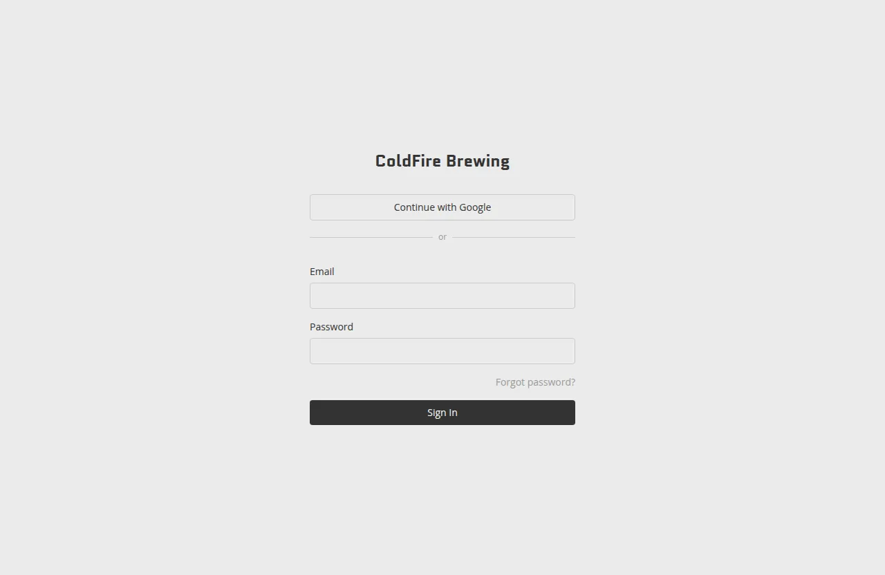 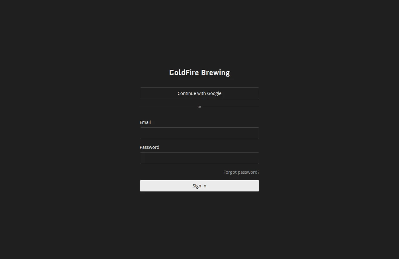
## Sign-in methods
[Section titled “Sign-in methods”](#sign-in-methods)
Your site uses one of two sign-in setups, chosen when the site was set up by your developer.
### Email and OAuth (Supabase auth)
[Section titled “Email and OAuth (Supabase auth)”](#email-and-oauth-supabase-auth)
Sites set up with full authentication show a sign-in form with an **Email** field and a **Password** field. If your developer has enabled social sign-in, you will also see a **Continue with Google** or **Continue with GitHub** button above the form.
To sign in with email and password, enter the address your developer invited you with and the password you set when you accepted the invite. To sign in with Google or GitHub, click the appropriate button and complete the authorization flow in the pop-up. You will be redirected back to your portal once authentication succeeds.
If you have forgotten your password, click **Forgot password?** beneath the password field. Enter your email address and click **Send reset link** — you will receive an email with a link to set a new password.
### Password only
[Section titled “Password only”](#password-only)
Some sites use a simpler shared-password setup. The sign-in screen shows only a **Password** field. Enter the editor password your developer gave you and click **Sign In**.
## First-time access
[Section titled “First-time access”](#first-time-access)
If you were invited by your developer, you will receive an email with a setup link. Clicking that link takes you to `/edit/set-password`, where you can choose your password before signing in for the first time.
## Who can edit
[Section titled “Who can edit”](#who-can-edit)
Access is controlled by your developer. There are two editor roles:
* **Owner** — full access, including site settings and audience management.
* **Editor** — can edit content and publish, but does not manage site-level settings.
If you cannot sign in or see a “You don’t have access to this site” message, contact the person who set up your portal.
# Your brand portal
> What your brand portal is and how editing works.
Your brand portal is a single-page website that lives at your own web address. It brings together your brand guide and asset library — colors, typography, logos, photography, and copy — into one place your team and partners can visit any time.
## Two ways to experience your portal
[Section titled “Two ways to experience your portal”](#two-ways-to-experience-your-portal)
Every portal has two distinct modes: **viewing** and **editing**.
**Viewing** is what everyone else sees. When a visitor opens your site they get a fast, clean page with no editor controls — just your content, rendered directly by the server. There is nothing for visitors to interact with on the editing side; the editing interface is completely separate.
**Editing** is what you see when you sign in at `/edit`. The page looks like your live site, but with controls layered on top that let you update text, swap images, add sections, and adjust settings. Only people you have authorized as owners or editors can reach the editing interface.
## How your changes reach the live site
[Section titled “How your changes reach the live site”](#how-your-changes-reach-the-live-site)
The portal keeps your content in a GitHub repository that belongs to your organization. When you make changes in the editor and click **Save & Publish**, the portal writes your updates to that repository. A short rebuild runs automatically, and your changes appear on the live site once it completes.
Until you publish, nothing you do in the editor affects what visitors see. You can draft changes, step away, and come back — your work stays saved in the editor, out of sight of anyone visiting the public site.
# Troubleshooting & FAQ
> Answers to common editing questions.
Quick answers to the questions editors ask most often. If something isn’t covered here, reach out to the person who set up your portal.
***
## My change isn’t showing up on the live site
[Section titled “My change isn’t showing up on the live site”](#my-change-isnt-showing-up-on-the-live-site)
The most common reason is that the change hasn’t been published yet — saving and publishing are two separate steps.
* **Did you publish?** Clicking **Save** (or the small **Save** option in the dropdown) stores your changes as a draft. They only go live when you click **Publish** or **Save & Publish**. Check the toolbar: if it shows **Publish**, your content is saved but not yet live.
* **Is the build still running?** After you publish, Netlify rebuilds your site, which typically takes two to four minutes. The toolbar shows **Publishing (m:ss)** in orange while it’s in progress, and turns green when done. Give it a moment before checking the live site.
* **Did the build fail?** If the toolbar shows **Publish failed** in red, the rebuild didn’t complete. Try publishing again, or contact your site administrator.
For a full explanation of the publish sequence, see [How changes go live](/editor/publishing/how-changes-go-live/).
***
## I can’t log in
[Section titled “I can’t log in”](#i-cant-log-in)
A few things to check:
* **Are you at the right URL?** The editor lives at `yoursite.com/edit`. Visiting the main site address won’t show a sign-in screen.
* **Are you using the right sign-in method?** Your site uses either a shared password or email-and-password login — whichever your developer set up. If you see only a **Password** field, enter the editor password you were given. If you see an **Email** and **Password** field, use the credentials from your invite.
* **Were you invited?** If you received an invitation email, click the link in that email first. It takes you to a setup screen where you create your password before signing in for the first time.
* **Forgotten your password?** On sites with email login, click **Forgot password?** beneath the password field to receive a reset link.
* **“You don’t have access to this site”?** Access is controlled by your site administrator — contact them to have your account created or restored.
See [Logging in](/editor/getting-started/logging-in/) for a full walkthrough.
***
## My image won’t upload
[Section titled “My image won’t upload”](#my-image-wont-upload)
Two things to check:
* **File format** — the media library accepts JPEG, PNG, WebP, GIF, and most other common image formats, as well as video files. Unusual or proprietary formats may be rejected.
* **File size** — files larger than **5 MB** are not accepted. If your image is over the limit, compress or resize it first, then try again. (Your site administrator can adjust this limit if needed.)
When a file is rejected, you’ll see a notice explaining which file was too large or couldn’t be processed.
See [Uploading images](/editor/media-library/uploading-images/) for more detail.
***
## I edited the wrong section — how do I undo?
[Section titled “I edited the wrong section — how do I undo?”](#i-edited-the-wrong-section--how-do-i-undo)
It depends on whether you’ve saved yet.
* **If you haven’t saved:** click **Discard Changes** in the toolbar to throw away all unsaved edits and return to the last saved state. The editor will ask you to confirm before discarding.
* **If you saved but haven’t published:** your change is in the repository but not live. You can open the section and edit it back to what it was, then save again. Alternatively, set the section to **Draft** status to hide it from visitors while you decide what to do.
* **Remember:** nothing is visible to visitors until you publish. Saved-but-unpublished content gives you a window to review and correct before anything goes live.
See [Saving your changes](/editor/publishing/saving-your-changes/) and [Section status](/editor/audiences-visibility/section-status/) for more on how drafts and discarding work.
***
## A section isn’t visible on the live site even after publishing
[Section titled “A section isn’t visible on the live site even after publishing”](#a-section-isnt-visible-on-the-live-site-even-after-publishing)
Check the section’s status. If a section is set to **Draft** or **Archived**, it won’t appear for visitors even after you publish.
* Hover over the section to reveal its controls.
* Look at the **status pill** in the section header — it shows the current status by name.
* If it says **Draft** or **Archived**, click the pill and choose **Live**, then save and publish again.
See [Section status](/editor/audiences-visibility/section-status/) for details on how each status behaves.
# Inserting & swapping media
> Place images in a Media section.
A **Media section** displays a single image or video. You can insert a new one from the library or swap an existing one for a different image at any time.
## Inserting an image into a new Media section
[Section titled “Inserting an image into a new Media section”](#inserting-an-image-into-a-new-media-section)
1. Add a **Media** section to your page (see [Adding & removing sections](/editor/editing-content/adding-removing-sections/)).
2. The new section appears as an empty placeholder. Click on it to open the media library.
3. The library opens in **select mode** — browse or search for the image you want.
4. Click any thumbnail to insert that image into the section.
The section updates immediately with your chosen image. The change is saved to your working copy; remember to save or publish when you’re ready to make it live.
## Swapping an image
[Section titled “Swapping an image”](#swapping-an-image)
To replace the current image in a Media section with a different one:
1. Click anywhere on the image in the editor.
2. The media library opens again in select mode.
3. Click the thumbnail of the image you want to use instead.
The section switches to the new image right away. The previous image stays in your library — it is not deleted when you swap it out.
## Choosing a document
[Section titled “Choosing a document”](#choosing-a-document)
A [Document section](/editor/editing-content/section-types/) picks its file the same way, from its settings panel rather than from the page:
1. Select the Document section and open **Settings**.
2. On the **File** tab, click **Choose document** (or **Replace document** if one is already set).
3. The library opens in select mode showing **only documents** — images and videos are hidden, and the type filter offers just documents. Click a tile to attach that file.
The panel then shows the file name and size beside the button, so you can confirm you picked the right file. Swapping is the same three steps; the previous document stays in your library.
## Uploading and inserting in one step
[Section titled “Uploading and inserting in one step”](#uploading-and-inserting-in-one-step)
You do not have to upload first. When the library is open in select mode, the upload zone is available at the top of the panel. Drop or pick a file and it will be processed and added to the library. Once processing is complete, the new image appears in the grid and you can click it to insert it.
# Managing your library
> Browse and reuse uploaded images.
Every image, video, and document you upload is stored in your media library. You can browse, search, reuse, and delete files from a single place.
## Browsing your library
[Section titled “Browsing your library”](#browsing-your-library)
Open the full media library manager by clicking the **Media library** button (the image icon) in the editor toolbar at the top of the page. The library grid shows every file you’ve uploaded, with square thumbnails and the filename on hover.
> Note: clicking an image **inside a Media section** opens a picker for choosing or swapping that section’s image — that is the insert/swap flow, not the full manager, so Delete, usage counts, and batch-select are not available there.
Use the **search box** to filter by filename, or use the type filter to show only images, animated files, videos, or documents.
## Documents in the library
[Section titled “Documents in the library”](#documents-in-the-library)
Documents — the PDF and HTML files used by [Document sections](/editor/editing-content/section-types/) — live in their own **Documents** folder, which the library creates and maintains for you as soon as you upload one. Open it from the sidebar or from the folder tile at the top level. A document tile shows a file icon rather than a preview, with a **PDF** or **HTML** badge in the corner and the filename and size beneath it.
The Documents folder is automatic: you can’t rename it, delete it, or drag files into or out of it, and documents can’t be filed into your own folders. Search and the **Documents** type filter still reach them from anywhere in the library — a document in a search result is tagged with a *Documents* chip, the same way a filed image shows its folder.
### Deleting a document
[Section titled “Deleting a document”](#deleting-a-document)
In the library’s manage view, documents work like images: hover a tile to see its usage count, click to select, and use **Delete** in the toolbar. You can select documents and images together — one Delete handles both.
If a document you’re deleting is used by a Document section, you’ll be asked to confirm. Confirming leaves those sections in place but empties them, so each one shows “no file selected” until you choose another document for it (or delete the section). Check the usage count before you delete if you’re not sure where a file is used.
Like every other library change, a deletion applies to your working copy immediately and is committed to your site’s repository when you save. Uploading a document while inside the Documents folder is fine — new files land in the library and appear in the folder automatically.
## Organizing with folders
[Section titled “Organizing with folders”](#organizing-with-folders)
Folders let you group related images and videos so they’re easier to find — they’re purely for organization. Moving a file into a folder never changes its ID or the URL your pages use to reference it, so reorganizing your library is always safe.
### Creating and renaming folders
[Section titled “Creating and renaming folders”](#creating-and-renaming-folders)
Click **New folder** in the library toolbar and give it a name. If a folder with that name already exists at the same level, a number is appended automatically (for example, `Logos (2)`).
To rename a folder, open its **⋮** menu and choose **Rename**.
### Moving files into folders
[Section titled “Moving files into folders”](#moving-files-into-folders)
* **Drag and drop** — drag one or more selected thumbnails onto a folder tile, or onto a folder in the sidebar tree (dragging over a collapsed folder briefly expands it so you can drop into a subfolder). You can also drop onto any segment of the breadcrumb to move into an ancestor folder.
* **Move to…** — if you’d rather not drag, select one or more thumbnails and click **Move**, then choose the destination folder from the list and confirm. This works the same way whether you’ve selected one file or many.
Use the breadcrumb at the top of the grid to see where you are and jump back to a parent folder or **All media**.
### Deleting folders
[Section titled “Deleting folders”](#deleting-folders)
Open a folder’s **⋮** menu and choose **Delete**.
* If the folder is empty, it’s removed immediately.
* If it contains files or subfolders, you’re asked to choose:
* **Move contents to parent** — the folder is removed and everything inside it moves up one level.
* **Delete N items** — the folder and everything inside it is deleted. Any of those images or videos currently in use in a section are also removed from those sections.
### Folders while picking an image
[Section titled “Folders while picking an image”](#folders-while-picking-an-image)
When you’re choosing or swapping an image from inside a Media section, you can still navigate into folders using the sidebar, tiles, and breadcrumb — but folder management (create, rename, delete, move, folder upload) isn’t available there, since that view is for picking a file, not organizing the library.
## Reusing images across sections
[Section titled “Reusing images across sections”](#reusing-images-across-sections)
An image you upload once can be placed in as many sections as you like — just select it from the library whenever you add or swap a Media section. Each section holds a reference to the image by its ID; the image file itself is stored once.
## Usage counts
[Section titled “Usage counts”](#usage-counts)
In the library’s manage view, hovering over a thumbnail shows a **usage count** — for example, “Used 3×” — so you can see at a glance which images are in use and which are not.
## Deleting images
[Section titled “Deleting images”](#deleting-images)
To delete one or more images:
1. Click the thumbnails you want to remove. A circle indicator appears on each selected item.
2. Click the **Delete** button that appears in the toolbar.
3. If any of the selected images are currently used in a section, a confirmation prompt appears. Confirming removes them from those sections and deletes the files.
Deletion takes effect in your working copy and is committed to your site’s repository when you save.
## How images are served
[Section titled “How images are served”](#how-images-are-served)
Once published, your images are served through your site’s media route (`/api/media/{id}/{width}.webp`). The browser receives the size that best fits the visitor’s screen — 640 px, 1 080 px, or 1 920 px wide — rather than always downloading the largest version.
Images are cached at the CDN level so that each size variant is fetched from storage roughly once and delivered quickly on repeat visits.
## Image IDs
[Section titled “Image IDs”](#image-ids)
Behind the scenes, every image has a 16-character ID derived from a hash of its contents. Two uploads of the same file produce the same ID, so the library will not store duplicates. You don’t need to work with IDs directly; they are used internally to wire sections to the right image.
# Uploading images
> Add images to your media library.
The media library is where all images and videos on your site live. Uploading a file adds it to your library so you can place it in any Media section — or swap it in later without re-uploading.
## How to open the upload area
[Section titled “How to open the upload area”](#how-to-open-the-upload-area)
Open the media library from any Media section in the editor. The upload area appears at the top of the panel that slides open.
 
## Uploading a file
[Section titled “Uploading a file”](#uploading-a-file)
You have two options:
* **Drag and drop** — drag one or more files from your desktop and drop them onto the dashed upload zone.
* **Click to browse** — click anywhere in the upload zone to open a file picker and select files from your computer.
Both accept images (JPEG, PNG, WebP, GIF, and most other common formats), video files, and documents — PDFs and single, self-contained HTML files. A document is stored as-is: it is never converted or resized.
## Uploading a whole folder
[Section titled “Uploading a whole folder”](#uploading-a-whole-folder)
If your files are already organized into folders on your computer, you can bring that structure into the library in one step:
* **Click “Upload a folder”** inside the dashed upload zone (just below the drag-and-drop text) to open a folder picker.
* **Drag a folder** from your desktop and drop it onto the upload zone, the same as dropping individual files.
Any subfolders inside are recreated as matching folders in the library, nested the same way. If you’re uploading into a folder that already contains a folder with the same name, the new files are merged into it instead of creating a duplicate.
If any files in the library already match files you’re uploading, those are skipped rather than uploaded again — you’ll see a notice such as “1 file already exists in the library and was left where it is.”
## What happens after you drop a file
[Section titled “What happens after you drop a file”](#what-happens-after-you-drop-a-file)
Your browser processes the file immediately — no waiting for a server round-trip:
1. The image is converted to **WebP format** in your browser.
2. Three sizes are generated automatically: **640 px**, **1 080 px**, and **1 920 px** wide. The right size is served to each visitor depending on their screen, so pages stay fast.
3. The processed file is held locally until you save. Once you save, it is stored in your site’s GitHub repository.
After processing finishes, the image appears in the library grid below the upload zone.
## File size limit
[Section titled “File size limit”](#file-size-limit)
Files larger than **5 MB** are rejected and will not upload. If a file is too large, you’ll see a notice — for a single over-limit file it names the file; if several are rejected at once, it shows how many. Compress or resize the image first, then try again.
(This limit is a default and can be adjusted by your site administrator.)
## Document size limits
[Section titled “Document size limits”](#document-size-limits)
Documents have their own limits, because they are stored differently from images:
* **Up to 2.5 MB** — the file is saved into your site’s repository along with everything else. Nothing extra is needed.
* **Over 2.5 MB** — the file goes to your site’s document storage, up to 200 MB. If document storage has not been set up yet, you’ll see a notice like *“report.pdf” is over 2.5MB, and document storage isn’t set up on this site yet.* — that file is skipped, everything else in the same drop still uploads, and nothing else about your site changes. Ask your site administrator to turn document storage on, or supply a smaller file.
* **Over 200 MB** — refused outright, with a notice naming the 200 MB document limit.
## Alt text
[Section titled “Alt text”](#alt-text)
Each image in the library has an **alt text** field directly below its thumbnail. Alt text describes the image for screen readers and search engines. Fill it in after uploading — you can update it at any time from the library.
# Using video
> Add self-hosted or embedded video with the Video section.
The **Video** section is a dedicated player for watchable video — full playback controls and sound, or a silent looping background clip. It’s separate from the Media section, which stays focused on still images and short animated loops.
## Three ways to source a video
[Section titled “Three ways to source a video”](#three-ways-to-source-a-video)
When you add a Video section, you choose where the footage comes from. Which option is right depends on the video:
* **Paste a YouTube, Vimeo, or Instagram link** — no upload at all. Best for long-form content, or anything already hosted elsewhere (interviews, campaign films, existing channel content). Nothing is stored in your portal; the section just embeds the player.
* **Upload a short loop (5 MB or less)** — stored the same way as your images, in your site’s own repository. This tier is meant for brief, silent, background-style clips — the kind of thing you’d otherwise use an animated GIF for.
* **Upload a larger video (up to 200 MB)** — for real footage with audio: interviews, product demos, brand films you host yourself. These are stored in your site’s dedicated video storage rather than the repository, so they don’t bloat it.
You don’t have to think about which tier a file lands in — drop it in and the portal figures it out from the file size. The distinction only matters for what you get: small loops upload instantly, larger ones show a progress bar while they transfer.
> Large uploads need your site’s video storage to be turned on. If it isn’t, the upload area will tell you and suggest embedding from YouTube or Vimeo instead — contact Drawn Agency to enable it.
## Adding a Video section
[Section titled “Adding a Video section”](#adding-a-video-section)
1. Add a **Video** section like any other (see [Adding & removing sections](/editor/editing-content/adding-removing-sections/)).
2. The new section appears as an empty placeholder. Clicking it opens the media library, where you can upload a new video or pick an existing one from your library.
3. For an upload, drag a file onto the drop zone or click to browse. The browser reads the video’s dimensions and duration and generates a poster frame automatically — no separate step needed.
Only `.mp4` and `.webm` files are accepted for upload. Files over 200 MB are rejected — compress or trim the video first.
### Embedding from YouTube, Vimeo, or Instagram, or choosing the source explicitly
[Section titled “Embedding from YouTube, Vimeo, or Instagram, or choosing the source explicitly”](#embedding-from-youtube-vimeo-or-instagram-or-choosing-the-source-explicitly)
The empty placeholder only opens the media library — it doesn’t have a URL field. To embed a YouTube, Vimeo, or Instagram video, or to explicitly pick between an upload and an embed at any time, open the section’s settings (the gear icon) and use the **Source** tab:
* **Choose from library** — opens the same media library picker as clicking the placeholder.
* **Paste embed URL** — paste the full YouTube, Vimeo, or Instagram URL and confirm. The section fetches the video’s dimensions automatically so the player reserves the right amount of space. Instagram doesn’t expose dimensions, so the section guesses from the link (reels 9:16, posts 4:5) and shows an **Aspect** toggle to correct it.
## Playback modes
[Section titled “Playback modes”](#playback-modes)
Each Video section has a **playback** setting with two modes:
* **Click to play** (default) — shows a poster image with native play controls. Visitors click to start playback with sound, and can pause, seek, and adjust volume.
* **Ambient** — autoplays silently on loop with no controls, like a looping background clip. Use this for footage that should play as soon as the page loads without demanding attention or sound.
Playback mode applies to self-hosted (library) video only — embedded YouTube/Vimeo/Instagram videos use the provider’s own player controls.
## Caption
[Section titled “Caption”](#caption)
Turn on **Show caption** (in the section settings’ Display tab) to display a caption beneath the player. With it on, an editable “Caption” placeholder appears directly under the video — click it and type. There’s no separate field in the settings modal; the caption is edited inline, the same way captions work on Media sections.
## The poster image
[Section titled “The poster image”](#the-poster-image)
Click-to-play videos show a poster before playback starts. The portal generates one automatically from the video’s first frame. If you’d rather show a specific image instead, that’s set by your agency during authoring or migration, not from an in-editor settings control — ask Drawn Agency if you need a poster override changed. The poster is independent of the video file either way, so swapping it doesn’t touch the video itself.
External embeds (YouTube/Vimeo/Instagram) use the thumbnail the provider itself supplies.
## What happens to videos you remove or replace
[Section titled “What happens to videos you remove or replace”](#what-happens-to-videos-you-remove-or-replace)
Small looping videos (5 MB or less) behave exactly like images in your library — they stick around until you delete them from the media library manager (see [Managing your library](/editor/media-library/managing-your-library/)).
Larger, self-hosted videos work a little differently. Because they live in dedicated video storage rather than your repository, the portal automatically cleans up files that are no longer referenced by either your working draft or your published site — this happens shortly after you publish, not the instant you remove a section, so a video you’re mid-upload on is never at risk of being swept up. You don’t need to do anything to trigger this; replacing or removing a Video section’s source is enough.
## Good to know
[Section titled “Good to know”](#good-to-know)
* Video files, unlike images, are not resized into multiple variants — the file you upload is served as-is.
* Self-hosted video plays back with native browser controls; there is no custom player chrome.
* YouTube embeds use the privacy-enhanced (no-cookie) player; Vimeo uses its standard embedded player. Neither autoplays with sound.
* Instagram embeds render Instagram’s post card (header, caption, and all) rather than a bare player, set Meta cookies for viewers, and won’t display posts from private accounts. If the post is deleted or restricted later, the embed breaks silently — for anything long-lived, consider self-hosting the footage instead.
# How changes go live
> What happens after you publish.
When you click **Publish** or **Save & Publish**, your changes do not appear on the live site instantly — a short automated process runs first. This page explains what happens and what to expect.
## The publish sequence
[Section titled “The publish sequence”](#the-publish-sequence)
1. **Your changes are written to GitHub.** The portal commits your content updates to the site’s GitHub repository. Only the content files you edited (section content, site settings, media) are written — the rest of the repository is untouched.
2. **Netlify detects the commit and starts a rebuild.** Your site is hosted on Netlify, which watches the repository for new commits. When the publish commit arrives, Netlify automatically kicks off a new build of your site.
3. **The live site updates.** Once the build finishes, your published content is live and visible to visitors.
The whole sequence typically takes **two to four minutes**, depending on the size of your site.
## Watching the build progress
[Section titled “Watching the build progress”](#watching-the-build-progress)
The editor toolbar shows live build status while a publish is in progress.
While the build is running, you will see **Publishing (m:ss)** in orange at the center of the toolbar, with a timer counting up.
When the build finishes successfully, the status changes to **Published in m:ss** in green. This message fades away on its own, or you can dismiss it with the × button.
If the build fails, the status shows **Publish failed** in red.
   
## What to do if publishing seems stuck
[Section titled “What to do if publishing seems stuck”](#what-to-do-if-publishing-seems-stuck)
Build times vary. If the **Publishing** timer reaches five minutes or more without completing, something may have gone wrong with the Netlify build.
In that case:
* **Check back in a few minutes.** Occasional build delays are normal.
* **Reload the editor.** If the build actually completed while the status indicator was out of sync, reloading will clear it.
* If the problem persists, contact your site administrator. They can check the build log in Netlify directly.
## Saving without publishing
[Section titled “Saving without publishing”](#saving-without-publishing)
If you are not ready to make your changes live, you can save them as a draft first. See [Saving your changes](/editor/publishing/saving-your-changes/) for how to use the **Save** option to write your work to GitHub without triggering a rebuild.
# Saving your changes
> How saving and publishing work.
When you edit content in the portal, your changes move through two steps before visitors can see them: first they are **saved** (written to your site’s repository as a draft), and then they are **published** (made live). Understanding this distinction helps you work confidently without worrying about accidentally sending half-finished content to your live site.
## Your working copy
[Section titled “Your working copy”](#your-working-copy)
As you type and make changes in the editor, your edits are automatically kept in your browser — even before you click Save. This means if your browser tab closes unexpectedly or you step away, your unfinished work is not lost. When you return to the editor, you will see a prompt offering to restore your unsaved changes or start fresh from the last saved state.
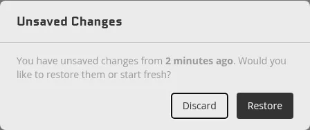 
Your edits stay in this browser working copy until you save them.
## The save bar
[Section titled “The save bar”](#the-save-bar)
The save controls appear in the toolbar at the top of the editor. What you see depends on the state of your changes.
### When you have unsaved edits
[Section titled “When you have unsaved edits”](#when-you-have-unsaved-edits)
When you have made changes that have not been saved yet, the toolbar shows a **Save & Publish** button. Clicking it does two things at once: it writes your changes to the site’s GitHub repository and immediately publishes them to your live site.
 
If you want to save your work without making it live yet, click the small arrow on the right side of the **Save & Publish** button to reveal a **Save** option. Choosing **Save** commits your changes to the repository as a draft — they are safely stored on GitHub but remain invisible to visitors until you publish.
After a save-only action, the toolbar status briefly shows **Saved** in green to confirm the operation completed.
### When changes are saved but not yet published
[Section titled “When changes are saved but not yet published”](#when-changes-are-saved-but-not-yet-published)
Once you have saved a draft, the button changes to **Publish**. Your content is in the repository waiting to go live. Clicking **Publish** promotes that draft to the live site and triggers a rebuild.
### When everything is up to date
[Section titled “When everything is up to date”](#when-everything-is-up-to-date)
When your live site already reflects everything in the repository, the button shows **Up to date** and is grayed out. There is nothing pending.
## Discarding changes
[Section titled “Discarding changes”](#discarding-changes)
If you have unsaved edits in your browser and want to undo all of them, a **Discard Changes** button appears next to the save button. Clicking it opens a confirmation prompt. Confirming drops the edits you haven’t saved yet and reloads the editor from your last saved version.
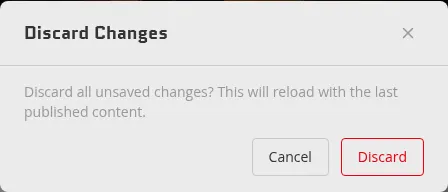 
Discarding cannot be undone, so the editor asks you to confirm before proceeding.
# Version history
> Browse what changed over time and restore an earlier version of your site.
Every save your portal receives is kept, so nothing you have published is ever really lost. The version history lets you look back through those saves, see what changed in any period, open an earlier version read-only, and — if you need to — restore it.
## Opening the history
[Section titled “Opening the history”](#opening-the-history)
At the bottom of the left sidebar is a **Last updated** block showing when the site last changed. Click it to open the history panel.
The panel groups your edits by time rather than listing every save in a row, so finding something from months ago does not mean scrolling through hundreds of near-identical entries. The groups are:
| Group | What it covers |
| --------------------- | -------------------------------------- |
| **Today** | Today’s individual edits |
| **Earlier this week** | The previous six days, one row per day |
| **Previous weeks** | The three weeks before that |
| **Earlier months** | Months back to January of this year |
| **Previous years** | One row per year |
Periods with no edits are left out entirely — a quiet week simply does not appear. If a group has nothing in it at all, it shows **No edits**.
Each row also carries a small bar showing how much editing happened in that period, so a busy week is visually obvious next to a quiet one.
## Drilling down to the moment you want
[Section titled “Drilling down to the moment you want”](#drilling-down-to-the-moment-you-want)
Each row has three separate things you can do, and it is worth knowing which is which:
* **Click the row itself** to see *what changed* in that period. This opens the change summary, described below, and is usually what you want.
* **Click the caret** on the row to *zoom in* — a year opens into months, a month into days, a day into the individual edits made that day.
* **Click the icon at the right edge** to *browse* the site as it was at the end of that period.
Zooming replaces the list rather than expanding it inline, so you can go several levels deep without the rows getting narrower. A trail appears across the top showing where you are, for example `History › 2025 › November › Nov 14`. Any step in that trail takes you back to that level, and **Back** moves up one level.
## Seeing what changed
[Section titled “Seeing what changed”](#seeing-what-changed)
Clicking a row opens a summary of that period’s changes, titled with the period you clicked — a day reads something like `Friday · Jul 24`, and a single edit reads `Edit at 4:47 PM`.
The summary groups the affected sections into **Edited**, **Added** and **Removed**, each with a count, and notes any structural changes such as sections being reordered. It is generated by comparing the two versions, so it reflects what actually changed rather than a note someone remembered to write.
From the summary you can:
* **Browse this version** — open the site read-only as it was, to check something before deciding
* **Restore** — bring that version’s content back as your current draft
## Browsing an earlier version
[Section titled “Browsing an earlier version”](#browsing-an-earlier-version)
Browsing opens your site as it existed at that point, in a read-only mode. You can move through pages normally to confirm you have the right version. Nothing you look at in this mode changes your live site, and you can leave it at any time to return to the current draft.
## Restoring a version
[Section titled “Restoring a version”](#restoring-a-version)
Restoring takes the content from an earlier version and makes it your current working copy. Because this replaces what is in the editor, you are asked to confirm first — the dialog changes to **Restore this version?** before anything happens.
A few things worth understanding before you restore:
* **Restoring does not immediately change your live site.** It brings the old content into your draft. It becomes public the same way any other edit does — when you publish. See [Saving your changes](/editor/publishing/saving-your-changes/) for how that works.
* **Restoring replaces your current content**, so if you have unsaved edits you care about, save or note them first.
* **Sections that were deleted after that version** come back as part of the restore.
If you restore something and change your mind, the version you restored *from* is still in the history — restoring is itself just another change, so you can go back again.
## If the history looks wrong
[Section titled “If the history looks wrong”](#if-the-history-looks-wrong)
* **“No history found”** means the panel could not find any past saves for this site. On a brand-new site with only one save, that is expected.
* **Everything appears on the same day.** If your site’s content was imported or rebuilt in bulk, every save can carry the same timestamp, which makes months of work read as a single afternoon. That reflects how the content was created, not a fault in the history.
* **Very old sites** keep a large but not unlimited history in the panel. On sites with an extremely long history the oldest row is labelled with a `+` to show there is more behind it than is listed.